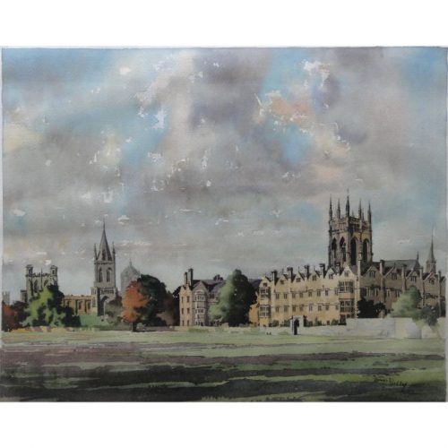
• George Bissill (1896-1973) Exploring the Lake District

    Watercolour 20 x 28 cm Born in 1896, George Bissill was a British miner, painter and furniture designer. Raised in the mining village of Langley Mill, Derbyshire, Bissill became a miner at the age of 13, before leaving to join the war effort in 1915. Upon his return from the war after being gassed, Bissill chose to become a pavement artist outside the newly erected Bush House in Aldwych, painting from his memory and his sketch book the uncompromising underground world he had inhabited. In 1935 he moved to the countryside near Newbury, where he lived and worked as a landscape painter, art restorer and dealer until his death in 1973. This watercolour forms part of a larger collection, 'unseen since they were taken from George Bissil's studio in 1983' and restored by Kate Pattinson. A series of planned exhibitions were cancelled due to Covid, but two shows, one in Oxford and one in Ilkeston, did take place. Through such exhibitions, Pattinson hoped to 'restore the reputation of an artist who, through mighty endeavour, conquered the art world in the 1920s with his powerful, authentic and experimental pictures.' Bissill's paintings are also held in a number of important public collections, including the Tate Gallery, National Museum of Ireland and the Manchester Art Gallery. One of Bissill's most powerful and expertly executed watercolours, this painting depicts a view over the shores of a lake in the Lake District. The sky is overcast, the fells are sparse--painted with muddy tones--, and yet flashes of colour appear on the shoreline as visitors enjoy the offerings of the majestic scenery. The figures seem to be passing their time skimming pebbles, conversing and hiking up the craggy paths of the fells, with their presence lending a lightness to the dramatic scenery. Condition: generally very good.

    If you would like to know more, please email info@manningfineart.co.uk or call us on 07929 749056.

  • Kerry Lee (1903 - 1988) London 'The Bastion of Liberty' Original vintage map 46 x 60 cm Published by Pictorial Maps Limited, Kerry Lee's own company c.1965 This edition of the map was produced around 1965. It depicts a number of London's iconic landmarks, including Tower Bridge, St Paul's Cathedral, Westminster and the Houses of Parliament and Buckingham Palace, all of which are distinguishable by the red banners which highlight each London landmark. Lee frames this charming map with illustrations of London boroughs and other landmarks that lie out of the scope of the map, Hampstead, Alexandra Palance, and Greenwich, for example. Well known as a creator of pictorial maps of British cities from the mid 20th century, Kerry Lee generally draws a self-portrait in the bottom corner by his signature - as here, where he is seen painting (mustachioed and bearded, and clad in a green tunic) with his ever-faithful dog Jim. Educated at Reading Schools of Arts and Science, the Slade and the Sorbonne in Paris, he subsequently assisted his step-father, an architect named Mr Harvey, as draftsman. Following the Depression Lee set up 'Associated Artists' at Blandford Studios off Baker Street, with a group of other commercial artists. During World War II he was based in Hertfordshire creating detailed cut-away drawings of German aircraft, and after the war - still at Blandford Studios - published a series of pictorial maps, both those for British Rail and also his own publications.
  • A. E. Halliwell (1905-1987) Early Summer Period Excursions from London

    Gouache 26 x 15 cm c.1930 Provenance: Family of the artist A.E. Halliwell (1905–1986) was a British artist, illustrator, and designer best known for his vibrant poster designs created for British railway companies during the mid-20th century. Born in Southport, Halliwell developed a strong foundation in art and design early in life. He studied at the Southport School of Art from 1923 to 1926 before graduating to the Royal College of Art in London and subsequently practising as a professional designer from the 1930s. Following his studies, Halliwell married Doris Doyle in Strood Kent, and  went on to have a significant teaching career himself, most notably as a lecturer at the Central School of Arts and Crafts (later part of Central Saint Martins), where he influenced a new generation of designers and illustrators. Halliwell is perhaps best remembered for his vibrant and engaging poster designs created for British railway companies during the 1930s. His work was characterised by a bright, graphic style that balanced charm with clarity, often depicting idealised scenes of British holiday destinations—from sunny seaside towns to tranquil countryside vistas. Beyond posters, his artistic output included book illustration, commercial design, and stage costume sketches, showcasing his versatility across mediums. His posters continue to remain enduring symbols of a golden age of British travel and design and are displayed in major collections including the London Transport Museum. This colourful poster design by A.E. Halliwell for a train provider promotes early summer period excursions from London. In his signature bold style, Halliwell brings together recognisable symbols of the early summer period--a pansy, and the harbinger of summer: a swallow-- and places them against a striking background, using geometric patterns and blocks of colour to create visual segments on the poster. Condition: Generally very good.

    If you would like to know more, please email info@manningfineart.co.uk or call us on 07929 749056.

  • A. E. Halliwell (1905-1987) Xmas Period Excursions from London

    Gouache 26 x 15 cm c.1930 Provenance: Family of the artist A.E. Halliwell (1905–1986) was a British artist, illustrator, and designer best known for his vibrant poster designs created for British railway companies during the mid-20th century. Born in Southport, Halliwell developed a strong foundation in art and design early in life. He studied at the Southport School of Art from 1923 to 1926 before graduating to the Royal College of Art in London and subsequently practising as a professional designer from the 1930s. Following his studies, Halliwell married Doris Doyle in Strood Kent, and  went on to have a significant teaching career himself, most notably as a lecturer at the Central School of Arts and Crafts (later part of Central Saint Martins), where he influenced a new generation of designers and illustrators. Halliwell is perhaps best remembered for his vibrant and engaging poster designs created for British railway companies during the 1930s. His work was characterised by a bright, graphic style that balanced charm with clarity, often depicting idealised scenes of British holiday destinations—from sunny seaside towns to tranquil countryside vistas. Beyond posters, his artistic output included book illustration, commercial design, and stage costume sketches, showcasing his versatility across mediums. His posters continue to remain enduring symbols of a golden age of British travel and design and are displayed in major collections including the London Transport Museum. This colourful poster design by A.E. Halliwell for a train provider promotes Christmas excursions from London. In his signature bold style, Halliwell brings together recognisable symbols of Christmas--a turkey and holly-- and places them against a striking background, using geometric patterns and blocks of colour to create visual segments on the poster. Condition: Generally very good.

    If you would like to know more, please email info@manningfineart.co.uk or call us on 07929 749056.

  • A. E. Halliwell (1905-1987) Easter Excursions from London

    Gouache 26 x 15 cm c.1930 Provenance: Family of the artist A.E. Halliwell (1905–1986) was a British artist, illustrator, and designer best known for his vibrant poster designs created for British railway companies during the mid-20th century. Born in Southport, Halliwell developed a strong foundation in art and design early in life. He studied at the Southport School of Art from 1923 to 1926 before graduating to the Royal College of Art in London and subsequently practising as a professional designer from the 1930s. Following his studies, Halliwell married Doris Doyle in Strood Kent, and  went on to have a significant teaching career himself, most notably as a lecturer at the Central School of Arts and Crafts (later part of Central Saint Martins), where he influenced a new generation of designers and illustrators. Halliwell is perhaps best remembered for his vibrant and engaging poster designs created for British railway companies during the 1930s. His work was characterised by a bright, graphic style that balanced charm with clarity, often depicting idealised scenes of British holiday destinations—from sunny seaside towns to tranquil countryside vistas. Beyond posters, his artistic output included book illustration, commercial design, and stage costume sketches, showcasing his versatility across mediums. His posters continue to remain enduring symbols of a golden age of British travel and design and are displayed in major collections including the London Transport Museum. This colourful poster design by A.E. Halliwell for a train provider promotes Easter excursions from London. In his signature bold style, Halliwell brings together recognisable symbols of spring and places them against a striking background, using blocks of colour to create visual segments on the poster. The blooming crocus is arguably the most striking element of this composition, standing out against its black background and hinting at Halliwell's appreciation for William Morris and the Arts and Crafts movement more generally. Condition: Generally very good.

    If you would like to know more, please email info@manningfineart.co.uk or call us on 07929 749056.

  • A. E. Halliwell (1905-1987) Furs

    Airbrush and pen 50 x 32 cm c.1930 Stamped signature Provenance: Family of the artist A.E. Halliwell (1905–1986) was a British artist, illustrator, and designer best known for his vibrant poster designs created for British railway companies during the mid-20th century. Born in Southport, Halliwell developed a strong foundation in art and design early in life. He studied at the Southport School of Art from 1923 to 1926 before graduating to the Royal College of Art in London and subsequently practising as a professional designer from the 1930s. Following his studies, Halliwell married Doris Doyle in Strood Kent, and  went on to have a significant teaching career himself, most notably as a lecturer at the Central School of Arts and Crafts (later part of Central Saint Martins), where he influenced a new generation of designers and illustrators. Halliwell is perhaps best remembered for his vibrant and engaging poster designs created for British railway companies during the 1930s. His work was characterised by a bright, graphic style that balanced charm with clarity, often depicting idealised scenes of British holiday destinations—from sunny seaside towns to tranquil countryside vistas. Beyond posters, his artistic output included book illustration, commercial design, and stage costume sketches, showcasing his versatility across mediums. His posters continue to remain enduring symbols of a golden age of British travel and design and are displayed in major collections including the London Transport Museum. This elegant poster design by A. E. Halliwell features a stylised figure of a woman clad in a fur stole, rendered with delicate stippling and minimal, flowing lines. The text 'Furs' mirrors these techniques, where Halliwell's blending of the airbrush and fine line technique creates a sense of continuity between the woman's outline, her outfit and the text itself. The overall effect is refined and airy, capturing the essence of 1930s Art Deco glamour. Condition: Generally very good, very faint area of staining to left margin, pin holes to corners.

    If you would like to know more, please email info@manningfineart.co.uk or call us on 07929 749056.

  • A. E. Halliwell (1905-1987) Xmas Gifts

    Airbrush and pen 50 x 32 cm c.1930 Stamped signature Provenance: Family of the artist A.E. Halliwell (1905–1986) was a British artist, illustrator, and designer best known for his vibrant poster designs created for British railway companies during the mid-20th century. Born in Southport, Halliwell developed a strong foundation in art and design early in life. He studied at the Southport School of Art from 1923 to 1926 before graduating to the Royal College of Art in London and subsequently practising as a professional designer from the 1930s. Following his studies, Halliwell married Doris Doyle in Strood Kent, and  went on to have a significant teaching career himself, most notably as a lecturer at the Central School of Arts and Crafts (later part of Central Saint Martins), where he influenced a new generation of designers and illustrators. Halliwell is perhaps best remembered for his vibrant and engaging poster designs created for British railway companies during the 1930s. His work was characterised by a bright, graphic style that balanced charm with clarity, often depicting idealised scenes of British holiday destinations—from sunny seaside towns to tranquil countryside vistas. Beyond posters, his artistic output included book illustration, commercial design, and stage costume sketches, showcasing his versatility across mediums. His posters continue to remain enduring symbols of a golden age of British travel and design and are displayed in major collections including the London Transport Museum. This intriguing poster design by A. E. Halliwell features a series of bells ringing in both the start of the Christmas church services and of holiday spirit more generally. As is typical of art deco design, Halliwell makes ample use of the airbrush technique, creating an elegant effect. Perhaps more interestingly, however, Halliwell also depicts multiple frames, showing the bells at different angles. In doing so, he highlights their movement through an almost stop-motion like technique. 'Ding-dong, ding-dong', you can almost hear the bells ringing straight out of the poster... Condition: Generally very good, slight discolouration, pin holes to corners.

    If you would like to know more, please email info@manningfineart.co.uk or call us on 07929 749056.

  • A. E. Halliwell (1905-1987) Presents for George, Mary & Gladys

    Gouache and collage 46 x 33 cm c.1930 Provenance: Family of the artist A.E. Halliwell (1905–1986) was a British artist, illustrator, and designer best known for his vibrant poster designs created for British railway companies during the mid-20th century. Born in Southport, Halliwell developed a strong foundation in art and design early in life. He studied at the Southport School of Art from 1923 to 1926 before graduating to the Royal College of Art in London and subsequently practising as a professional designer from the 1930s. Following his studies, Halliwell married Doris Doyle in Strood Kent, and  went on to have a significant teaching career himself, most notably as a lecturer at the Central School of Arts and Crafts (later part of Central Saint Martins), where he influenced a new generation of designers and illustrators. Halliwell is perhaps best remembered for his vibrant and engaging poster designs created for British railway companies during the 1930s. His work was characterised by a bright, graphic style that balanced charm with clarity, often depicting idealised scenes of British holiday destinations—from sunny seaside towns to tranquil countryside vistas. Beyond posters, his artistic output included book illustration, commercial design, and stage costume sketches, showcasing his versatility across mediums. His posters continue to remain enduring symbols of a golden age of British travel and design and are displayed in major collections including the London Transport Museum. This playful and visually rhythmic poster design features an abstract arrangement of wrapped gift boxes rendered in a bold, geometric style. Using a limited yet striking colour palette, Halliwell emphasises pattern and contrast—each present decorated with distinct motifs like stripes, chevrons, waves, triangles, and polka dots. Gift tags labeled “George,” “Mary,” and “Gladys” dangle from the boxes, adding a personal, almost whimsical touch to the structured composition while vertical black and white streaks create a layered sense of depth and motion, as if the presents are seen through strips of curtain or light. Bringing together symbols of the Christmas period, Halliwell expertly captures the festive spirit with sophistication and graphic precision. Condition: Generally very good.

    If you would like to know more, please email info@manningfineart.co.uk or call us on 07929 749056.

  • A. E. Halliwell (1905-1987) Hats

    Airbrush and pen 50 x 32 cm c.1930 Stamped signature Provenance: Family of the artist A.E. Halliwell (1905–1986) was a British artist, illustrator, and designer best known for his vibrant poster designs created for British railway companies during the mid-20th century. Born in Southport, Halliwell developed a strong foundation in art and design early in life. He studied at the Southport School of Art from 1923 to 1926 before graduating to the Royal College of Art in London and subsequently practising as a professional designer from the 1930s. Following his studies, Halliwell married Doris Doyle in Strood Kent, and  went on to have a significant teaching career himself, most notably as a lecturer at the Central School of Arts and Crafts (later part of Central Saint Martins), where he influenced a new generation of designers and illustrators. Halliwell is perhaps best remembered for his vibrant and engaging poster designs created for British railway companies during the 1930s. His work was characterised by a bright, graphic style that balanced charm with clarity, often depicting idealised scenes of British holiday destinations—from sunny seaside towns to tranquil countryside vistas. Beyond posters, his artistic output included book illustration, commercial design, and stage costume sketches, showcasing his versatility across mediums. His posters continue to remain enduring symbols of a golden age of British travel and design and are displayed in major collections including the London Transport Museum. This elegant poster design by A. E. Halliwell features two women, adorned in stylish and extravagant hats. To the left of the work, a woman dons a tight-fitting cloche, to her right, another woman models a gainsborough chapeau, its enormous rim providing ample shade for them both. By using simple forms and playing with the contrasts between the dark airbrushed hats and pale delicate faces, Halliwell creates a striking work, capturing the class of 1930s Art Deco glamour. Condition: Generally very good, very faint area of staining to left margin, pin holes to corners.

    If you would like to know more, please email info@manningfineart.co.uk or call us on 07929 749056.

  • A. E. Halliwell (1905-1987) Don't be drowned, travel underground

    Gouache 11 x 6 cm 1927 Signed, dated and inscribed 'Poster design 12.5" x 20" executed 1927' Provenance: Family of the artist A.E. Halliwell (1905–1986) was a British artist, illustrator, and designer best known for his vibrant poster designs created for British railway companies during the mid-20th century. Born in Southport, Halliwell developed a strong foundation in art and design early in life. He studied at the Southport School of Art from 1923 to 1926 before graduating to the Royal College of Art in London and subsequently practising as a professional designer from the 1930s. Following his studies, Halliwell married Doris Doyle in Strood Kent, and  went on to have a significant teaching career himself, most notably as a lecturer at the Central School of Arts and Crafts (later part of Central Saint Martins), where he influenced a new generation of designers and illustrators. Halliwell is perhaps best remembered for his vibrant and engaging poster designs created for British railway companies during the 1930s. His work was characterised by a bright, graphic style that balanced charm with clarity, often depicting idealised scenes of British holiday destinations—from sunny seaside towns to tranquil countryside vistas. Beyond posters, his artistic output included book illustration, commercial design, and stage costume sketches, showcasing his versatility across mediums. His posters continue to remain enduring symbols of a golden age of British travel and design and are displayed in major collections including the London Transport Museum and the V & A. This poster design cleverly contrasts the perils of winter travel on icy streets with the safety and reliability of the London Underground. Halliwell's use of sharp angles and limited colour palette heightens the emotional impact, making the message both memorable and visually compelling. It is a fine example of early 20th-century transport poster art that blends public service messaging with striking modernist aesthetics. As Halliwell signals beneath this design, the poster was executed and featured around the London Underground system throughout the 1930s. Condition: Generally very good.

    If you would like to know more, please email info@manningfineart.co.uk or call us on 07929 749056.

  • Harry Charles Beck (1902-1974) London Underground Railways Pocket Map September 1933 Lithograph 14.5 x 20.5 cm An edition from the first year of publication of Beck's iconic map, precursor to all other similar maps globally. This reimagining of the tube map constituted a veritable departure from earlier maps, stripping the sprawling Tube network down to a neat diagram of coloured, criss-crossing lines. Harry Beck was a technical draughtsman who worked for the London Metro Signal Office. Following being fired, he created the first diagrammatic Tube map in 1931. Having submitted it to the Publicity Office at London Transport, it was rejected. However an updated proposal was accepted, being published in January 1933 in an edition of 700,000 pocket maps - most of which were consigned to the dustbin within hours, days or weeks. Those that survive are rare. Immediately popular it was adopted and similar maps have been used ever since by London Transport - and indeed many other rail systems worldwide. Beck was inspired whilst creating an electrical circuit diagram to apply the same concept to the Underground system, in the understanding that passengers on the network were more interested in how the lines related to each other, than in how they related to the topography of the city. Beck worked on the map in his spare time, and was - depending on the story you believe - either not paid for his work, or was paid a mere five or ten guineas. These days his work is acknowledged on all published London Transport maps.
  • James Priddey (1916-1980) FRSA RBSA

    Merton College, Oxford

    Watercolour and ink 35 x 42cm (13.7×16.5 in.) If you are interested email info@manningfineart.co.uk or call us on 07929 749056. A Birmingham-based artist, educated at the Birmingham College of Art and member of the Royal Birmingham Society of Artists. Priddey had a very distinctive style which he applied to his topographical watercolours.
  • Out of stock

    Peter Collins ARCA (1923-2001) Still Life with Green Apples and Bottle

    Oil on Board 49x59cm Provenance: The Artist's Studio A stongly-painted image, with a generous use of skilfully executed impasto and bright tones. A bowl of green fruit, probably apples, and with perhaps some lemons sits besides a slender and partly-drunk bottle, with an abstract tablecloth in red, white and blue behind. Click here for other items by the artist and for biographical details.
  • British Airways Holidays

    Concorde Vacations (1999)

    Original Vintage Lithographic Poster 92 x 61 cm Original vintage travel poster, advertising Concorde Vacations by British Airways Holidays and featuring an image of an iconic Concorde plane flying through the night. This unique edition a stunning image of the supersonic passenger plane Concorde, set against a night-time backdrop and framed almost as if a rocket shooting through space. The aircraft was originally developed and manufactured jointly between the British Aircraft Corporation and the French airline company Sud-Aviation. The aircraft was capable of flying at a maximum speed over twice the speed of sound (taking less than 3.5 hours to fly the London to New York route but costing over 30 times more than a regular plane ticket). Although the venture ultimately ended in tragedy, with the fatal crash in July 2000, their speed and luxury distinguished the planes as an icon of modernity.
  • Hubert Mathieu

    Téléferique du Béout: Lourdes (1952)

    Lithographic poster 100x62cm Complete with a ski cable car in the place famous as a place of Roman Catholic pilgrimage. If you are interested email info@manningfineart.co.uk or call us on 07929 749056.
  • Uxbridge Station Poster c.1930 Printed by HMSO

    Lithograph 100x62cm This four coloured lithograph was printed in extremely limited numbers for London Transport by HMSO. These maps detailed station entrances and were placed along the underground network to inform commuters exactly where they were in London. If you are interested email info@manningfineart.co.uk or call us on 07929 749056. Condition: Generally very good, slight bruising to the very edges in places, and a little touching in of the red border.
  • P S Lamborn (1722-1774)

    A view of the Public Library, the Senate House and St Mary's Church and the University of Cambridge

    Engraving, 1768 40x54cm If you are interested email info@manningfineart.co.uk or call us on 07929 749056.  
  • Clifford Ellis (1907-1985)

    Grey Abstract 

    Gouache 10x18cm Provenance: the family of the artist, by descent. Click here for biographical details and other works by the artist. If you are interested email info@manningfineart.co.uk or call us on 07929 749056.
  • Clifford Ellis (1907-1985)

    Abstract in Grey I

    Gouache 21x12cm Provenance: the family of the artist, by descent. Click here for biographical details and other works by the artist. If you are interested email info@manningfineart.co.uk or call us on 07929 749056.
  • Anonymous

    Draughts Eat Coal - Stop All Draughts! Save Fuel for Production

    Lithographic poster 76 x 50cm Issued by the Ministry of Fuel and Power Printed for HM Stationery Office by J Weiner Ltd, London WC1 Fuel was needed for production of munitions and machinery, as well as to drive the machinery. The population was therefore exhorted not to waste fuel. Successful Home Front propaganda posters, as Fougasse proved, needed to amuse the watcher; cartoonists were accordingly highly regarded for this task.
  • David Loggan (1634-1692) All Souls College, Oxford

    Collegium Omnium Animarum Engraving (1675) 30x40cm If you are interested email info@manningfineart.co.uk or call us on 07929 749056.
  • Alfred Daniels (1924-2015)

    Almshouses Canning Circus Nottingham

    Conte and wash, 1975 33x62cm Signed and dated 'Alfred Daniels 1975' Click here for biographical details and other works by the artist. If you are interested email info@manningfineart.co.uk or call us on 07929 749056.
  • 'ER' Monogrammist St John's College Cambridge, the Wren Bridge from the River Cam

    Watercolour c. 1900 35x25cm A highly accomplished watercolour of the Kitchen Bridge at St John's College. The artist has clearly had a change of heart, and visibly moved the person standing on the bridge, bringing a sense of movement to what is otherwise a still painting. Moreover the richness of the colour he has chosen for the brickwork brings a further element of surprise to the viewer. If you are interested email info@manningfineart.co.uk or call us on 07929 749056. Condition: Mounted to board, the occasional tiny spot to the sky as visible in photograph.
  • Claude Muncaster (1903-1974) Liverpool Docks

    Dated 1928 Inscribed to reverse Watercolour 28x37cm Muncaster's watercolours capture the English countryside feel with great competence and feeling. Here he records the docks at Liverpool, a busy scene with splashes of bright paint enlivening the otherwise dull smoky port. Liverpool Claude Grahame Muncaster, RWS, ROI, RBA, SMA was the son of Oliver Hall RA. At the age of fifteen his career as a landscape painter began, and he soon took to the seas, spending the 1920s and 30s travelling the world with his sketchbook in a series of vessels. With the outbreak of war and he joined the RNVR training as a navigator. Having left school at fifteen his mathematics was very weak and it was a relief for all when his artistic talents meant he was recruited as a camofleur. A master of capturing seascapes he was therefore able to hide huge ships ‘in plain sight’ with clever disguises. After the war he painted for the Royal Family and was a frequent guest at Sandringham. Claude Muncaster was a watercolourist known for his landscapes and maritime scenes. He was born Grahame Hall, the son of the Royal Academician Oliver Hall who taught his son to paint from an early age; Grahame first exhibited his work aged 15 and a few years later was showing at the RA. However, he adopted the name Claude Muncaster in 1922 to dissociate his career from that of his father. Muncaster’s primary choice of subject matter came from a genuine love of the sea. He made several long-distance sea voyages, including one around the Horn as a deckhand in the windjammer Olivebank in 1931, which he described in ‘Rolling Round the Horn’, published in 1933. Armed with a sketchbook, his aim was to be able to ‘paint ships and the sea with greater authority’. This he certainly achieved, perfectly capturing the limpid first light of morning over the Port of Aden, the choppy rain-grey waters of the Bay of Biscay and a streak of sunlight through gathering storm clouds at dusk in Exeter. He became an Associate of the Royal Watercolour Society in 1931 and was a founder member, and later President, of the Royal Society of Marine Artists. During the Second World War, Muncaster served in the Royal Naval Volunteer Reserve (RNVR) from 1940-44, training as a navigator before going on to advise on the camouflage of ships, and also worked as an official war artist. In ‘Still Morning at Aden’ (1944) he depicts Allied warships in this safe anchorage in the Middle East; the back is stamped with Admiralty approval. In 1946-7 he was commissioned by the Queen to produce watercolours of the royal residences at Windsor, Sandringham and Balmoral; the Duke of Edinburgh, in a foreword to a biography of Muncaster, recalls looking at these and considering the artist’s ‘unerring instinct for a subject’, his sense of atmosphere. Other commissions included large panoramas of the Thames and of Bradford. His career also included work as an etcher, illustrator, writer, lecturer and broadcaster, and his paintings can be found in the Royal Academy, Tate, National Maritime Museum Cornwall, National Railway Museum and Royal Air Force Museum. If you are interested email info@manningfineart.co.uk or call us on 07929 749056. Condition: Conservation mounted and wrapped in transparent sleeve for protection; slight toning to extremities and possibly some loss of colour from sky.
  • Major F A Molony (c. 1865 - ?) St John's College, Cambridge

    watercolour, probably early twentieth century 7x10" Molony was member of the Royal Engineers and a talented watercolourist. 25 July 1882: Promoted to the rank of Lieutenant. 1885: Served in the 10th Company, Royal Engineers during the Suakin Expedition. 22 October 1890: Promoted to the rank of Captain. 27 October 1899: Promoted to the rank of Major. Fought at Battle of Pieters Hill, in the Anglo-Boer war. 23 June 1902: Mentioned in Lord Kitchener's Despatches.m, If you are interested email info@manningfineart.co.uk or call us on 07929 749056. Condition: Good.
  • David Loggan (1634-1692) View of Cambridge

    Engraving after 1690, this is a slightly later Henry Overton printing, shortly after 1700 35x51cm Baptised in Danzig in 1634 Loggan's parents were English and Scottish. Studying engraving in Danzig with Willem Hondius (1598-1652 or 1658) he moved to London in the late 1650s producing the engraved title-page for the folio 1662 Book of Common Prayer. Marrying in 1663 he moved to Nuffield, Oxfordshire in 1665 to avoid the Plague and was in 1668/9 appointed Public Sculptor to the nearby University of Oxford having been commissioned to produce bird’s-eye views of all the Oxford Colleges. He lived in Holywell Street as he did this. Oxonia illustrata was published in 1675, with the help of Robert White (1645-1704). Following its completion he commenced work on his equivalent work for Cambridge, Cantabrigia Illustrata which was finally published in 1690 when he was made engraver to Cambridge University. Oxonia illustrata also includes an engraving of Winchester College (sharing its founder – William of Wykeham – with New College) whilst Cantabrigia illustrata includes one of Eton College (which shares its founder – Henry VIII – with King’s College). Bird’s-eye views required a particular talent as an architectural perspectivist of that era as it was not until 1783 that the first living thing (a sheep, named Montauciel ‘climb to the sky’) was sent aloft by the Mongolfier brothers in a balloon. Loggan thus had to rely on his imagination in conceiving the views. Loggan’s views constitute the first accurate depictions of the two Universities, in many ways unchanged today. Whilst the Oxford engravings were produced in reasonable numbers and ran to a second edition by Henry Overton (on thicker paper and with a plate number in the bottom right-hand corner), those of Cambridge were printed in smaller numbers and it is thought largely no second edition was produced, although this frontispiece proudly claims to have been published by Overton and a pencil note on the print suggests 1715 as a date. The Dutchman Pieter van der Aa published some miniature versions of the engravings for James Beverell’s guidebook to the UK Les Delices de la Grande Bretagne c. 1708. Edmund Hort New (1871-1931) produced a series of pen-and-ink drawings of views of Oxford that paid homage to Loggan showing the development of the city in the following two hundred years. They were turned into photoengravings by Emery Walker who published the series between . Probably no more than two hundred of each engraving were produced and the plates were destroyed in the blitz. The contemporary artist Andrew Ingamells (b.1956) has produced a highly-acclaimed series of etchings again bringing Loggan’s vision up to date. If you are interested email info@manningfineart.co.uk or call us on 07929 749056. Condition: Good. Some age toning as visible in photograph; usual handling wear and marks to edges.
  • J F Barry Pittar (British 1880-1948) Tom Tower, Christ Church Oxford

    Watercolour 15.5x13cm If you are interested email info@manningfineart.co.uk or call us on 07929 749056. Condition: Good.
  • Erté (Romain de Tirtoff) (1892-1990) 'Manhattan Mary IV'

    Serigraph (Artist's Proof IL/L) Signed in pencil 70 x 56cm (sheet) 41.5 x 30.5cm (plate) The Russian born Romain de Tirtoff moved to Paris around 1912 to work as a designer, choosing the pseudonym ‘Erté’ based on the French pronunciation of his initials. He produced fashion plates for the designer Paul Poiret and signed a contract with Harper’s Bazaar that saw him design over 200 covers for the magazine. Costume and stage design followed in the 1920s, for the Folies Bergeres and similar revues in Paris, then in Hollywood for Louis B. Mayer. Erté’s distinctive and elegant style came to epitomise the Art Deco era; it is characterised by a combination of sharp geometric line - like the harlequin background to this print - strong colour planes and images of fashionable modern women with close-cropped hair and asymmetric hemlines. Art Deco enjoyed a revival in the 1960s, and it was from this point that limited edition prints began to be produced from Erté’s designs. ‘Manhattan Mary’ was a Broadway musical which opened at the Apollo Theatre, New York in September 1927, with set and costume designs by Erté. If you are interested email info@manningfineart.co.uk or call us on 07929 749056. Condition: Excellent.
  • Julian Otto Trevelyan, RA (1910 -1988) Caius College II, Cambridge (1959/1962)

    Signed by the artist and inscribed in pencil Artist's Proof, aside from the edition of 70. The edition consisted of 70 numbered proofs and 30 artist’s proofs. We also have listed one of the 70 numbered proof prints, which is in a purple colourway - rather than the blue here. 37x51cm (14.5×20 inches) This comes from Julian Trevelyan’s Cambridge Suite which consisted of 10 lithographs: Caius College, Caius College II, Christ’s College, Corpus Christi College, Downing College, Emmanuel College, Jesus College, Peterhouse, St Catharine’s College and Sidney Sussex College. The Government Art Collection has copies of several of the prints in this series. If you are interested email info@manningfineart.co.uk or call us on 07929 749056. Condition: Good. Old crease that runs from top to bottom has been restored and is barely perceptible - see photograph.
  • Walther Koch (1875-1915) Zug Berg und Strassenbahn

    Original lithographic poster (1914) 40x30" Printed in Zurich by Anstalt Gebr Fretz If you are interested email info@manningfineart.co.uk or call us on 07929 749056. Condition: Excellent.
  • David Loggan (1634-1692)

    Queen's College, Oxford (1674)

    Engraving, 30 x 41cm Loggan was born to English and Scottish parents, and was baptised in Danzig in 1634. After studying engraving in Danzig with Willem Hondius (1598-1652 or 1658), he moved to London in the late 1650s, going on to produce the engraved title-page for the folio 1662 Book of Common Prayer. He married in 1663 and moved to Nuffield in Oxfordshire in 1665. Loggan was appointed Public Sculptor to the nearby University of Oxford in the late 1660s, having been commissioned to produce bird’s-eye views of all the Oxford colleges. He lived in Holywell Street as he did this. The 'Oxonia Illustrata' was published in 1675, with the help of Robert White (1645-1704). Following its completion, Loggan began work on his equivalent work for Cambridge; the 'Cantabrigia Illustrata' was finally published in 1690, when he was made engraver to Cambridge University. The 'Oxonia Illustrata' also includes an engraving of Winchester College (Winchester and New College share William of Wykeham as their founder) whilst the 'Cantabrigia Illustrata' includes one of Eton College (which shares its founder, Henry VIII, with King’s College). Bird’s-eye views from this era required a particular talent as an architectural perspectivist; it was not until 1783 that it became possible for artists to ascend via hot air balloons and view the scenes they were depicting from above. Loggan thus had to rely on his imagination in conceiving the views. Loggan’s views constitute the first accurate depictions of the two Universities, in many ways unchanged today. Whilst the Oxford engravings were produced in reasonable numbers and ran to a second edition by Henry Overton (on thicker paper and with a plate number in Roman numerals in the bottom right-hand corner), those of Cambridge were printed in much smaller numbers. The Dutchman Pieter van der Aa published some miniature versions of the engravings for James Beverell’s guidebook to the UK, 'Les Delices de la Grande Bretagne' (c. 1708). The contemporary artist Andrew Ingamells (b.1956) has produced a highly-acclaimed series of etchings which bring Loggan’s original vision up to date. Condition: good, crease bottom right hand corner. If you’d like to know more, please email info@manningfineart.co.uk or call us on 07929 749056.
  • 'Bisto for all Meat Dishes'

      Original vintage poster 55 x 202 cm This original vintage poster is an excellent opportunity to acquire a piece of British advertising history. Bisto is an instantly recognisable brand today, and has been throughout the 20th century; the catchphrase on the poster here, "Bisto for all meat dishes" was used in the 1950s. The first Bisto product, in 1908, was a meat-flavoured gravy powder which rapidly became a bestseller in the UK. It was added to gravies to thicken them and give a richer taste and aroma. Invented by Messrs Roberts & Patterson, it was named "Bisto" because it "Browns, Seasons and Thickens in One". As of 2005, Bisto Gravy Granules had a British market share of over 70%. Nearly all British grocery outlets stock a Bisto product.
  • Julian Trevelyan (1910-1988) Islam Etching 35 x 48 cm (sheet size 55 x 68 cm) Nephew of the historian G M Trevelyan, Julian Trevelyan was educated at Bedales and then at Trinity College, Cambridge, where he read English. After moving to Paris, Trevelyan studied engraving at Stanley William Hayter’s school, working alongside artists such as Max Ernst, Joan Miro and Pablo Picasso. He married the potter Ursula Darwin in 1934, and in 1935 they moved to Hammersmith, buying Durham Wharf beside the River Thames which was Trevelyan’s studio – and home – for the rest of his life. His wartime service was – like so many artists – as a camoufleur. A Royal Engineer from 1940-43, he served in North Africa and Palestine, forcing the German Afrika Korps to use resources against a dummy army whilst real tanks were disguised as more harmless equipment. In the desert, nothing could be hidden - but it could be disguised. Following the dissolution of his marriage in 1950, he married the painter Mary Fedden. Teaching at Chelsea School of Art, Trevelyan eventually became head of the Etching Department and his pupils included David Hockney and Peter Ackroyd. Condition: mounted to board.
  • Out of stock

    Charles "Snaffles" Johnson Payne (1884-1967)

    The Huntsman: "The 'oss loves the 'ound but I loves both"

    Lithograph 47 x 43 cm Signed in pencil with Snaffles' bit blindstamp, in original 1/2" frame. Snaffles was one of the foremost sporting artists of his era, publishing many popular prints such as these: hunting pictures, racing scenes, and military subjects. Snaffles' distinctive drawing style is emphasised by his 'remarque' - sketches in the margin - and his witty titles. Condition: very good. Small chip to bottom centre of frame.
  • Walter Hoyle (1922-2000)

    St Catharine's College, Cambridge (1956-66)

      Linocut 59 x 39 cm Signed lower right; inscribed and numbered 35/75 in pencil. Hoyle trained at Beckenham School of Art and the Royal College of Art. At the latter he was strongly influenced by Edward Bawden, one of Britain’s greatest linocut printers. Bawden had been commissioned by the 1951 Festival of Britain to produce a mural for the South Bank, and chose Hoyle to assist on account of his great talent. Hoyle moved to Great Bardfield in Essex, becoming a part of the Great Bardfield group of artists; diverse in style, they created figurative work, in stark contrast to the abstract art of the St Ives artists at the opposite end of the country. Hoyle taught at St Martin’s School of Art from 1951-60, the Central School of Arts and Crafts from 1960-64, and the Cambridge School of Art from 1964-1985, during which time he launched Cambridge Print Editions. His work is held in the collections of the Tate Gallery, the Victoria and Albert Museum, The British Museum, Kettle’s Yard and the Fry Art Gallery. Condition: very good.
  • Out of stock

    John Cromby (20th century)

    A Passenger Ship in Liverpool Harbour

      Oil on board 34 x 59 cm Signed lower right. A liner steers between a bright blue sky and a deep blue sea. Small steamships sail nearby, and seagulls wind their way among the various vessels. In the background, Liverpool's skyline is silhouetted. Cromby was a Liverpool-based artist, renowned for his paintings of Liverpool docks. Condition: excellent. If you’d like to know more, please email info@manningfineart.co.uk or call us on 07929 749056.
  • John Cromby (20th century)

    Berean

      Oil on board 38 x 49 cm Signed lower right. The Berean emerges from the horizon between a choppy sea and blue sky studded with clouds. The Berean was built by William Pile of Sunderland for Thomas B Walker of London in 1869, and was one of the fastest ships on the London-Tasmania run. The Berean was inward-bound from Langesund, Norway, with a cargo of ice, when she was struck by a foreign steamship and foundered on the 8th April 1910. In Cromby's painting, a grey-green headland emerges from the right of the picture. Cromby was a Liverpool-based artist, renowned for his paintings of Liverpool docks. Condition: excellent. If you’d like to know more, please email info@manningfineart.co.uk or call us on 07929 749056.
  • Ken Messer (1931 - 2018)

    Dreaming Spires

      Watercolour 30 x 38 cm Signed lower left. Oxford's skyline, including the Radcliffe Camera, the spire of University Church of St Mary the Virgin, and Magdalen Tower, is silhouetted against the grey sky of a winter day. The trees in the foreground are stark and black. Messer's depiction of Oxford's dreaming spires is an outstanding architectural record of the city's - and University's - most remarkable buildings. The painter and draughtsman Ken Messer is closely related to Oxford and its architecture in several ways. Born in Newport, South Wales, he was educated at the City of Oxford High School for Boys in Oxford, and then spent six years working as an accountant in Oxford. He then joined British Overseas Airways Corporation (BOAC) as a steward, flying internationally. Injury due to a car accident during the 1960s meant that he joined the design department of Pergamon Press in Oxford at the age of 33. Six years later, he was appointed to the position of studio manager, in charge of art and design. In 1974, Messer left Pergamon Press to become a freelance graphic designer. He started painting more watercolours, becoming a full-time artist. During the 1980s, his ink drawings were regularly published in the Oxford Times. He has sometimes been called "The Oxford Artist" because of his large number of works depicting Oxford. He and his wife Dilys lived at first in Richmond upon Thames and then in Abingdon, just south of Oxford. Messer's work has been shown at the Mall Galleries for the annual exhibitions of the Royal Institute of Painters in Water Colours annual exhibitions. Condition: excellent. If you’d like to know more, please email info@manningfineart.co.uk or call us on 07929 749056.
  • Gerardus Mercator (1512 - 1594)

    Map of the North of Scotland (1683)

      Engraving with later hand colouring 35 x 45 cm A fantastically characterful and detailed map engraving of the North of Scotland from 1683. The highly detailed and beautifully coloured map is inscribed to the reverse with a description of the parts of Scotland illustrated, called the ''Troisieme Table d''Escosse''. The map comes from the 1683 French edition of Gerardus Mercator''s Atlas Major, which was first published in 1585. Gerardus Mercator was the Flemish father of mapmaking. He was a skilled geographer, cosmographer and cartographer and is most renowned for creating the 1569 world map based on a new projection which represented sailing courses of constant bearing (rhumb lines) as straight lines - an innovation that is still employed in today''s nautical charts. Mercator was a highly influential pioneer in the history of cartography and is generally considered one of the founders of the Netherlandish school of cartography and geography. He is also widely considered the most notable figure of the school. In his own day, he was a notable maker of globes and scientific instruments. In addition, he had interests in theology, philosophy, history, mathematics and geomagnetism. He was also an accomplished engraver and calligrapher. Unlike other great scholars of the age, he travelled little and his knowledge of geography came from his library of over a thousand books and maps, from his visitors and from his vast correspondence (in six languages) with other scholars, statesmen, travellers, merchants and seamen. Mercator''s early maps were in large formats suitable for wall mounting but in the second half of his life, he produced over 100 new regional maps in a smaller format suitable for binding into his Atlas of 1595. This was the first appearance of the word Atlas in reference to a book of maps. However, Mercator used it as a neologism for a treatise (Cosmologia) on the creation, history and description of the universe, not simply a collection of maps. He chose the word as a commemoration of the Titan Atlas, "King of Mauretania", whom he considered to be the first great geographer. Mercator wrote on geography, philosophy, chronology and theology. All of the wall maps were engraved with copious text on the region concerned. As an example, the famous world map of 1569 is inscribed with over five thousand words in fifteen legends. Condition: a little spotting, primarily to margins. If you’d like to know more, please email info@manningfineart.co.uk or call us on 07929 749056.
  • Fairey Swordfish

      Aeroplane identification poster, published 1942 63 x 47 cm A particularly unusual style of aeroplane identification poster, owing to the very arty images. Most such posters rely on very plain silhouettes, this series - and we have several in this series; view them here - have a much more arty approach to the task with shading and an interesting angle view. The Fairey Swordfish is a biplane torpedo bomber designed by the Fairey Aviation Company. Originating in the early 1930s, the Swordfish, nicknamed "Stringbag", was operated by the Fleet Air Arm of the Royal Navy, it was also used by the Royal Air Force (RAF), as well as several overseas operators, including the Royal Canadian Air Force (RCAF) and the Royal Netherlands Navy. It was initially operated primarily as a fleet attack aircraft. During its later years, the Swordfish became increasingly used as an anti-submarine and training platform. The type was in frontline service throughout the Second World War. Despite being obsolete by 1939, the Swordfish achieved some spectacular successes during the war. Notable events included sinking one battleship and damaging two others of the Regia Marina (the Italian Navy) during the Battle of Taranto, and the famous attack on the Bismarck, which contributed to her eventual demise. By the end of the war, the Swordfish held the distinction of having caused the destruction of a greater tonnage of Axis shipping than any other Allied aircraft. The Swordfish remained in front-line service until V-E Day, having outlived multiple aircraft that had been intended to replace it in service. Condition: generally very good. If you are interested, please email info@manningfineart.co.uk or call us on 07929 749056.
  • Army Fi-156 Fieseler "Storch"

      Aeroplane identification poster, published 1944 63 x 47 cm A particularly unusual style of aeroplane identification poster, owing to the very arty images. Most such posters rely on very plain silhouettes, this series - and we have several in this series; view them here - have a much more arty approach to the task with shading and an interesting angle view. The Fieseler Fi 156 Storch, meaning "stork", was a small German liaison aircraft built by Fieseler before and during World War II. It was notable for its excellent short-takeoff-and-landing performance and low stall speed of 31 mph.The Douglas Skymaster was a four-engine transport aircraft used by the United States Army Air Forces in World War II and the Korean War. Like the Douglas C-47 Skytrain (the Skytrain poster from the same series is also available in our storefront), the Skymaster was derived from a civilian airliner, the Douglas DC-4. The Storch was deployed in all European and North African theatres of World War II. In addition to its liaison function, a number were used to fly a battalion of Infantry Regiment Grossdeutschland behind enemy lines during the invasion of Belgium. In 1943, the Storch played a role in Operation Eiche, the rescue of deposed Italian dictator Benito Mussolini from a boulder-strewn mountain-top near the Gran Sasso. Even though the mountain was surrounded by Italian troops, German commando Otto Skorzeny and 90 paratroopers used gliders to land on the peak and quickly captured it. However, the problem of how to get back off remained. A Focke-Achgelis Fa 223 helicopter was sent, but it broke down en route. Instead, pilot Heinrich Gerlach flew over in a Storch. After Mussolini and Skorzeny had boarded the aircraft, the Storch took off to 250 ft, even though the aircraft was overloaded. A Storch was the last aircraft shot down by the Allies on the Western Front. Condition: generally very good. If you are interested, please email info@manningfineart.co.uk or call us on 07929 749056.
  • Royal Air Force Handley Page "Hampden" Bomber

      Aeroplane identification poster, published 1943 63 x 47 cm A particularly unusual style of aeroplane identification poster, owing to the very arty images. Most such posters rely on very plain silhouettes, this series - and we have several in this series; view them here - have a much more arty approach to the task with shading and an interesting angle view. The Handley Page HP.52 Hampden is a British twin-engine medium bomber that was operated by the Royal Air Force (RAF). It was part of the trio of large twin-engine bombers procured for the RAF, joining the Armstrong Whitworth Whitley and Vickers Wellington. The Hampden was powered by Bristol Pegasus radial engines but a variant known as the Handley Page Hereford had in-line Napier Daggers. The Hampden served in the early stages of the Second World War, bearing the brunt of the early bombing war over Europe, taking part in the first night raid on Berlin and the first 1,000-bomber raid on Cologne. When it became obsolete, after a period of mainly operating at night, it was retired from RAF Bomber Command service in late 1942. By 1943, the rest of the trio were being superseded by the larger four-engined heavy bombers such as the Avro Lancaster. Condition: generally very good. If you are interested, please email info@manningfineart.co.uk or call us on 07929 749056.
  • Army FW-189 "Flying Eye"

      Aeroplane identification poster, published 1942 63 x 47 cm A particularly unusual style of aeroplane identification poster, owing to the very arty images. Most such posters rely on very plain silhouettes, this series - and we have several in this series; view them here - have a much more arty approach to the task with shading and an interesting angle view. The Focke-Wulf Fw 189 Uhu ("Eagle Owl") was a German twin-engine, twin-boom, three-seat tactical reconnaissance and army cooperation aircraft. It first flew in 1938, entered service in 1940 and was produced until mid-1944. It was nicknamed the “Flying Eye.” Patrolling the vast flatlands of Ukraine and Belarus, the Flying Eye was used extensively on the Eastern Front with great success. It was nicknamed "Rama" ("frame") by Soviet forces, in reference to its distinctive tailboom and stabiliser shapes, which gave it its characteristic quadrangular appearance. Despite its low speed, the Fw 189's manoeuvrability made it a difficult target for attacking Soviet fighters. When attacked, the Flying Eye was often able to out-turn enemy fighters by simply flying in a tight circle. Condition: generally very good. If you are interested, please email info@manningfineart.co.uk or call us on 07929 749056.
  • Junkers "JU 52"

      Aeroplane identification poster, published 1942 63 x 47 cm A particularly unusual style of aeroplane identification poster, owing to the very arty images. Most such posters rely on very plain silhouettes, this series - and we have several in this series; view them here - have a much more arty approach to the task with shading and an interesting angle view. The Junkers Ju 52/3m (nicknamed Tante Ju ("Aunt Ju") and Iron Annie) was a transport aircraft that was designed and manufactured by German aviation company Junkers. Development of the Ju 52 commenced during 1930, headed by German aeronautical engineer Ernst Zindel. Its maiden flight was on 13 October 1930. Following the rise of Nazi Germany, thousands of Ju 52s were procured as a staple military transport of the nation. The Ju 52 was in production between 1931 and 1952. In a civilian role, it flew with over 12 airlines, including Swissair and Deutsche Luft Hansa, as both a passenger carrier and a freight hauler. In a military role, large numbers flew with the Luftwaffe, being deployed on virtually all fronts of the Second World War as a troop and cargo transport; it was also briefly used as a medium bomber. Additionally, the type was deployed by other nation''s militaries in conflicts such as the Spanish Civil War, the Chaco War, and the Portuguese Colonial War. During the postwar era, the Ju 52 had a lengthy service life with numerous military and civilian operators; large numbers were still in use by the 1980s. Even in the 21st century, several aircraft have remained operational, typically used for purposes such as heritage aviation displays and aerial sightseeing. Condition: generally very good. If you are interested, please email info@manningfineart.co.uk or call us on 07929 749056.
  • Walter Ernest Spradbery (1889 - 1969)

    Temple Church and Library after Bombardment (1944)

      Lithograph 66 x 57 cm Walter Spradbery's poster for the London Underground depicting a bombed Temple Church; a rainbow strikes hopefully out of the church's remains, and the sun shines on the golden stone of the building. The full poster bears the legend 'The Proud City' above Spradbery's design, and, beneath it, a quote from Charles Lamb: 'So may the winged horse, your ancient badge and cognisance, still flourish!'. This is a fantastic piece of British and London history, as well as a fantastically designed poster by a notable 20th century artist. The London Transport Museum has a copy of the poster, reference 1983/4/5751. 'The Proud City' was a series of six posters, all designed by Spradbery. They were commissioned by London Transport in 1944 as a defiant celebration of London's surviving the Blitz, and each poster also included a literary quotation. Walter Ernest Spradbery was a designer, painter, and poet who lived through the First and Second World Wars. He produced posters for LNER, Southern Railways, and London Transport, and was noted for his fascination with architecture and landscape. He studied, and later taught, at the Walthamstow School of Art. He was a pacifist and campaigned for nuclear disarmament, serving in the Medical Corps during the First World War and painting scenes of warfare for its duration, as well as during the Second World War. His anti-war stance and the horrors he had witnessed as a medic fed into his post-war poster design, especially 'The Proud City' poster series. Condition: generally very good. If you’d like to know more, please email info@manningfineart.co.uk or call us on 07929 749056.
  • Margaret Souttar (1914 - 1987)

    Trinity Hall, Cambridge I

      Acrylic paint 55 x 76 cm Signed in pencil lower right. Souttar was a Scottish painter and printmaker known for her images of town- and cityscapes. In the early 1960s, she was commissioned to produce a series of prints of the Cambridge colleges. She captures the modernity and optimism of 1960s Cambridge; the fact that a female artist was commissioned to create the prints reflects the changing attitudes of the University towards women. Trinity Hall was one of the first Cambridge colleges to admit women as students - it did not do so until 1976. Provenance: the artist's studio sale. Condition: generally very good, a few handling marks. If you are interested, please email info@manningfineart.co.uk or call us on 07929 749056. Click here for other views of Trinity Hall.
  • Wilfred Pettitt (1904 - 1978)

    Great Court, Trinity College, Cambridge

      Watercolour 17 x 27 cm A smartly-dressed couple and their two children enjoy the sunny and immaculately-lawned Great Court of Trinity College, Cambridge. The man and woman admire the ornate fountain which stands sentinel in the middle of the court (it, along with the rest of Great Court, was erected by by Thomas Nevile, master of the college in the early 17th century). Their children, perhaps oblivious to the architectural majesty around them, amuse themselves by playing with the pigeons. Wilfred Stanley Pettitt was born in Great Yarmouth, and studied at the Great Yarmouth School of Art and the Norwich School of Art. In 1928 he showed at the Royal Academy Royal Academy for the first time, and his work was also exhibited by the Royal Society of British Artists and the Royal Cambrian Academy. In 1944 Pettitt became one of the founding members of the Norwich Twenty Group (a group of Norfolk artists who intended to raise the standards of local professional art). He died in Eastbourne in 1978. Condition: mounted to board; otherwise very good. If you are interested, please email info@manningfineart.co.uk or call us on 07929 749056. Click here for other views of Trinity College, Cambridge.
Go to Top