Welcome to the shop. You are most welcome to browse, navigate using the menu above, or search the website.

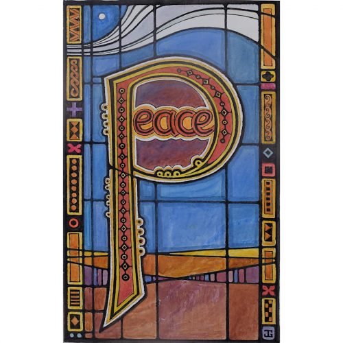
This simple but effective design for a Christmas card from 1989 beautifully demonstrates Gray’s modernist style, with her recognisably colourful palette and simple yet detailed delineation of her geometric, lettered design.
Provenance: the artist’s studio sale. Condition: very good. If you are interested, please email info@manningfineart.co.uk or call us on 07929 749056. For other works by Jane Gray and more information about her, please click here.


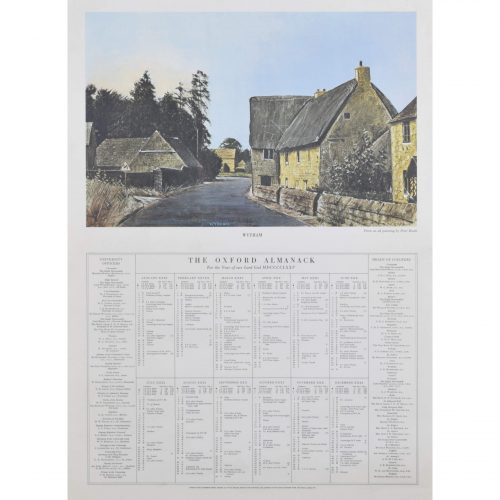
If you would like to know more, please email info@manningfineart.co.uk or call us on 07929 749056.

If you would like to know more, please email info@manningfineart.co.uk or call us on 07929 749056.

Signed, dated and studio stamp verso.
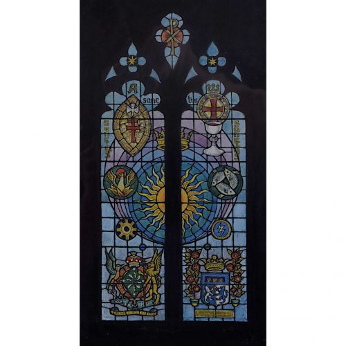
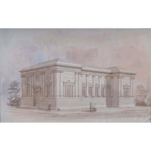
All Saints Church in Writtle, Essex has stood at the heart of the ancient manor of Writtle for over one thousand years and dates back to the early 13th century, although, a Saxon church likely existed on the site prior to this. The living of Writtle church was handed over in 1399 to the Warden and Fellows of New College Oxford in whose patronage the church has remained to this day. This window design features the Arms of Baroness Platt of Writtle linked with those of Guglielmo Marconi as well as the phoenix, and three fishes of Trinity. The window was installed in 1992.
Provenance: the artist’s studio sale. Literature: Jane Gray, Playing with Rainbows. (Shropshire: Ellingham Press, 2011), p.81. Condition: very good. If you are interested, please email info@manningfineart.co.uk or call us on 07929 749056. For other works by Jane Gray and more information about her, please click here.


If you would like to know more, please email info@manningfineart.co.uk or call us on 07929 749056.


If you would like to know more, please email info@manningfineart.co.uk or call us on 07929 749056.

If you would like to know more, please email info@manningfineart.co.uk or call us on 07929 749056.