-
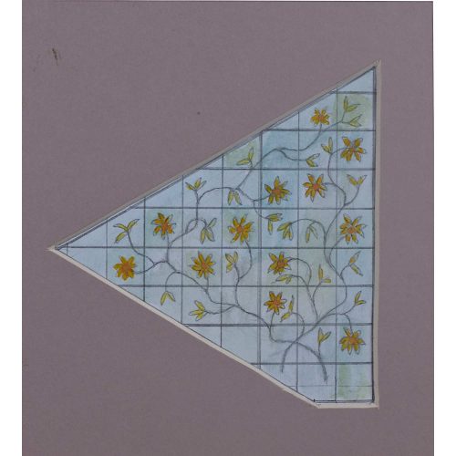
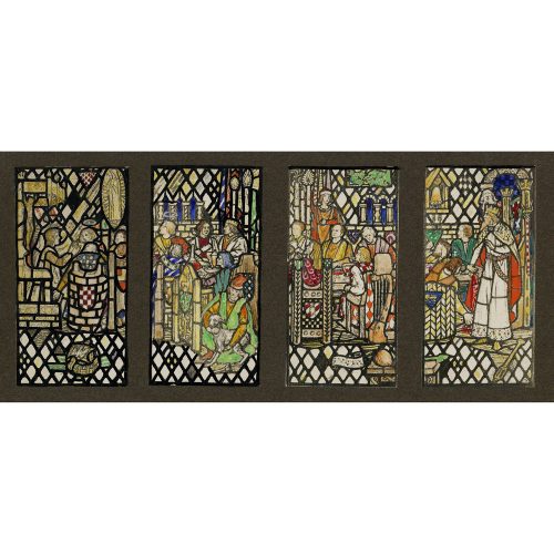
Jane Gray (b.1931)
Floral Design for Domestic Stained Glass Window
Watercolour 11.5 x 11 cmStudio stamp verso.
This uniquely shaped design for a domestic window centres on a sprawling pair of entangled floral branches that cover the small squared panels in an astute imitation of a trellis. The design is typical of many of Gray’s domestic windows which often focus on floral designs.
Provenance: the artist’s studio sale. Condition: very good. If you are interested, please email info@manningfineart.co.uk or call us on 07929 749056. For other works by Jane Gray and more information about her, please click here. -
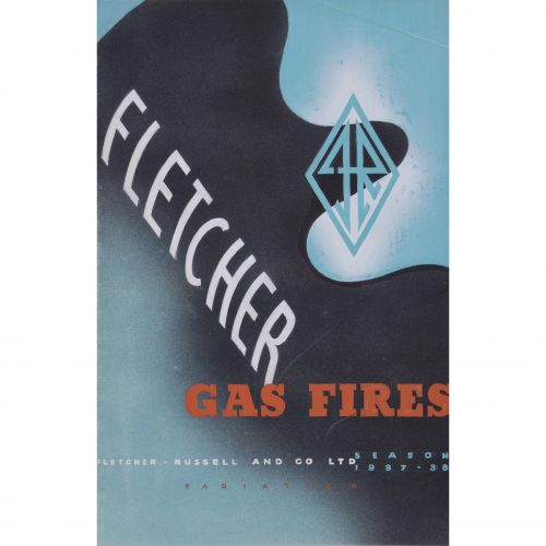
Brownbridge (flourished 1930s - 1940s)
Fletcher Gas Fires brochure design (1937)
Lithographic brochure 21.5 x 14 cm From a small archive of works by Brownbridge, a member of the Society of Industrial Artists. An original gouache design for a brochure advertising Fletcher Russell and Co. gas fires. The futuristic style of the boldly blue-, black-, and orange-coloured poster, as well as the dynamic diamond-shaped badge containing the initials F and R (for Fletcher and Russell) combine to make this a highly modern piece of 1930s design. Society of Industrial Artists correspondance (photographed above) is not included; please enquire separately. Condition: generally very good; gentle crease to top right corner. If you are interested, please email info@manningfineart.co.uk or call us on 07929 749056. Click here for other designs by Brownbridge. -
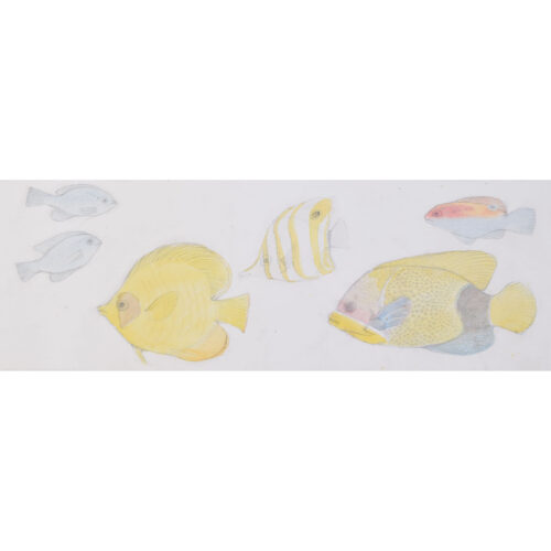
Jane Gray (born 1931)
Fish (1960)
Pencil and watercolour 19 x 54 cm Provenance: the artist's studio sale. Jane Gray A.R.C.A. (b.1931) is a British stained glass artist. She studied stained glass at the Kingston School of Arts (1949 - 1951) and later at the Royal College of Art (1951 - 1955) under Lawrence Lee. Lee was so impressed with Gray’s work that he asked her to work alongside him on the design of ten nave windows for Coventry Cathedral. This six-year-long design project culminated in their final installation in 1962 after the cathedral’s consecration. Gray was the first woman to become a liveryman of the Worshipful Company of Glaziers and has designed more than a hundred windows in private and public buildings, chapels and over forty churches across the country, including St Peter’s, Martindale, Shrewsbury Abbey, St Oswald, Oswestry and St Mary, Chirk. Gray’s designs mark a crucial turning point in the history of stained glass art as the Victorian style gave way to a modern, aesthetic. In her work, Gray navigates this shift with a style that, whilst distinctly modern, retains a deep rooted sense of the medieval. Despite many of her commissions being for church windows, stained glass design was not simply about religious depiction for Gray, but more about ‘colour, shapes, luminosity, [and] playing with rainbows’. Condition: generally very good. If you are interested, please email info@manningfineart.co.uk or call us on 07929 749056. For other works by Jane Gray and more information about her, please click here. -
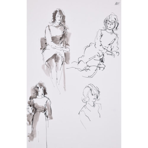
Peter Collins ARCA (1923 - 2001)
Figure Studies
Ink and wash 44 x 28 cm Provenance: the artist's studio sale. Four characterful and intimate clothed studies of a model with voluminous 1960s hair. Collins' first job was in the commercial studio of an advertising agency. World War II interrupted his career and he joined the Royal Artillery, teaching painting and drawing in the Education Corps - whilst simultaneously teaching at St Martin's School of Art, part time. Following the war, Collins studied at the Royal College of Art, winning a scholarship. He then worked as a commercial artist, producing some well-known posters for clients including British Railways and British European Airways. He was the Art Director at Odhams Press and spent time designing for both ICI and Shell. With his wife Georgette, he created the 'Bacombe Galleries' in Sussex, converting a group of buildings into a gallery space. In 1975 they developed the Stanley Studios in Chelsea, which were scheduled for redevelopment, into a combined artists' studio and residence. Moving into the Stanley Studios allowed the Collinses to immerse themselves in Chelsea's art scene, and they proceeded to fill the studios with art, antiques, sculpture, and other curios. Condition: generally very good. If you are interested, please email info@manningfineart.co.uk or call us on 07929 749056. Click here for other works by Peter Collins. -
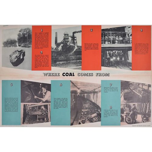
FHK Henrion (1914 - 1990)
Where Coal Comes From (circa 1945)
Original vintage poster 51 x 76 cm Signed in plate. Issued by the Ministry of Fuel and Power; printed for HM Stationery Office by Field Sons & Co Ltd, Bradford. We have been unable to identify any other copy of this poster by this renowned designer in any public collection - it is possibly the only remaining copy. A Ministry of Fuel poster encouraging the public to use less fuel. FHK Henrion was a German graphic designer who moved to Paris after leaving school, studying with the poster designer Paul Colin and then moving to London in 1936. Interned in the Isle of Man during the Second World War, he went on to design posters for the Ministry of Information and the US Office of War Information. After the War he started his own design agency, pioneering the concept of corporate identity. Clients included KLM, Giro, The Post Office, Tate & Lyle. The Ministry of Power and Fuel existed from 1942 to 1957 to control the nation's use of the scarce resources during and after the Second World War. Condition: centre folds as issued with a little wear to the extremities of the folds; generally very good. If you’d like to know more, please email info@manningfineart.co.uk or call us on 07929 749056. -
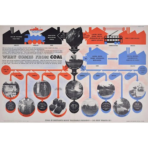
FHK Henrion (1914 - 1990)
What Comes from Coal (circa 1945)
Original vintage poster 51 x 76 cm Signed in plate. Issued by the Ministry of Fuel and Power; printed for HM Stationery Office by Field Sons & Co Ltd, Bradford. We have been unable to identify any other copy of this poster by this renowned designer in any public collection - it is possibly the only remaining copy. A Ministry of Fuel poster encouraging the public to use less fuel. FHK Henrion was a German graphic designer who moved to Paris after leaving school, studying with the poster designer Paul Colin and then moving to London in 1936. Interned in the Isle of Man during the Second World War, he went on to design posters for the Ministry of Information and the US Office of War Information. After the War he started his own design agency, pioneering the concept of corporate identity. Clients included KLM, Giro, The Post Office, Tate & Lyle. The Ministry of Power and Fuel existed from 1942 to 1957 to control the nation's use of the scarce resources during and after the Second World War. Condition: centre folds as issued with a little wear to the extremities of the folds; generally very good. If you’d like to know more, please email info@manningfineart.co.uk or call us on 07929 749056. -
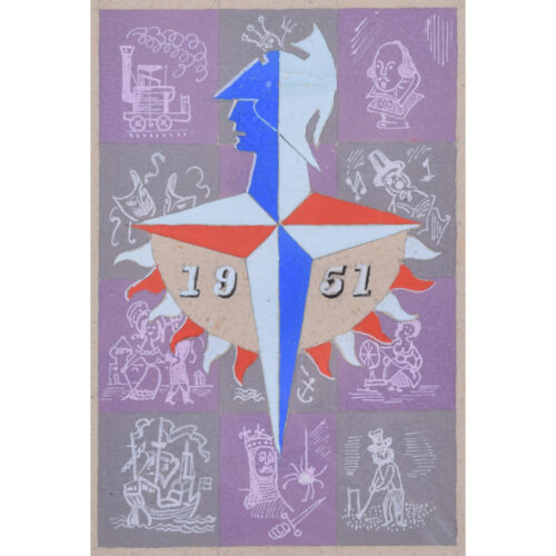
Peter J Wright after Abram Games (1914 - 1996)
Festival of Britain Logo (1951)
Gouache 21 x 13 cm A gouache painting of Abram Games' fantastic Art Deco Modern design for the logo advertising the Festival of Britain. Games' design, called the Festival Star, includes a modernist Britannia in profile with bunting below, all set on the four points of the compass and in the Union Jack colours of red, white, and blue. Games was one of twelve artists invited to submit designs to the Arts Council and the Council of Industrial Design in 1948. The Festival of Britain was a national exhibition and fair that reached millions of visitors throughout the United Kingdom in the summer of 1951. It was devised as a celebration of a hundred years since the Great Exhibition of 1851, but focused entirely on Britain and its achievements rather than adopting the international outlook of the Great Exhibition. The Festival's purpose was to highlight and celebrate how far Britain had come in the wake of the Second World War's devastation. Abram Games OBE RDI was a celebrated British graphic artist. His parents were Eastern European Jews and changed their family name from Gamse to Games after moving to Britain. Games studied at Saint Martin's School of Art in London but left after two terms; aged 21, he won a poster competition for the London County Council and then began to work as a freelance poster designer. In 1937 the journal Art and Industry featured him in an article and this resulted inseveral high-profile graphic design commissions from the General Post Office, London Transport, Royal Dutch Shell, and more. He also designed stamps for the Israeli Post Office, covers for The Jewish Chronicle and synagogue prayer book prints, and designed several posters promoting Jewish organisations and initiatives. Condition: generally very good. If you are interested, please email info@manningfineart.co.uk or call us on 07929 749056. Click here for other Modern British design. -
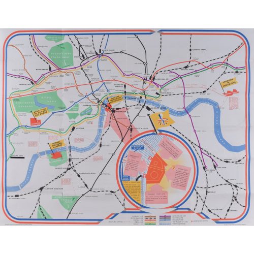
James Hart
Festival of Britain
Lithographic poster map 45 x 58 cm Folding map published for London Transport and British Railways for visitors to the 1951 Festival of Britain, featuring the Abram Games logo, details of water bus services, a detailed plan of the Lambeth exhibition area by Waterloo Bridge. If you are interested email info@manningfineart.co.uk or call us on 07929 749056. -
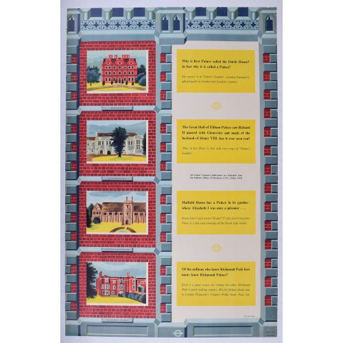
Ernest William Fenton (b. 1922)
Transport for London: Kew Palace, Eltham Palace, Hatfield Old Palace, Richmond Palace
Printed for London Transport Lithographic poster 40x25 inches Educated at Selby College of Art, Leeds College of Art and the Royal College of Art, William Fenton designed posters for London Transport from 1952-1976. If you are interested email info@manningfineart.co.ukor call us on 07929 749056. -
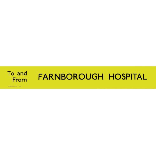
Anon.
Farnborough Hospital Routemaster
Slipboard Poster c.1970 Screenprint poster 64x9cm In a black hand-finished frame. Printed for London Transport for use on Routemaster or RT buses. If you are interested email info@manningfineart.co.uk or call us on 07929 749056. Condition: Excellent. -
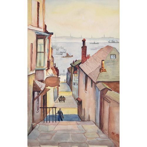
Falmouth, 1944 (unknown Modern British Artist)
Watercolour 46 x 30cm An evocative painting of Falmouth, the Cornish town shaped by its relationship to the sea. The artist leads us from the warm tones of the stone flags and empty buildings down towards a grey sea and a gently smouldering sky. Ships move in to the port, and a unit of pylons, starkly silhouetted, looks out over the bay. Condition: excellent. If you’d like to know more, please email info@manningfineart.co.uk or call us on 07929 749056. -
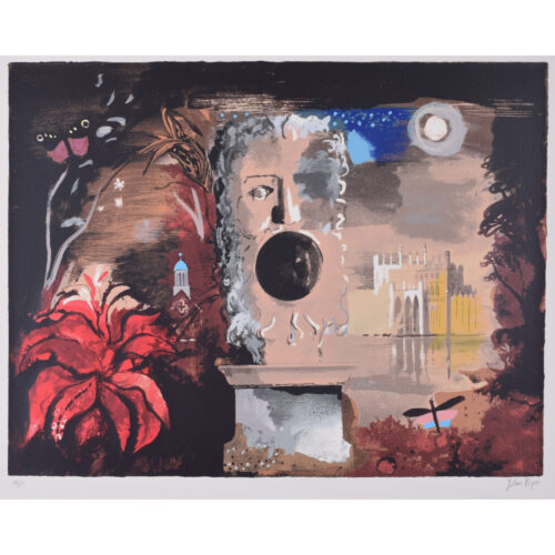
John Piper (1903 - 1992)
Façade (1987)
Lithograph 45 x 60 cm Numbered 96/108 lower left and signed lower right, both in pencil. Printed by Piper and the screenprinter Chris Prater in 1987 after the original designs from 1942. 'Façade' was a sequence of poems written by the English poet Edith Sitwell. They were set to music by William Walton in 1922, four years after they were first written. 'Façade' premiered in 1923 in London, and was praised for its experimental modernist style. The choreographer Frederick Ashton made Façade into a ballet in 1931; Sitwell did not wish her poems to be included, but Walton's orchestral arrangements were used. John Piper was commissioned as set designer for a 1942 performance of Facade in 1942. This lithograph is the design for the performance's curtain; the poetry and music of the performance were played behind the curtain, unseen by the audience. The Gothic house to the right was inspired by Eaton Hall in Cheshire, and we also see a folly, lake, and wood typical of an English country house. The moon, butterfly, and dragonfly lend themselves to the scene's dreamlike aspects, and the mask in the centre of the design highlights the collaborative nature of Façade - a salute to poetry, music, art, and even architecture. John Piper CH was an English painter, printmaker, and designer of stained-glass windows. His work often focused on the British landscape, especially churches and monuments, and included tapestry designs, book jackets, screen-prints, photography, fabrics and ceramics. Condition: very good. If you are interested, please email info@manningfineart.co.uk or call us on 07929 749056. Click here for other works by John Piper. -
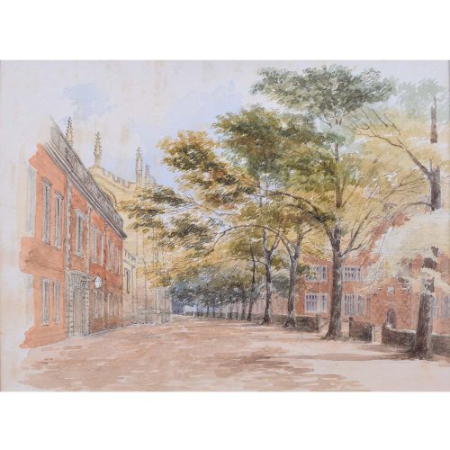
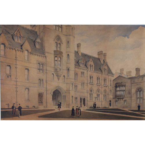 F F Hoyland Balliol College, Oxford (1880) Watercolour 44 x 66 cm Signed lower left and dated. An impressive watercolour of Balliol College. Scholars, sporting gowns and mortarboards, gather in the quad. Hoyland's stylistic precision transforms this watercolour into a beautifully executed depiction of the College's architecture.
 -
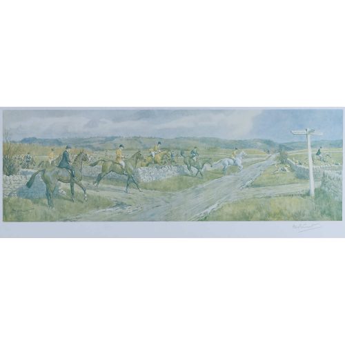 Frank Algernon Stewart (1877-1945) The Heythrop at Stow on the Wold Lithograph 24 x 63cm Signed in pencil. Framed. A typical hunting print by Stewart, showing one of the country's leading packs. Condition: Slight, even, loss of colour, as expected. If you’d like to know more, please email info@manningfineart.co.uk or call us on 07929 749056.
 -
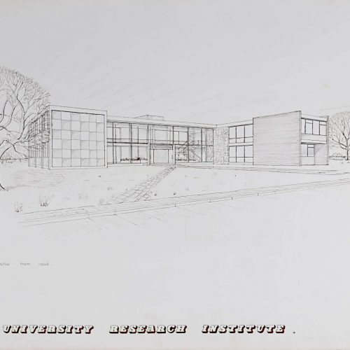
V A Hards (British, c. 1930-c. 2012) Exterior for a University Research Institute (1956)
Watercolour on wove 77 x 55 cm Signed and dated 1956. Hards was educated at Brixton School of Building and Woolwich Polytechnic between 1948 and 1956, during which period he produced some very competent work, including this design for a brutalist University Institute's exterior. Brixton School of Building was incorporated into the Polytechnic of the South Bank - now London South Bank University. Condition: some edge wear and isolated spots - see photographs. Stamped and marked with 'Brixton School of Building' stamp. If you’d like to know more, please email info@manningfineart.co.uk or call us on 07929 749056. -
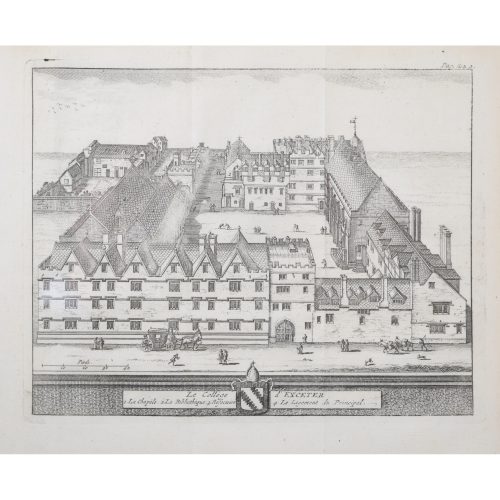
Pieter van der Aa (1659-1733), after David Loggan (1634–1692)
Exeter College, Oxford (1727)
Engraving 12 x 16 cm An eighteenth-century view of Exeter, engraved by Pieter van der Aa after David Loggan, the noted engraver, draughtsman, and painter. Pieter van der Aa of Leiden was a Dutch publisher best known for preparing maps and atlases, though he also printed editions of foreign bestsellers and illustrated volumes. He is noted for the many engravings he produced after David Loggan's series of Oxford and Cambridge colleges and costumes. In 1727 Van Der Aa illustrated "Les Delices de la Grande Bretagne & de L'Irelande" by James Beeverell, the book in which this engraving appears. Condition: a good impression. If you’d like to know more, please email info@manningfineart.co.uk or call us on 07929 749056. -
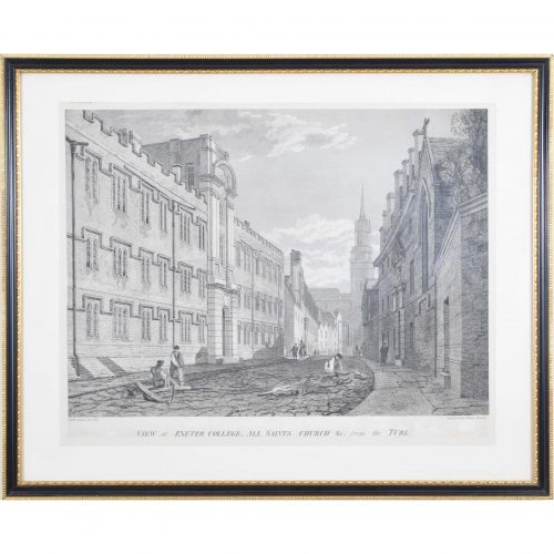
James Basire II (1769 - 1822) after JMW Turner (1775 - 1851)
View of Exeter College, All Saints Church &c. from the Turl
Engraving 35 x 46 cm A view of Exeter College, Oxford from Turl Street. Labourers cobble the road. The spire of what was All Saints Church, now Lincoln College's library, overlooks the scene. Turner's drawing was reproduced as a lithograph in 1800, to be published in the “Oxford Almanack”. The Oxford Almanack was an annual almanack published by the Oxford University Press for the University of Oxford from 1674 through 2019 (when printing sadly ceased due to “dwindling interest”). The almanack traditionally included engravings or lithographs of the University and information about the upcoming year. Other almanack artists have included Michael Burghers and John Piper. Basire and Dayes collaborated on several views of Oxford during the courses of their careers. Joseph Mallord William Turner RA, known in his time as William Turner, was an English Romantic painter, printmaker and watercolourist. He is known for his expressive colouring, imaginative landscapes and turbulent, often violent, marine paintings. He left behind more than 550 oil paintings, 2,000 watercolours, and 30,000 works on paper. He was championed by the leading English art critic John Ruskin from 1840, and is today regarded as having elevated landscape painting to an eminence rivalling history painting. James Basire II was a British engraver, son of James Basire I, also a celebrated engraver. In 1802 he became Engraver to the Society of Antiquaries. Condition: trimmed within plate mark and mounted to paper. If you’d like to know more, please email info@manningfineart.co.uk or call us on 07929 749056. Other views of Exeter College, Oxford are available here. -
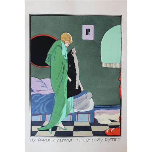
After Ettore Tito (1859-1941) c.1920s A set of four pochoir prints: 'Les paroles s'envolent les ecrits restent'; 'On a souvent besoin d'un plus petit que soi'; 'Qui trop embrasse...'; 'Aide-toi le ciel t'aidera'
23.5 x 16.5 cm (to mount) Ettore Tito (1859-1941) Tito trained at the Accademia di Belle Arti in Venice and later became a professor there, known for his landscapes and scenes of traditional life in the Veneto region, as well as producing several larger mythological murals notably for the Villa Berlinghieri in Rome and the Chiesa degli Scalzi in Venice. He associated with an expatriate artistic milieu that included John Singer Sargent and Isabella Stewart Gardner. However, in the 1920s he also produced these pochoir prints of emancipated women for a French magazine which were considered rather risqué at the time! If you are interested email info@manningfineart.co.ukor call us on 07929 749056. Condition: Excellent, mounted. -
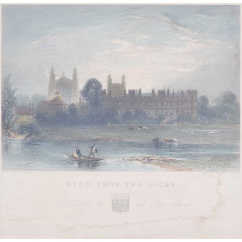
James Redaway (1797 - 1858)
Eton from the Locks
Hand-coloured engraving 27 x 28 cm Redaway's view of Eton College, seen from the locks on the River Thames. James Redaway was a nineteenth-century engraver, principally of landscapes and architectural subjects. Condition: some staining to lower half of print. If you’d like to know more, please email info@manningfineart.co.uk or call us on 07929 749056. -
FP Barraud (1856 - 1924)
Eton College
Watercolour 12 x 18 cm Inscribed faintly lower left 'Eton Coll.' and signed lower right. Condition: generally very good; mounted to board. If you are interested, please email info@manningfineart.co.uk or call us on 07929 749056. Click here for other views of Eton College. -
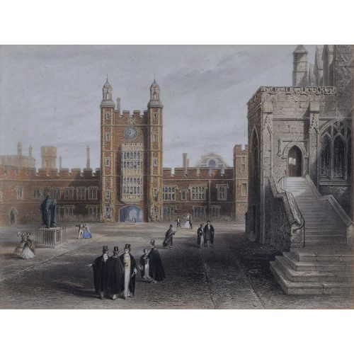
Anonymous (19th century) Eton College Courtyard
Lithograph 29 x 38 cm We have a pair of these rather fine 19th century lithographs: see the second one here. Mounted to board. -
Anonymous (19th century) Eton College
Lithograph 29 x 38 cm We have a pair of these rather fine 19th century lithographs; view the other picture here. Condition: Mounted to board. -
Anonymous Eton College
Watercolour 21.2×28.5cm If you are interested email info@manningfineart.co.ukor call us on 07929 749056. Condition: Good. -
Anon. Eton College
Watercolour 31.5x40.5cm If you are interested email info@manningfineart.co.uk or call us on 07929 749056. Condition: Good. -

Ethel Louise Rawlins (1880 – 1940)
A Garden Below the South Downs
Oil on canvas51 x 61 cmSigned lower right.Rawlins was a painter who studied at the Slade School of Fine Art and in Newlyn, Cornwall. She settled in Sussex in the early 1920s, and often painted the rolling hills of the Sussex landscape. Here, blue hills and a grey sky serve as the background for an extensive garden complete with stone urns, flowers, and slanting shadows created by the late afternoon sun. -
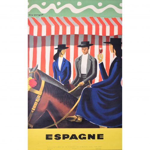
Guy Georget (1911 - 1992)
Espagne - Riders
Original vintage poster 100 x 62 cm One of Georget's fantastic posters designed for the Spanish tourist board. Three riders in traditional dress, with the ladies riding side-saddle, and one with sherry in hand, pose mounted in front of a red and white striped background. The bold, bright colours make the poster typically Georget. Guy Georget was a commercial designer; most of his poster designs were published in the late 1940s. Hired by the tourist boards in their post-war spree of tourism encouragement, Georget designed posters influenced by the styles of Pablo Picasso and Georges Braque. Condition: generally very good; a few tiny repaired edge tears. If you are interested, please email info@manningfineart.co.uk or call us on 07929 749056. Click here for more original vintage travel posters. -
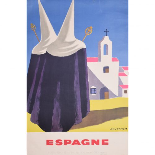
Guy Georget (1911 - 1992)
Espagne - Pilgrims
Original vintage poster 100 x 62 cm One of the fantastic posters Georget designed for the Spanish tourist board. Two pilgrims progress towards a typically Spanish church; Georget makes uses vibrant tones of bright blue, pink, and yellow to illustrate the scene. Guy Georget was a commercial designer; most of his poster designs were published in the late 1940s. Hired by the tourist boards in their post-war spree of tourism encouragement, Georget designed posters influenced by the styles of Pablo Picasso and Georges Braque. Condition: generally very good; a few repaired edge tears including one at the top c. 80mm, one to left side c. 25 mm. If you are interested, please email info@manningfineart.co.uk or call us on 07929 749056. Click here for more original vintage travel posters. -
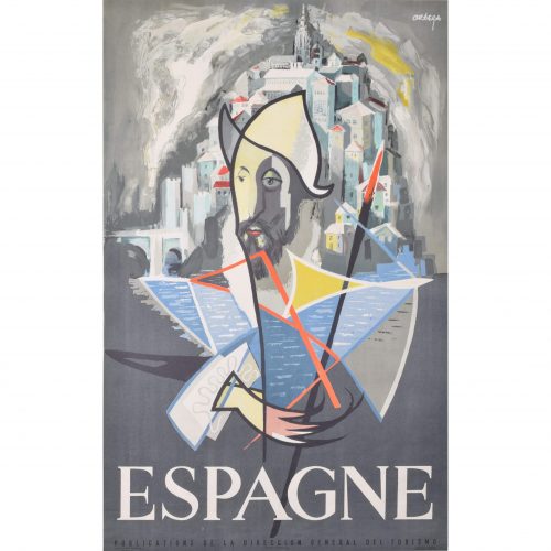
José Ortega (1921 - 1990)
"Don Quixote" Espagne
Original vintage poster c. 1960 99 x 65 cm Printed in Barcelona for the Publications de la Direccion General del Turismo. Ortega's poster is an abstract depiction Don Quixote (the Spanish hero written by Miguel de Cervantes), complete with his distinctive hat and spear. Ortega designed the poster for the Spanish tourist board, using an illustrious figure from Spain's literary heritage to encourage people to visit Spain. José García Ortega was born in Arroba de los Montes and was a member of the Communist Party. He worked as a painter and sculptor, studying at the Círculo de Bellas Artes in Madrid. In 1953 he went to France to study art, funded by a French government scholarship. He returned to Spain throughout the 1950s and 1960s, and became a commercially successful artist. Some of his most famous designs include the posters which the Spanish tourist board commissioned from him circa 1960. Condition: generally very good. If you are interested, please email info@manningfineart.co.uk or call us on 07929 749056. Click here for more original vintage travel posters. -
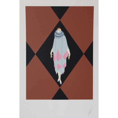
Erté (Romain de Tirtoff) (1892-1990) 'Manhattan Mary IV'
Serigraph (Artist's Proof IL/L) Signed in pencil 70 x 56cm (sheet) 41.5 x 30.5cm (plate) The Russian born Romain de Tirtoff moved to Paris around 1912 to work as a designer, choosing the pseudonym ‘Erté’ based on the French pronunciation of his initials. He produced fashion plates for the designer Paul Poiret and signed a contract with Harper’s Bazaar that saw him design over 200 covers for the magazine. Costume and stage design followed in the 1920s, for the Folies Bergeres and similar revues in Paris, then in Hollywood for Louis B. Mayer. Erté’s distinctive and elegant style came to epitomise the Art Deco era; it is characterised by a combination of sharp geometric line - like the harlequin background to this print - strong colour planes and images of fashionable modern women with close-cropped hair and asymmetric hemlines. Art Deco enjoyed a revival in the 1960s, and it was from this point that limited edition prints began to be produced from Erté’s designs. ‘Manhattan Mary’ was a Broadway musical which opened at the Apollo Theatre, New York in September 1927, with set and costume designs by Erté. If you are interested email info@manningfineart.co.uk or call us on 07929 749056. Condition: Excellent. -
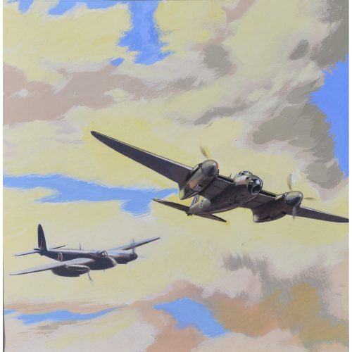
Ernest Bendell-Bayly Mosquito Fighter Bomber
Oil on paper laid on board Design for poster 32x31cm 1940s Ernest Bendell-Bayly was a partner in the Bayly-Souster advertising agency, employer of, amongst others, Owen Miller. If you are interested email info@manningfineart.co.uk or call us on 07929 749056. -
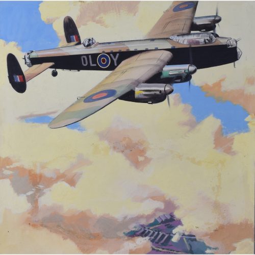
Ernest Bendell-Bayly Lancaster Bomber
Oil on paper laid on board 39x38cm Design for a poster 1940s If you are interested email info@manningfineart.co.uk or call us on 07929 749056. Ernest Bendell-Bayly was a partner in the Bayly-Souster advertising agency, employer of, amongst others, Owen Miller. They produced many posters for the Ministry of Aircraft Production during the war. -
Eric Gill
Canterbury Tales The Summoner's Tale
Woodblock Print Published Hague & Gill 1934 in an unnumbered edition of 300 23x21cm Following Chichester Technical and Art School, Gill moved to London in 1900 to train with the ecclesiastical architects W D Caroe. Finding architecture somewhat pedestrian he took stonemasonry lessons at Westminster Technical Institute and calligraphy lessons at the Central School of Arts and Crafts, coming under the influence of Edward Johnson, the designer of the London Underground's own typeface. In 1903 he ceased his attempts to become an architect, instead becoming a monumental mason, letter-cutter and calligrapher. Based in Ditchling, he began direct carving of stone figures, the semi-abstract figures taking their influence from mediaeval statuary, mixed with influences from Classical statuary from the Greeks and Romans, with a little post-Impressionism added in. With major commissions from Westminster Cathedral for its Stations of the Cross (1914), a series of War Memorials including the Grade II* memorial in Trumpington, and three of the sculptures for Charles Holden's 1928 headquarters of London Underground at 55 Broadway, St James's, and a series of sculptures for the new 1932 Broadcasting House. The list continues. Never one to rest on his laurels, he was at the same time engaged in typographical adventures. He had collaborated with Edward Johnson on the latter's initial thoughts on his London Transport typeface, but in 1925 designed Perpetua on his own, and Gill Sans between 1927-30. For the Golden Cockerel Press he created, in 1929, a bolder typeface to complement wood engravings. And of course Gill was publishing decorated books. His 1929 Canterbury Tales was an epic work, with a whole series of beautiful wood engravings such as this one. The present print is from the 1934 edition for Faber & Faber ('Engravings 1928-1933 by Eric Gill') he printed with his son-in-law, Rene Hague, produced with the original engraved wood blocks. In Chaucer's Tales, the Summoner's Tale tells the story of the man who summonsed people to the ecclesiastical courts. It satirises the friar, considering him to be corrupt. Philip Hofer was a curator and collector, and commissioned this fine Ex Libris plate from Gill. If you are interested email info@manningfineart.co.uk or call us on 07929 749056. Condition: Generally very good condition. -
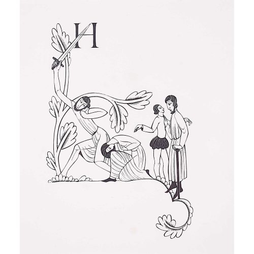
Eric Gill
Initial Letter 'H' for The Canterbury Tales (1929) - The Doctor's Tale
Woodblock Print Published Hague & Gill 1934 in an unnumbered edition of 300 23x21cm Following Chichester Technical and Art School, Gill moved to London in 1900 to train with the ecclesiastical architects W D Caroe. Finding architecture somewhat pedestrian he took stonemasonry lessons at Westminster Technical Institute and calligraphy lessons at the Central School of Arts and Crafts, coming under the influence of Edward Johnson, the designer of the London Underground's own typeface. In 1903 he ceased his attempts to become an architect, instead becoming a monumental mason, letter-cutter and calligrapher. Based in Ditchling, he began direct carving of stone figures, the semi-abstract figures taking their influence from mediaeval statuary, mixed with influences from Classical statuary from the Greeks and Romans, with a little post-Impressionism added in. With major commissions from Westminster Cathedral for its Stations of the Cross (1914), a series of War Memorials including the Grade II* memorial in Trumpington, and three of the sculptures for Charles Holden's 1928 headquarters of London Underground at 55 Broadway, St James's, and a series of sculptures for the new 1932 Broadcasting House. The list continues. Never one to rest on his laurels, he was at the same time engaged in typographical adventures. He had collaborated with Edward Johnson on the latter's initial thoughts on his London Transport typeface, but in 1925 designed Perpetua on his own, and Gill Sans between 1927-30. For the Golden Cockerel Press he created, in 1929, a bolder typeface to complement wood engravings. And of course Gill was publishing decorated books. His 1929 Canterbury Tales was an epic work, with a whole series of beautiful wood engravings such as this one. The present print is from the 1934 edition for Faber & Faber ('Engravings 1928-1933 by Eric Gill') he printed with his son-in-law, Rene Hague, produced with the original engraved wood blocks. In Chaucer's Tales, the Summoner's Tale tells the story of the man who summonsed people to the ecclesiastical courts. It satirises the friar, considering him to be corrupt. Philip Hofer was a curator and collector, and commissioned this fine Ex Libris plate from Gill. If you are interested email info@manningfineart.co.uk or call us on 07929 749056. Condition: Generally very good condition. -
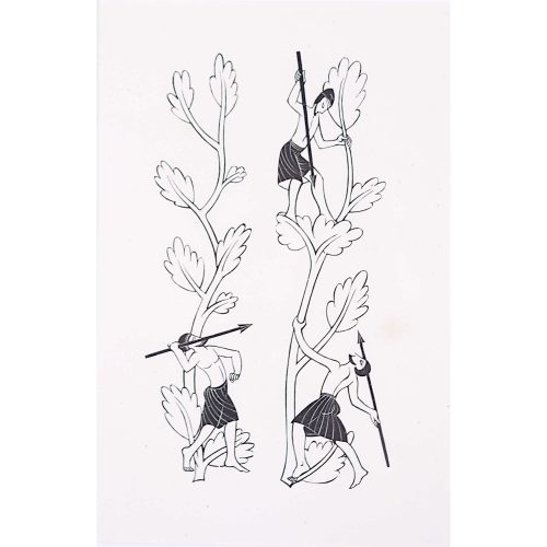
Eric Gill
Border for The Canterbury Tales (1929) - Three Men with Spears
Woodblock Print Published Hague & Gill 1934 in an unnumbered edition of 300 23x21cm Following Chichester Technical and Art School, Gill moved to London in 1900 to train with the ecclesiastical architects W D Caroe. Finding architecture somewhat pedestrian he took stonemasonry lessons at Westminster Technical Institute and calligraphy lessons at the Central School of Arts and Crafts, coming under the influence of Edward Johnson, the designer of the London Underground's own typeface. In 1903 he ceased his attempts to become an architect, instead becoming a monumental mason, letter-cutter and calligrapher. Based in Ditchling, he began direct carving of stone figures, the semi-abstract figures taking their influence from mediaeval statuary, mixed with influences from Classical statuary from the Greeks and Romans, with a little post-Impressionism added in. With major commissions from Westminster Cathedral for its Stations of the Cross (1914), a series of War Memorials including the Grade II* memorial in Trumpington, and three of the sculptures for Charles Holden's 1928 headquarters of London Underground at 55 Broadway, St James's, and a series of sculptures for the new 1932 Broadcasting House. The list continues. Never one to rest on his laurels, he was at the same time engaged in typographical adventures. He had collaborated with Edward Johnson on the latter's initial thoughts on his London Transport typeface, but in 1925 designed Perpetua on his own, and Gill Sans between 1927-30. For the Golden Cockerel Press he created, in 1929, a bolder typeface to complement wood engravings. And of course Gill was publishing decorated books. His 1929 Canterbury Tales was an epic work, with a whole series of beautiful wood engravings such as this one. The present print is from the 1934 edition for Faber & Faber ('Engravings 1928-1933 by Eric Gill') he printed with his son-in-law, Rene Hague, produced with the original engraved wood blocks. If you are interested email info@manningfineart.co.uk or call us on 07929 749056. Condition: Generally very good condition. -
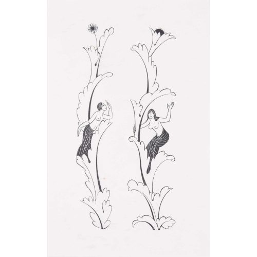
Eric Gill (1882-1940) Canterbury Tales Border - Two nudes i
Woodblock Print Published Hague & Gill 1934 23x21cm Condition: very good Click here for biographical details and other prints by Gill. If you are interested email info@manningfineart.co.uk or call us on 07929 749056. -

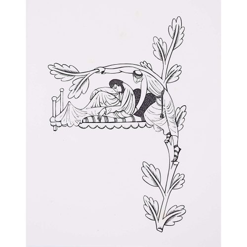
Eric Gill (1882-1940) The Deposition from the Cross
Woodblock Print Published Hague & Gill 1934 23x21cm Christ's body is taken down from the Cross, Mary assists by holding the ropes, and two men - Joseph of Arimathea and Nicodemus climb the ladder - one of the instruments of the passion. Click here for biographical details and other prints by Gill. If you are interested email info@manningfineart.co.uk or call us on 07929 749056. -
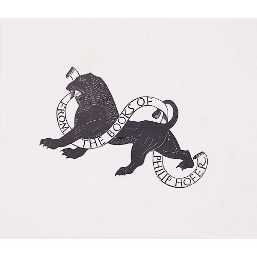
Eric Gill
From the Books of Philip Hofer Woodblock Print
Published Hague & Gill 1934 in an unnumbered edition of 300 23x21cm Following Chichester Technical and Art School, Gill moved to London in 1900 to train with the ecclesiastical architects W D Caroe. Finding architecture somewhat pedestrian he took stonemasonry lessons at Westminster Technical Institute and calligraphy lessons at the Central School of Arts and Crafts, coming under the influence of Edward Johnson, the designer of the London Underground's own typeface. In 1903 he ceased his attempts to become an architect, instead becoming a monumental mason, letter-cutter and calligrapher. Based in Ditchling, he began direct carving of stone figures, the semi-abstract figures taking their influence from mediaeval statuary, mixed with influences from Classical statuary from the Greeks and Romans, with a little post-Impressionism added in. With major commissions from Westminster Cathedral for its Stations of the Cross (1914), a series of War Memorials including the Grade II* memorial in Trumpington, and three of the sculptures for Charles Holden's 1928 headquarters of London Underground at 55 Broadway, St James's, and a series of sculptures for the new 1932 Broadcasting House. The list continues. Never one to rest on his laurels, he was at the same time engaged in typographical adventures. He had collaborated with Edward Johnson on the latter's initial thoughts on his London Transport typeface, but in 1925 designed Perpetua on his own, and Gill Sans between 1927-30. For the Golden Cockerel Press he created, in 1929, a bolder typeface to complement wood engravings. And of course Gill was publishing decorated books. His 1929 Canterbury Tales was an epic work, with a whole series of beautiful wood engravings such as this one. The present print is from the 1934 edition for Faber & Faber ('Engravings 1928-1933 by Eric Gill') he printed with his son-in-law, Rene Hague, produced with the original engraved wood blocks. Philip Hofer was a curator and collector, and commissioned this fine Ex Libris plate from Gill. If you are interested email info@manningfineart.co.uk or call us on 07929 749056. Condition: Generally very good condition. -
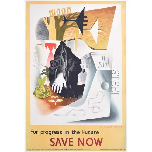
Eric Fraser For Progress in the Future Save Now
75x51cm Original Vintage Poster Issued by the National Savings Committee If you are interested email info@manningfineart.co.uk or call us on 07929 749056. Condition: Backed to linen, small edge tears to right side as visibile in image. -
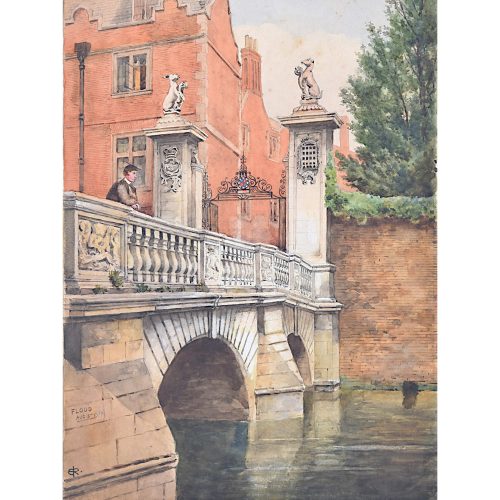
'ER' Monogrammist St John's College Cambridge, the Wren Bridge from the River Cam
Watercolour c. 1900 35x25cm A highly accomplished watercolour of the Kitchen Bridge at St John's College. The artist has clearly had a change of heart, and visibly moved the person standing on the bridge, bringing a sense of movement to what is otherwise a still painting. Moreover the richness of the colour he has chosen for the brickwork brings a further element of surprise to the viewer. If you are interested email info@manningfineart.co.uk or call us on 07929 749056. Condition: Mounted to board, the occasional tiny spot to the sky as visible in photograph. -
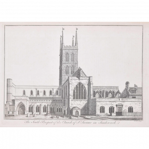
Benjamin Cole (1697-1783)
Southwark Cathedral (c. 1753)
Engraving 24 x 33 cm Stow's Survey of London, a ward-by-ward topographical and historical tour of the City of London giving an account of buildings, social conditions and customs, was first published in 1598. This view of Southwark Cathedral, labelled here as 'the South Prospect of the Church of St Saviour in Southwark', offers a charming perspective of the building's architecture and churchyard. Condition: Generally very good; slight offsetting from facing page and old library stamp to reverse. -
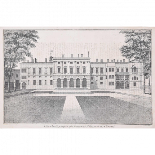
Benjamin Cole (1697-1783)
South Prospect of Somerset House (c. 1753)
Engraving 24 x 37 cm Stow's Survey of London, a ward-by-ward topographical and historical tour of the City of London giving an account of buildings, social conditions and customs, was first published in 1598. Cole's architectural view of Somerset House illustrates the clean neoclassical proportions for which it is known. Condition: Trimmed by the binder's knife within plate marks; some offsetting from facing page; occasional soft creases; generally good. -
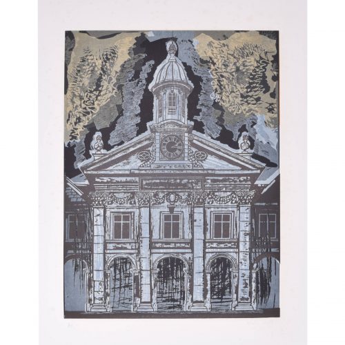
Margaret Souttar (1914 - 1987)
Emmanuel College, Cambridge with Lion Rampant (1960)
Acrylic paint 102 x 69 cm Signed and dated lower right. Souttar was a Scottish painter and printmaker known for her images of town- and cityscapes. In the early 1960s, she was commissioned to produce a series of prints of the Cambridge colleges. She captures the modernity and optimism of 1960s Cambridge; the fact that a female artist was commissioned to create the prints reflects the changing attitudes of the University towards women. These views highlight the layers of history and architectural styles which make up a Cambridge college. Provenance: the artist's studio sale. Condition: generally very good. If you are interested, please email info@manningfineart.co.uk or call us on 07929 749056. Click here for other views of Emmanuel College, Cambridge. -
Margaret Souttar (1914 - 1987)
Emmanuel College, Cambridge (1960)
Acrylic paint 102 x 69 cm Signed and dated lower right. Souttar was a Scottish painter and printmaker known for her images of town- and cityscapes. In the early 1960s, she was commissioned to produce a series of prints of the Cambridge colleges. She captures the modernity and optimism of 1960s Cambridge; the fact that a female artist was commissioned to create the prints reflects the changing attitudes of the University towards women. These views highlight the layers of history and architectural styles which make up a Cambridge college. Provenance: the artist's studio sale. Condition: generally very good. If you are interested, please email info@manningfineart.co.uk or call us on 07929 749056. Click here for other views of Emmanuel College, Cambridge. -
Margaret Souttar (1914 - 1987)
Emmanuel College, Cambridge Lion Rampant (1960)
Acrylic paint 74 x 50 cm Signed and dated lower right. Souttar was a Scottish painter and printmaker known for her images of town- and cityscapes. In the early 1960s, she was commissioned to produce a series of prints of the Cambridge colleges. She captures the modernity and optimism of 1960s Cambridge; the fact that a female artist was commissioned to create the prints reflects the changing attitudes of the University towards women. These views highlight the layers of history and architectural styles which make up a Cambridge college. Provenance: the artist's studio sale. Condition: generally very good; some crinkling as a result of using water-based paints on thin paper. If you are interested, please email info@manningfineart.co.uk or call us on 07929 749056. Click here for other views of Emmanuel College, Cambridge. -
Walter Hoyle (1922 - 2000)
Emmanuel College, Cambridge (Cambridge Series 1956 - 66)
Linocut 55 x 43 cm Signed and inscribed A/P in pencil. Hoyle's view of Emmanuel's Front Court bleaches the gold of the chapel's Ketton Stone into an icy blue, and situates it beneath a tempestuous yellow sky. Hoyle trained at Beckenham School of Art and the Royal College of Art. At the latter he was strongly influenced by Edward Bawden, one of Britain’s greatest linocut printers. Bawden had been commissioned by the 1951 Festival of Britain to produce a mural for the South Bank, and chose Hoyle to assist on account of his great talent. Hoyle moved to Great Bardfield in Essex, becoming a part of the Great Bardfield group of artists; diverse in style, they created figurative work, in stark contrast to the abstract art of the St Ives artists at the opposite end of the country. Hoyle taught at St Martin’s School of Art from 1951-60, the Central School of Arts and Crafts from 1960-64, and the Cambridge School of Art from 1964-1985, during which time he launched Cambridge Print Editions. His work is held in the collections of the Tate Gallery, the Victoria and Albert Museum, The British Museum, Kettle’s Garden and the Fry Art Gallery. Provenance: family of the artist. Condition: generally very good; a few handling marks and areas of discolouration to extreme margins, extraneous ink to right hand side, and a very small brown spot to very top right beyond the blue sky. If you are interested, please email info@manningfineart.co.uk or call us on 07929 749056. Click here for other views of Emmanuel College, Cambridge. -
Samuel Sparrow (active 1800) after John Kirby Baldrey (1750 - 1823)
Emmanuel College, Cambridge
Engraving 35 x 49 cm An engraving of Emmanuel College's neoclassical facade, complete with strolling undergraduates in pairs. The engraving was printed in the Cambridge Almanack in 1806. Samuel Sparrow was a British engraver of landscapes and architectural scenes after his fellow artists, often published as bookplates. John Kirkby Baldrey was a draughtsman and engraver who provided designs for the Cambridge University Almanack between 1803 and 1810. Condition: generally very good; some age toning. If you’d like to know more, please email info@manningfineart.co.uk or call us on 07929 749056. -
Out of stock
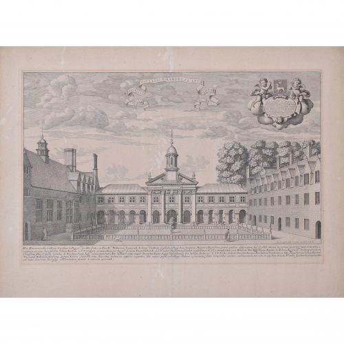
David Loggan (1634 - 1692)
Emmanuel College, Cambridge (1690)
Engraving 31 x 47 cm Loggan was born to English and Scottish parents, and was baptised in Danzig in 1634. After studying engraving in Danzig with Willem Hondius (1598-1652 or 1658), he moved to London in the late 1650s, going on to produce the engraved title-page for the folio 1662 Book of Common Prayer. He married in 1663 and moved to Nuffield in Oxfordshire in 1665. Loggan was appointed Public Sculptor to the nearby University of Oxford in the late 1660s, having been commissioned to produce bird’s-eye views of all the Oxford colleges. He lived in Holywell Street as he did this. The 'Oxonia Illustrata' was published in 1675, with the help of Robert White (1645 - 1704). Following its completion, Loggan began work on his equivalent work for Cambridge; the 'Cantabrigia Illustrata' was finally published in 1690, when he was made engraver to Cambridge University. The 'Oxonia Illustrata' also includes an engraving of Winchester College (Winchester and New College share William of Wykeham as their founder) whilst the 'Cantabrigia Illustrata' includes one of Eton College (which shares its founder, Henry VIII, with King’s College). Bird’s-eye views from this era required a particular talent as an architectural perspectivist; it was not until 1783 that it became possible for artists to ascend via hot air balloons and view the scenes they were depicting from above. Loggan thus had to rely on his imagination in conceiving the views. Loggan’s views constitute the first accurate depictions of the two Universities, in many ways unchanged today. Whilst the Oxford engravings were produced in reasonable numbers and ran to a second edition by Henry Overton (on thicker paper and with a plate number in Roman numerals in the bottom right-hand corner), those of Cambridge were printed in much smaller numbers. The Dutchman Pieter van der Aa published some miniature versions of the engravings for James Beverell’s guidebook to the UK, 'Les Delices de la Grande Bretagne' (circa 1708). The contemporary artist Andrew Ingamells has produced a highly-acclaimed series of etchings which bring Loggan’s original vision up to date. Condition: generally very good; mostly even all-over toning. If you’d like to know more, please email info@manningfineart.co.uk or call us on 07929 749056.