-

H S Rogers
St Edmund Hall - 1926 Proposed Alterations No 2
Pen ink and hand colouring 49 x 38 cm Architectural plans for St Edmund Hall, Oxford by esteemed architect H S Rogers. Condition: Very good, on linen-backed paper -

H S Rogers
St Edmund Hall - 1926 Proposed Alterations No 2
Pen ink and hand colouring 49 x 38 cm Architectural plans for St Edmund Hall, Oxford by esteemed architect H S Rogers. Condition: Very good, on linen-backed paper -
Out of stock
H. M. Bateman (1887-1970)
Don't be Fuel-ish (the Man who Wasted Gas II)
For HMSO by Chromoworks. Ministry of Fuel & Power Lithographic poster c. 1940 38x26cm If you are interested email info@manningfineart.co.uk or call us on 07929 749056. -
Out of stock
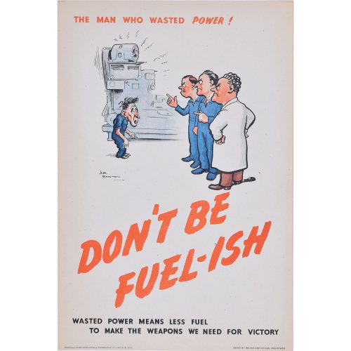
H. M. Bateman (1887-1970)
Don't be Fuel-ish (the man who wasted power)
Lithographic poster 38x26cm If you are interested email info@manningfineart.co.uk or call us on 07929 749056. -
Out of stock
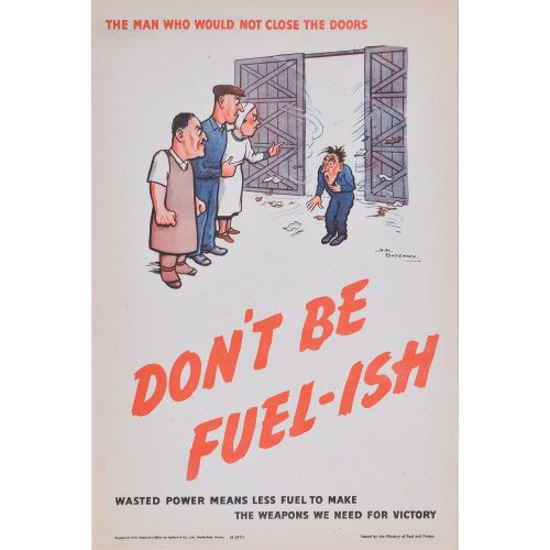
H. M. Bateman
Don't be Fuel-ish (the man who would not close the doors)
Lithographic poster 38x26cm If you are interested email info@manningfineart.co.uk or call us on 07929 749056. -
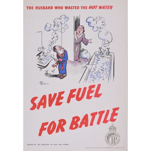
H. M. Bateman (1887-1970)
Save Fuel for Battle (the husband who wasted the hot water)
Lithographic poster c. 1940 For HMSO by Chromoworks. Ministry of Fuel & Power 38x26cm If you are interested email info@manningfineart.co.uk or call us on 07929 749056. -
Out of stock
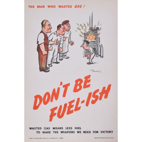
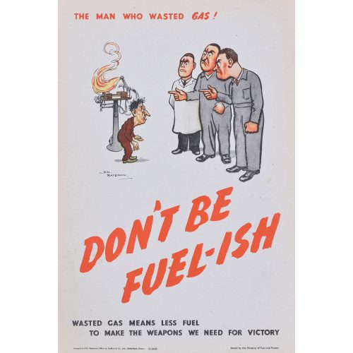
H. M.Bateman
Don't be Fuel-ish (the man who wasted gas)
Lithographic poster c.1940 For HMSO by Chromoworks. Ministry of Fuel & Power 38x26cm If you are interested email info@manningfineart.co.uk or call us on 07929 749056. -
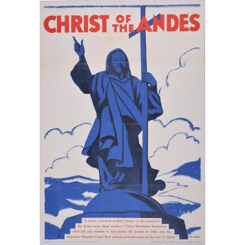 Hal Woolf Christ of the Andes Lithographic poster 76x50cm Printed by the David Allen Printing Co (London) Ltd., Wandsworth, SW18 Published by the League of Nations Union, 15 Crosvenor Crescent, London SW1 A statue, cast from melted cannon, on the summit of the Andes bears these words: "These Mountains themselves shall fall and crumble to dust before the people of Chile and the Argentine Republic forget their solemn covenant sworn at the feet of Christ." The League of Nations Union was formed in 2018 to promote international justice based upon the ideals of the League of Nations. Membership peaked in 1931 at over 400,000. In 1948 it was superseded by the United Nations Association. The statue of 'Christ the Redeemer of the Andes' is a monument unveiled in 1904 to celebrate the peaceful resolution of the border dispute between Argentina and Chile. If you are interested email info@manningfineart.co.uk or call us on 07929 749056.
 -

John Bluck (early 19th century) after Augustus Charles Pugin (1762 - 1832) Hall of Emmanuel College
Aquatint with original hand colouring 24 x 29 cm Published by Rudolph Ackermann (1764 - 1834). An engraving of the hall of Emmanuel College, Cambridge, from Ackermann's 'A History of the University of Cambridge, Its Colleges, Halls and Public Buildings'. Augustus Charles Pugin was an Anglo-French artist and architectural draughtsman. Pugin produced views of London, jointly creating the illustrations for the 'Microcosm of London' published by Rudolph Ackermann in 1811, followed by plates for Ackermann's books about Westminster Abbey, Oxford and Cambridge universities, and Winchester College. His later works included illustrations for Specimens of Gothic Architecture (1821–1823), The Royal Pavilion at Brighton (1826), Architectural Antiquities of Great Britain (1826), Specimens of the Architectural Antiquities of Normandy (1827), Illustrations of the Public Buildings of London (1825 to 1828), Paris and its Environs (1829 to 1831), and Examples of Gothic Architecture (1831). He also produced a book of furniture designs called Gothic Furniture, and assisted architects with detailing for their gothic designs. He ran a drawing school at his house in Bloomsbury. John Bluck was an aquatint engraver, mainly of topographical views, but also of marine and sporting subjects after his contemporaries. He produced plates for numerous publications. Rudolph Ackermann was an Anglo-German bookseller, inventor, lithographer, publisher and businessman. In 1795 he established a print-shop and drawing-school at 96 Strand. Here Ackermann set up a lithographic press and began a trade in prints. He later began to manufacture colours and thick carton paper for landscape and miniature painters. Within three years the premises had become too small and he moved to 101 Strand, in his own words "four doors nearer to Somerset House", the seat of the Royal Academy of Arts. Between 1797 and 1800 Ackermann rapidly developed his print and book publishing business, encompassing many different genres including topography, caricature, portraits, transparencies and decorative prints. Condition: Generally very good, paper slightly toned within platemark.If you would like to know more, please email info@manningfineart.co.uk or call us on 07929 749056.
-

John Bluck (early 19th century) after Augustus Charles Pugin (1762 - 1832) Hall of Queen's College
Aquatint with original hand colouring 24 x 29 cm Published by Rudolph Ackermann (1764 - 1834). Augustus Charles Pugin was an Anglo-French artist and architectural draughtsman. Pugin produced views of London, jointly creating the illustrations for the 'Microcosm of London' published by Rudolph Ackermann in 1811, followed by plates for Ackermann's books about Westminster Abbey, Oxford and Cambridge universities, and Winchester College. His later works included illustrations for Specimens of Gothic Architecture (1821–1823), The Royal Pavilion at Brighton (1826), Architectural Antiquities of Great Britain (1826), Specimens of the Architectural Antiquities of Normandy (1827), Illustrations of the Public Buildings of London (1825 to 1828), Paris and its Environs (1829 to 1831), and Examples of Gothic Architecture (1831). He also produced a book of furniture designs called Gothic Furniture, and assisted architects with detailing for their gothic designs. He ran a drawing school at his house in Bloomsbury. John Bluck was an aquatint engraver, mainly of topographical views, but also of marine and sporting subjects after his contemporaries. He produced plates for numerous publications. Rudolph Ackermann was an Anglo-German bookseller, inventor, lithographer, publisher and businessman. In 1795 he established a print-shop and drawing-school at 96 Strand. Here Ackermann set up a lithographic press and began a trade in prints. He later began to manufacture colours and thick carton paper for landscape and miniature painters. Within three years the premises had become too small and he moved to 101 Strand, in his own words "four doors nearer to Somerset House", the seat of the Royal Academy of Arts. Between 1797 and 1800 Ackermann rapidly developed his print and book publishing business, encompassing many different genres including topography, caricature, portraits, transparencies and decorative prints. Condition: Paper slightly toned within platemark.If you would like to know more, please email info@manningfineart.co.uk or call us on 07929 749056.
-

John Bluck (early 19th century) after Augustus Charles Pugin (1762 - 1832) Hall of Trinity College, Cambridge (1815)
Aquatint with original hand colouring 21 x 27 cm Published by Rudolph Ackermann (1764 - 1834). An engraving of a quiet Trinity College Hall from Ackermann's 'History of Cambridge'. Augustus Charles Pugin was an Anglo-French artist and architectural draughtsman. Pugin produced views of London, jointly creating the illustrations for the 'Microcosm of London' published by Rudolph Ackermann in 1811, followed by plates for Ackermann's books about Westminster Abbey, Oxford and Cambridge universities, and Winchester College. His later works included illustrations for Specimens of Gothic Architecture (1821–1823), The Royal Pavilion at Brighton (1826), Architectural Antiquities of Great Britain (1826), Specimens of the Architectural Antiquities of Normandy (1827), Illustrations of the Public Buildings of London (1825 to 1828), Paris and its Environs (1829 to 1831), and Examples of Gothic Architecture (1831). He also produced a book of furniture designs called Gothic Furniture, and assisted architects with detailing for their gothic designs. He ran a drawing school at his house in Bloomsbury. John Bluck was an aquatint engraver, mainly of topographical views, but also of marine and sporting subjects after his contemporaries. He produced plates for numerous publications. Rudolph Ackermann was an Anglo-German bookseller, inventor, lithographer, publisher and businessman. In 1795 he established a print-shop and drawing-school at 96 Strand. Here Ackermann set up a lithographic press and began a trade in prints. He later began to manufacture colours and thick carton paper for landscape and miniature painters. Within three years the premises had become too small and he moved to 101 Strand, in his own words "four doors nearer to Somerset House", the seat of the Royal Academy of Arts. Between 1797 and 1800 Ackermann rapidly developed his print and book publishing business, encompassing many different genres including topography, caricature, portraits, transparencies and decorative prints. Condition: Generally very good; toning to within platemark.If you would like to know more, please email info@manningfineart.co.uk or call us on 07929 749056.
-
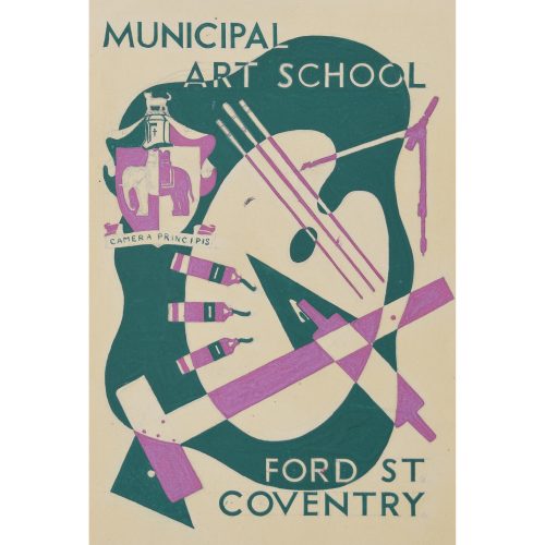
Hammond (British, fl. 1930s) Design for Municipal Art School Brochure
21.5x18 cm Lithograph drawn directly to stone, 1937 Sadly nothing is known of the life of the artist of this series of rather fine Art Deco designs we have listed. This is drawn directly onto the stone, a considerable skill in itself, and in just two colours in order to limit the cost of the lithography. If you are interested email info@manningfineart.co.uk or call us on 07929 749056. Condition: Generally very good. -
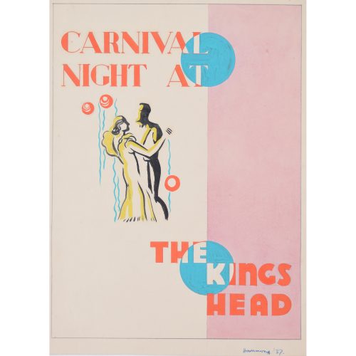
Hammond (British, fl. 1930s) Original design for poster and flyer for Carnival Night at the King's Head
26x19 cm Gouache, 1937 Sadly nothing is known of the life of the artist of this series of rather fine Art Deco designs we have listed. An elegant couple dance in this well composed design. Designed to be lithographed, the artist has restricted himself to four colours. If you are interested email info@manningfineart.co.uk or call us on 07929 749056. Condition: Generally very good. -
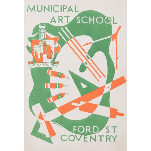
Hammond (British, fl. 1920s) Original artwork for brochure for Municipal Art School, Ford St, Coventry, England UK
21.5x14 cm Gouache, c. 1937 Sadly nothing is known of the life of the artist of thes series of rather fine Art Deco designs we have listed. If you are interested email info@manningfineart.co.uk or call us on 07929 749056. Condition: Generally very good. -
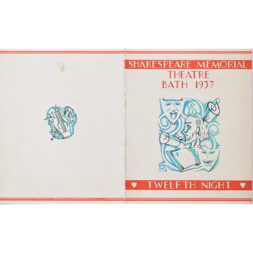
Hammond (British, fl. 1920s) Original artwork for Design for Shakespeare Twelfth Night programme to be held in Bath
26x21 cm Gouache, 1937 Sadly nothing is known of the life of the artist of thes series of rather fine Art Deco designs we have listed. If you are interested email info@manningfineart.co.uk or call us on 07929 749056. Condition: Generally good; small stain to reverse as illustrated in photograph; fold to centre as intended by artist. -
Brendan Neiland (b.1941) R.A. (Expelled)
Hampton Court (1984)
Screenprint 74 x 51 cm Signed, dated, titled, and numbered 152/250 in pencil. A print of one of Hampton Court's magnificent facades, reflected in its fountain. Reflected architecture is one of Neiland's most recurring themes. The Fountain Court was designed by Sir Christopher Wren; he began remodelled the palace in the baroque style for William III and Mary II in 1689. It held private and state apartments for both the King and Queen. Wren’s other works at Hampton Court Palace include the Lower Orangery and the grand colonnade in Clock Court, providing a grand entrance to the King's Apartments. The architectural historian Sir John Summerson described Fountain Court as 'Startling, as of simultaneous exposure to a great many eyes with raised eyebrows'. Brendan Neiland (born 23 October 1941 in Lichfield, Staffordshire) is an English artist best known for his paintings of reflections in modern city buildings. In 1992 he was elected to the Royal Academy (RA). Neiland is known for his interpretations of city life. His work is widely exhibited in major museums and galleries worldwide including, in Britain, the Victoria and Albert Museum, The Tate Gallery London, The Collections of the British Council and the Arts Council of Great Britain. He is represented by the Redfern Gallery and has had numerous shows internationally, including at the Galerie Belvedere in Singapore, who represent him in Singapore and the Far East. Condition: very good. If you’d like to know more, please email info@manningfineart.co.uk or call us on 07929 749056. -
Out of stock
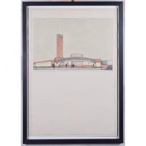
Brian Bannatyne Lewis (1906 - 1991)
Hanger Lane Station (1938)
Pen, ink and watercolour 70 x 50 cm Inscribed 'BB Lewis' lower right. A 1938 design for the new Hanger Lane tube station, commissioned by the Great Western Railway (GWR) for its proposed western extension to the Central Line. The design's Art Deco lettering befits London Transport's aesthetic in the 1930s. Lewis brings his designs to life by including smartly-dressed characters entering and leaving the stations. The Central line opened in 1900, between Shepherd's Bush and Bank; it extended westwards to Ealing Broadway in 1920. Two years after the formation of London Transport in 1933, an extensive New Works Programme began, proposing a westwards extension of the line to Denham. Brian Lewis created designs for nine stations in early 1938, but the Second World War broke out before they could be built. By the time the extension had been built, Lewis was no longer chief architect of the GWR - the stations were modified and completed by Frederick Francis Charles Curtis instead. The extension to Greenford opened in 1947 and finally reached West Ruislip in 1948. Denham never actually became part of the tube line, owing to the establishment of the green belt. Brian Lewis was born in Tasmania, attended school in Melbourne, and subsequently obtained a Diploma in Architecture in 1928 from the University of Melbourne. He then moved to the UK to study at the Liverpool School of Architecture, winning scholarships in each of his three years of study to fund extensive European travel. He married a fellow Liverpool architectural student, Hilary Archer. After moving to London, he took up employment with the GWR in their architects’ office; he also lectured at a local polytechnic, and moonlighted with his wife at home on mainly residential commissions – rather different projects from the hotels and stations which GWR commissioned from him. He exhibited frequently at the Royal Academy of Arts, showing superb measured drawings of historic buildings. In the Second World War he enlisted with the Second Imperial Australian Force, serving in the Middle East, then transferred to the Royal Australian Engineers where he became a Captain. In 1943 he was sent to London to help GWR repair bomb damage. Lewis became Chief Architect of GWR in 1945 (following the retirement of the noted Percy Emerson Culverhouse), and the first Chair of Architecture at Melbourne University in 1947. He also became the consulting architect for the major buildings of the Australian National University in Canberra, producing an imaginative site plan and designing University House, which was awarded the Sulman medal in 1954. He also designed the Risdon Prison Complex in 1960. He retired in 1971 to paint watercolours and write his memoirs. Condition: generally very good; a few handling marks and two holes from filing. Handsomely framed. If you are interested, please email info@manningfineart.co.uk or call us on 07929 749056. Click here to view the other station designs in the set. -
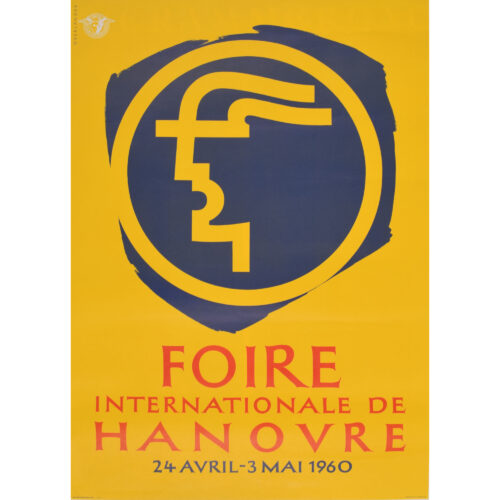
Foire Internationale de Hanover
Original vintage poster 84 x 59 cm This poster with its highly modern logo advertises the 1960 Hanover Fair. British military authorities organised the trade fair as a bolster to Germany's post-war economy. Over 1,000 exhibitors showed a selection of items made in Germany for overseas export. This version of the poster was designed for display in France. Condition: generally very good. Not backed. If you are interested, please email info@manningfineart.co.uk or call us on 07929 749056. Click here for more original vintage posters. -
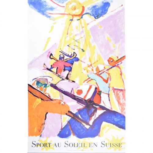
Hans Falk (1918-2002)
Sport au Soleil en Suisse
Original Vintage Poster (1957) Lithograph 40x25" Signed in the plate, and showing a procession of brightly-coloured skiers heading up the mountain towards the sun. Falk was a Swiss graphic designer who spent much of his life in the USA, UK and Ireland, producing many striking and popular posters. -
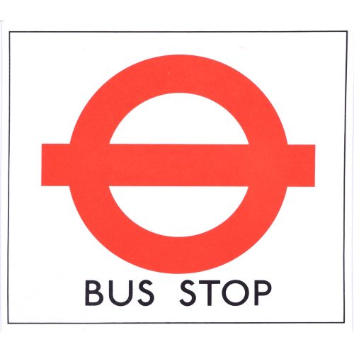
Hans Schleger 'Zero' (1898-1976) London Transport Bus Stop Poster
Screenprint poster c. 1970 16x17.8 cm Printed for London Transport These posters were designed to be used as temporary stops when the usual stop required amendment for instance owing to road works or similar events. Printed on paper they were designed to be posted up at the alternative site, possibly over a different sort of stop (bus stop, coach stop, request stop, etc.). Working with Edward Johnson's special typeface created for London Transport, Hans Schleger - or Zero as he signed himself - adopted the famous roundel used by London Underground for use at Bus Stops. Born in Germany, Schleger was an influential graphic designer. After serving during the First World War, he studied at the Berlin Kunstgewerbeschule, being taught by Emil Orlik. The same year Walter Gropius founded the Bauhaus at Weimar and Schleger learned the same principles of breaking down the barriers between architecture, design, fine art and craft. A firm believer in the Bauhaus principles of simplicity in design and reduction to essentials, these may be seen in the clean lines of the roundel. In 1924 he moved to New York, applying Modernism to American advertising, and then returned to Berlin in 1929 working for the British advertising agency Crawfords, where he met Edward McKnight Kauffer who introduced him to Jack Beddington the head of advertising at Shell Mex BP. Following the rise of Hitler he emigrated to London where he produced a series of posters for Shell Mex. During World War 2 he worked for the British Government. In 1950 he taught at the Chicago Institute of Design which had been founded by Moholy-Nagy, thus bringing him back to his Bauhaus origins. Subsequently he designed the trademarks of John Lewis Partnership, Penguin, Deutsche Bank and the Edinburgh Festival. If you are interested email info@manningfineart.co.uk or call us on 07929 749056. Condition: In unissued condition. Mounted. -
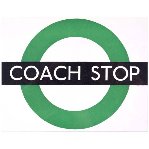
Hans Schleger 'Zero' (1898-1976) London Transport Coach Stop Poster
Screenprint poster c. 1970 16x20 cm Printed for London Transport These posters were designed to be used as temporary stops when the usual stop required amendment for instance owing to road works or similar events. Printed on paper they were designed to be posted up at the alternative site, possibly over a different sort of stop (bus stop, coach stop, request stop, etc.). Working with Edward Johnson's special typeface created for London Transport, Hans Schleger - or Zero as he signed himself - adopted the famous roundel used by London Underground for use at Bus Stops. Born in Germany, Schleger was an influential graphic designer. After serving during the First World War, he studied at the Berlin Kunstgewerbeschule, being taught by Emil Orlik. The same year Walter Gropius founded the Bauhaus at Weimar and Schleger learned the same principles of breaking down the barriers between architecture, design, fine art and craft. A firm believer in the Bauhaus principles of simplicity in design and reduction to essentials, these may be seen in the clean lines of the roundel. In 1924 he moved to New York, applying Modernism to American advertising, and then returned to Berlin in 1929 working for the British advertising agency Crawfords, where he met Edward McKnight Kauffer who introduced him to Jack Beddington the head of advertising at Shell Mex BP. Following the rise of Hitler he emigrated to London where he produced a series of posters for Shell Mex. During World War 2 he worked for the British Government. In 1950 he taught at the Chicago Institute of Design which had been founded by Moholy-Nagy, thus bringing him back to his Bauhaus origins. Subsequently he designed the trademarks of John Lewis Partnership, Penguin, Deutsche Bank and the Edinburgh Festival. If you are interested email info@manningfineart.co.uk or call us on 07929 749056. Condition: In unissued condition. Mounted. -

Hans Schleger 'Zero' (1898-1976) London Transport Coach Stop Request Poster
Screenprint poster c. 1970 16x18 cm Printed for London Transport These posters were designed to be used as temporary stops when the usual stop required amendment for instance owing to road works or similar events. Printed on paper they were designed to be posted up at the alternative site, possibly over a different sort of stop (bus stop, coach stop, request stop, etc.). Working with Edward Johnson's special typeface created for London Transport, Hans Schleger - or Zero as he signed himself - adopted the famous roundel used by London Underground for use at Bus Stops. Born in Germany, Schleger was an influential graphic designer. After serving during the First World War, he studied at the Berlin Kunstgewerbeschule, being taught by Emil Orlik. The same year Walter Gropius founded the Bauhaus at Weimar and Schleger learned the same principles of breaking down the barriers between architecture, design, fine art and craft. A firm believer in the Bauhaus principles of simplicity in design and reduction to essentials, these may be seen in the clean lines of the roundel. In 1924 he moved to New York, applying Modernism to American advertising, and then returned to Berlin in 1929 working for the British advertising agency Crawfords, where he met Edward McKnight Kauffer who introduced him to Jack Beddington the head of advertising at Shell Mex BP. Following the rise of Hitler he emigrated to London where he produced a series of posters for Shell Mex. During World War 2 he worked for the British Government. In 1950 he taught at the Chicago Institute of Design which had been founded by Moholy-Nagy, thus bringing him back to his Bauhaus origins. Subsequently he designed the trademarks of John Lewis Partnership, Penguin, Deutsche Bank and the Edinburgh Festival. If you are interested email info@manningfineart.co.uk or call us on 07929 749056. Condition: In unissued condition. Mounted. -
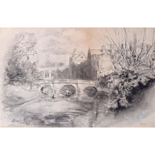
Hanslip Fletcher (1874-1955) St John's College, Cambridge
20x30cm Pen and Wash If you are interested email info@manningfineart.co.uk or call us on 07929 749056. Condition: Good. -
 Harry Charles Beck (1902-1974) London Underground Railways Pocket Map September 1933 Lithograph 14.5 x 20.5 cm An edition from the first year of publication of Beck's iconic map, precursor to all other similar maps globally. This reimagining of the tube map constituted a veritable departure from earlier maps, stripping the sprawling Tube network down to a neat diagram of coloured, criss-crossing lines. Harry Beck was a technical draughtsman who worked for the London Metro Signal Office. Following being fired, he created the first diagrammatic Tube map in 1931. Having submitted it to the Publicity Office at London Transport, it was rejected. However an updated proposal was accepted, being published in January 1933 in an edition of 700,000 pocket maps - most of which were consigned to the dustbin within hours, days or weeks. Those that survive are rare. Immediately popular it was adopted and similar maps have been used ever since by London Transport - and indeed many other rail systems worldwide. Beck was inspired whilst creating an electrical circuit diagram to apply the same concept to the Underground system, in the understanding that passengers on the network were more interested in how the lines related to each other, than in how they related to the topography of the city. Beck worked on the map in his spare time, and was - depending on the story you believe - either not paid for his work, or was paid a mere five or ten guineas. These days his work is acknowledged on all published London Transport maps.
 -
 Harry Charles Beck (1902-1974) London Underground Railways Pocket Map 1936 No. 1 Lithograph 14.5 x 20.5 cm An early edition of Beck's iconic map, precursor to all other similar maps of other transport systems worldwide. The 1936 edition is very similar to the 1933 first published. Beck was a technical draughtsman who worked for the London Metro Signal Office. Following being fired, he created the first diagrammatic Tube map in 1931. Having submitted it to the Publicity Office at London Transport, it was rejected. However an updated proposal was accepted, being published in January 1933 in an edition of 700,000 pocket maps - most of which were consigned to the dustbin within hours, days or weeks. Those that survive are rare. Immediately popular it was adopted and similar maps have been used ever since by London Transport - and indeed many other rail systems worldwide. Beck was inspired whilst creating an electrical circuit diagram to apply the same concept to the Underground system, in the understanding that passengers on the network were more interested in how the lines related to each other, than in how they related to the topography of the city. Beck worked on the map in his spare time, and was - depending on the story you believe - either not paid for his work, or was paid a mere five or ten guineas. These days his work is acknowledged on all published London Transport maps.
 -
 Harry Charles Beck (1902-1974) London Underground Railways Pocket Map 1936 No. 2 Lithograph 14.5 x 20.5 cm An early edition of Beck's iconic map, precursor to all other similar maps of other transport systems worldwide. The 1936 edition is very similar to the 1933 first published. Beck was a technical draughtsman who worked for the London Metro Signal Office. Following being fired, he created the first diagrammatic Tube map in 1931. Having submitted it to the Publicity Office at London Transport, it was rejected. However an updated proposal was accepted, being published in January 1933 in an edition of 700,000 pocket maps - most of which were consigned to the dustbin within hours, days or weeks. Those that survive are rare. Immediately popular it was adopted and similar maps have been used ever since by London Transport - and indeed many other rail systems worldwide. Beck was inspired whilst creating an electrical circuit diagram to apply the same concept to the Underground system, in the understanding that passengers on the network were more interested in how the lines related to each other, than in how they related to the topography of the city. Beck worked on the map in his spare time, and was - depending on the story you believe - either not paid for his work, or was paid a mere five or ten guineas. These days his work is acknowledged on all published London Transport maps.
 -
 Harry Charles Beck (1902-1974) London Underground Railways Pocket Map 1937 No. 1 Lithograph 14.5 x 20.5 cm An early edition of Beck's iconic map, precursor to all other similar maps of other transport systems worldwide. The 1937 edition is very similar to the 1933 first published, though is distinguishable from other editions of the period by its thinner lines and use of circles instead of diamonds for connecting stations. Beck was a technical draughtsman who worked for the London Metro Signal Office. Following being fired, he created the first diagrammatic Tube map in 1931. Having submitted it to the Publicity Office at London Transport, it was rejected. However an updated proposal was accepted, being published in January 1933 in an edition of 700,000 pocket maps - most of which were consigned to the dustbin within hours, days or weeks. Those that survive are rare. Immediately popular it was adopted and similar maps have been used ever since by London Transport - and indeed many other rail systems worldwide. Beck was inspired whilst creating an electrical circuit diagram to apply the same concept to the Underground system, in the understanding that passengers on the network were more interested in how the lines related to each other, than in how they related to the topography of the city. Beck worked on the map in his spare time, and was - depending on the story you believe - either not paid for his work, or was paid a mere five or ten guineas. These days his work is acknowledged on all published London Transport maps.
 -
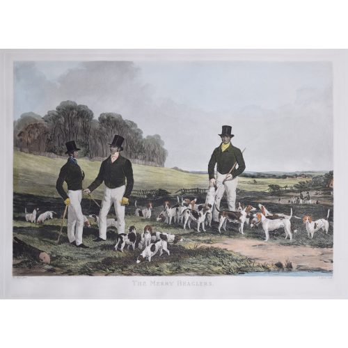
John Harris after Harry Hall The Merry Beaglers
Restrike print - c. mid twentieth century 48x65cm Aquatint with hand colouring The most famous beagling print there is, after the 1845 painting. If you are interested email info@manningfineart.co.uk or call us on 07929 749056. -
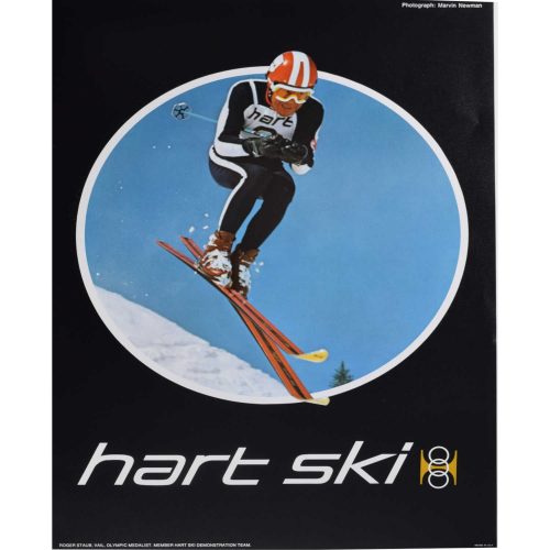
Hart Ski Colorado Original Vintage Poster (c.1970), Roger Staub USA
67 x 53 cm Made in U.S.A Photograph of Olympic Medalist, Roger Staub, photographed by Marvin Newman. Born in 1936, Staub won the gold medal in the Giant Slalom in the 1960 Winter Olympics in Squaw Valley; his first Olympics having been in 1956 where he finished fourth. Following a brief career as a professional racer he commenced a life as ski school director at Vail, Colorado, just after its opening. He died in 1974 in a ski gliding accident. Condition: Generally excellent, direct from the surplus stock of the printers, LooArt Press, which closed in the early 1970s. -

A. E. Halliwell (1905-1987) Hats
Airbrush and pen 50 x 32 cm c.1930 Stamped signature Provenance: Family of the artist A.E. Halliwell (1905–1986) was a British artist, illustrator, and designer best known for his vibrant poster designs created for British railway companies during the mid-20th century. Born in Southport, Halliwell developed a strong foundation in art and design early in life. He studied at the Southport School of Art from 1923 to 1926 before graduating to the Royal College of Art in London and subsequently practising as a professional designer from the 1930s. Following his studies, Halliwell married Doris Doyle in Strood Kent, and went on to have a significant teaching career himself, most notably as a lecturer at the Central School of Arts and Crafts (later part of Central Saint Martins), where he influenced a new generation of designers and illustrators. Halliwell is perhaps best remembered for his vibrant and engaging poster designs created for British railway companies during the 1930s. His work was characterised by a bright, graphic style that balanced charm with clarity, often depicting idealised scenes of British holiday destinations—from sunny seaside towns to tranquil countryside vistas. Beyond posters, his artistic output included book illustration, commercial design, and stage costume sketches, showcasing his versatility across mediums. His posters continue to remain enduring symbols of a golden age of British travel and design and are displayed in major collections including the London Transport Museum. This elegant poster design by A. E. Halliwell features two women, adorned in stylish and extravagant hats. To the left of the work, a woman dons a tight-fitting cloche, to her right, another woman models a gainsborough chapeau, its enormous rim providing ample shade for them both. By using simple forms and playing with the contrasts between the dark airbrushed hats and pale delicate faces, Halliwell creates a striking work, capturing the class of 1930s Art Deco glamour. Condition: Generally very good, very faint area of staining to left margin, pin holes to corners.If you would like to know more, please email info@manningfineart.co.uk or call us on 07929 749056.
-
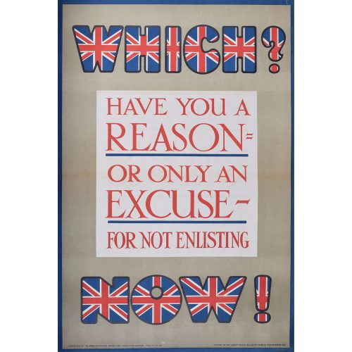
Parliamentary Recruiting Committee Which? Have you a Reason for not Enlisting - Or only an Excuse for not Enlisting. Now!
Original lithographic poster c. 1914 75 x 50cm Published by the Parliamentary Recruiting Committee, London Printed by the Abbey Press 32 & 34 Great Peter St Westminster SW Before conscription was introduced at the beginning of 1916, recruitment into the British Army was all by way of volunteering. Lord Kitchener, Secretary of State for War, wanted to recruit almost 100,000 men per month and by the end of 1915 the supply of volunteers - despite excellent posters such as this one - was drying up. -
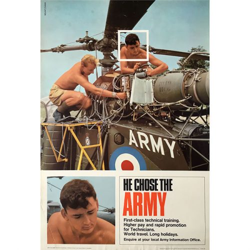
Anonymous
He Chose the Army
Printed for Her Majesty’s Stationary Office by the British Colour Printing Co. Ltd. c. 1960. Photolithograph 76x51cm If you are interested email info@manningfineart.co.uk or call us on 07929 749056. -

Penelope Ellis (1935-2016) Heading out to Pasture
Woodblock print 11 x 16 cm Provenance: From the artist's estate sale. Penelope Mary Ellis (1935–2016) was a British artist celebrated for her conceptual abstract works in the 1960s. Born in Hampstead, London, she was the eldest daughter of artists and educators Clifford and Rosemary Ellis. Ellis attended the High School in Bath before enrolling at the Slade School of Fine Art from 1953 to 1956, focusing on sculpture. She was awarded a British Institute in Paris Scholarship for the 1956–1957 academic year, allowing her to further her art studies in France. Upon returning to England, Ellis taught art at Badminton School until her retirement in 1997. Ellis was known for her pioneering conceptual abstract oil paintings in the 1960s, noted for being ahead of their time. Additionally, she created sculptures, ceramics, jewellery, and models, showcasing her versatility and commitment to professional craftsmanship. This woodblock print depicts a cow heading out to pasture. Its lines and shapes are somewhat irregular, suggesting either a deliberate folk-art influence or the natural texture of the woodblock carving process. Furthermore, Ellis makes use of the technique of 'negative space', creating contrasts, for example, between the cow's white spots, its dark patches, the grass and the buildings depicted in the background. This composition was likely produced in Ellis's early artistic career, before she shifted to more abstract conceptual work. In any case, it is a beautiful and evocative piece, capturing a rustic, almost timeless moment with striking simplicity. Condition: Generally very good.If you would like to know more, please email info@manningfineart.co.uk or call us on 07929 749056.
-

A. E. Halliwell (1905-1987) Hendon Air Display 'Loop the Loop' Gouache
26 x 32 cm 1928 Inscribed 'rough' to the lower right and stamped to reverse A.E. Halliwell Provenance: Family of the artist A.E. Halliwell (1905–1986) was a British artist, illustrator, and designer best known for his vibrant poster designs created for British railway companies during the mid-20th century. Born in Southport, Halliwell developed a strong foundation in art and design early in life. He studied at the Southport School of Art from 1923 to 1926 before graduating to the Royal College of Art in London and subsequently practising as a professional designer from the 1930s. Following his studies, Halliwell married Doris Doyle in Strood Kent, and went on to have a significant teaching career himself, most notably as a lecturer at the Central School of Arts and Crafts (later part of Central Saint Martins), where he influenced a new generation of designers and illustrators. Halliwell is perhaps best remembered for his vibrant and engaging poster designs created for British railway companies during the 1930s. His work was characterised by a bright, graphic style that balanced charm with clarity, often depicting idealised scenes of British holiday destinations—from sunny seaside towns to tranquil countryside vistas. Beyond posters, his artistic output included book illustration, commercial design, and stage costume sketches, showcasing his versatility across mediums. His posters continue to remain enduring symbols of a golden age of British travel and design and are displayed in major collections including the London Transport Museum and the V & A. With bold curves and crisp, minimalist style, this artwork captures the daring loop-the-loop of an aircraft against a sunlit sky. Both functional and artistic, the poster exemplifies the era’s art deco fusion of design and public service messaging. Condition: Generally very good.If you would like to know more, please email info@manningfineart.co.uk or call us on 07929 749056.
-
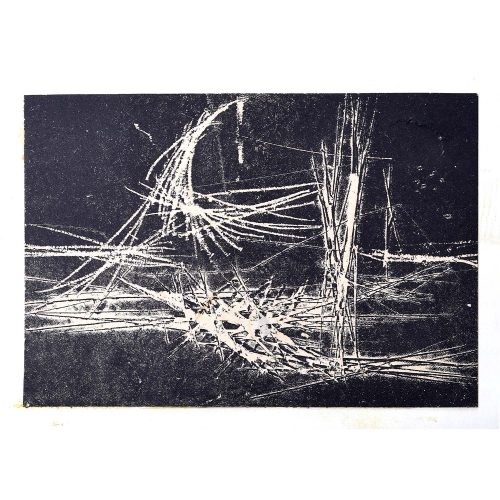
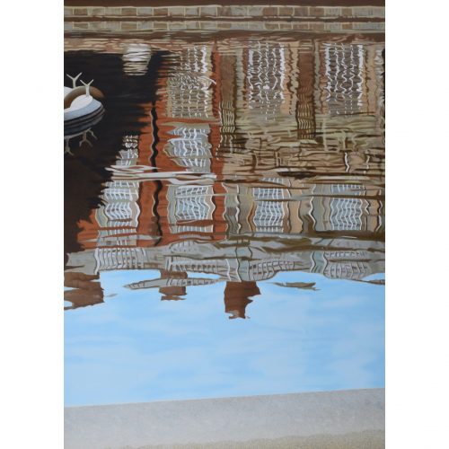
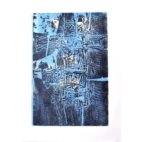
Henry Cliffe (1919-1983) Abstract Harbour
Etching Mid 20th Century 13x19cm Click here for biographical details and other pictures by the artist. If you are interested email info@manningfineart.co.uk or call us on 07929 749056. Condition: Good. -
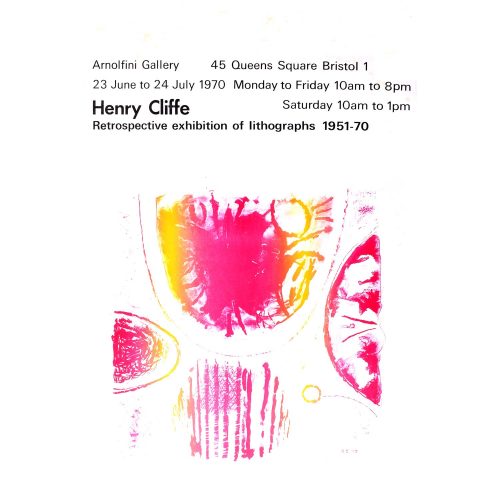
Henry Cliffe (1919-1983) Arnolfini Gallery Exhibition of Lithographs
Etching Mid 20th Century 76x50cm Click here for biographical details and other pictures by the artist. If you are interested email info@manningfineart.co.uk or call us on 07929 749056. Condition: Good, some faint spots at top. -
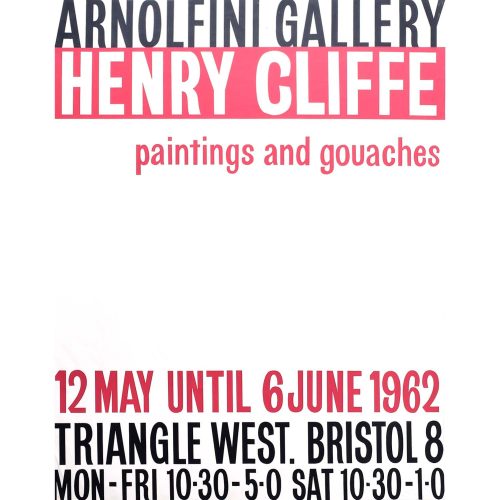
Henry Cliffe (1919-1983) Arnolfini Gallery Poster
Etching Mid 20th Century 63.5x51cm Click here for biographical details and other pictures by the artist. If you are interested email info@manningfineart.co.uk or call us on 07929 749056. Condition: Good, some faint spots at top. -
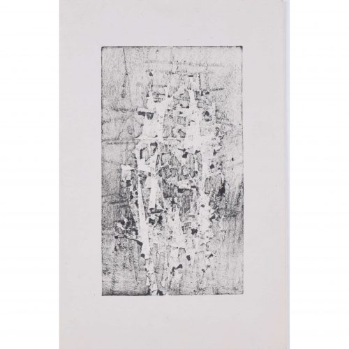
Henry Cliffe (1919-1983) Blue Figures
Etching Mid 20th Century 9.5x16.5cm Click here for biographical details and other pictures by the artist. If you are interested email info@manningfineart.co.uk or call us on 07929 749056. Condition: Good. -
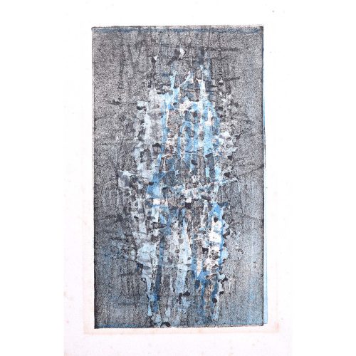
Henry Cliffe (1919-1983) Blue Standing Figure
Etching Mid 20th Century 46x30cm Click here for biographical details and other pictures by the artist. If you are interested email info@manningfineart.co.uk or call us on 07929 749056. Condition: Good. -
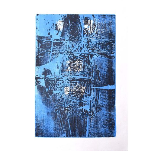
Henry Cliffe (1919-1983) Blue Standing Figure II
Etching Mid 20th Century 45.5x30cm Click here for biographical details and other pictures by the artist. If you are interested email info@manningfineart.co.uk or call us on 07929 749056. Condition: Good. -
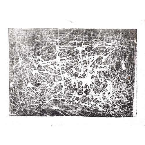
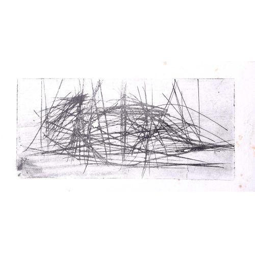
Henry Cliffe (1919-1983) Constellations I
Etching Mid 20th Century 9x16.5cm Click here for biographical details and other pictures by the artist. If you are interested email info@manningfineart.co.uk or call us on 07929 749056. Condition: Good. -
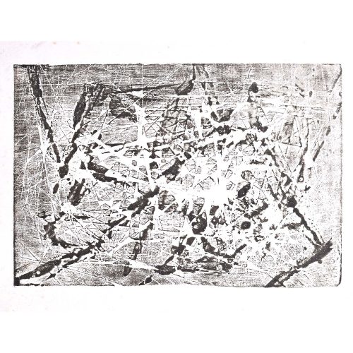
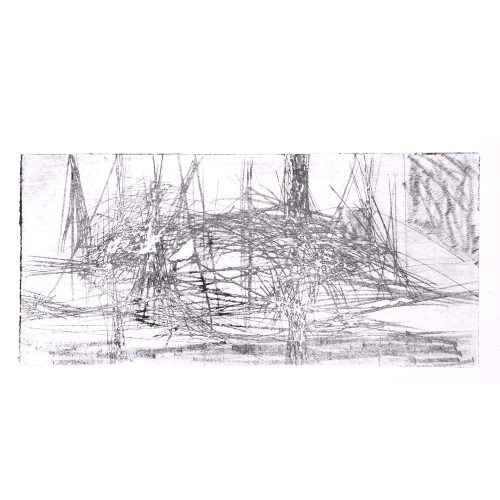
Henry Cliffe (1919-1983) Constellations II
Etching Mid 20th Century 16x24cm Click here for biographical details and other pictures by the artist. If you are interested email info@manningfineart.co.uk or call us on 07929 749056. Condition: Good. -
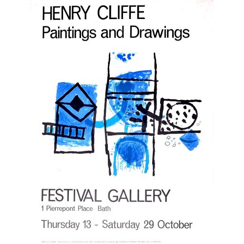
Henry Cliffe (1919-1983) Festival Gallery Poster
Etching Mid 20th Century 51x38cm Click here for biographical details and other pictures by the artist. If you are interested email info@manningfineart.co.uk or call us on 07929 749056. Condition: Good, some faint spotting round margins. -
Henry Cliffe (1919-1983) Monochrome Figures
Etching 9.5 x 16.5 cm Condition: Good. If you are interested, please email info@manningfineart.co.uk or call us on 07929 749056. -
Henry Cliffe (1919-1983) Reclining Figure I
Etching Mid 20th Century 11x24cm Click here for biographical details and other pictures by the artist. If you are interested email info@manningfineart.co.uk or call us on 07929 749056. Condition: Good. -
Henry Cliffe (1919-1983) Reclining Figure II
Etching Mid 20th Century 11x24cm Click here for biographical details and other pictures by the artist. If you are interested email info@manningfineart.co.uk or call us on 07929 749056. Condition: Good.