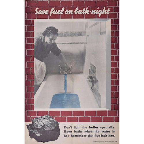
-
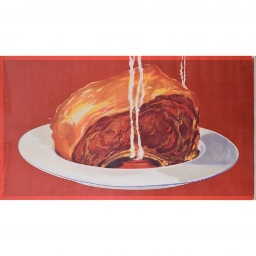
Rib of Beef
Original vintage poster 56 x 97 cm An original poster produced by Bisto to to advertise their gravy granules. With no lettering, the deep red poster is a bold and compelling advert which relies on the public's understanding that Bisto is the only choice. Condition: backed to linen, very good; a few repaired tears to right side. If you are interested, please email info@manningfineart.co.uk or call us on 07929 749056. Click here for other original vintage posters. -
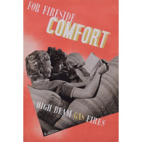
Brownbridge (flourished 1930s - 1940s)
For Fireside Comfort, High Beam Gas Fires brochure design
Gouache, mixed media art, and collage 21.5 x 14 cm From a small archive of works by Brownbridge, a member of the Society of Industrial Artists. A design for a brochure advertising Radiation's high beam gas fires. Brownbridge's design combines a photograph of a mother and child with hand-painted text; the red and yellow colour palette project warmth and cosiness. The mother's hair is fantastically 1930s, and she reads a copy of 'Patsy Ann: Her Happy Times' by Mona Reed King (first published in 1935) to her son. Society of Industrial Artists correspondance (photographed above) is not included; please enquire separately. Condition: generally very good; lacking 'The Serene' collaged photograph. If you are interested, please email info@manningfineart.co.uk or call us on 07929 749056. Click here for other designs by Brownbridge. -
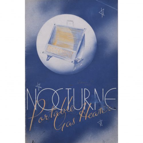
Brownbridge (flourished 1930s - 1940s)
Nocturne Portable Gas Heater brochure design
Gouache and mixed media art 21.5 x 14 cm From a small archive of works by Brownbridge, a member of the Society of Industrial Artists. A marvellous gouache design for a brochure advertising the Nocturne portable gas heater. The art deco text surrounded by stars and image of the innovative gas heater superimposed on the moon combine to make this a thoroughly modern piece of 1930s design. Society of Industrial Artists correspondance (photographed above) is not included; please enquire separately. Condition: generally very good; some damage to reverse. If you are interested, please email info@manningfineart.co.uk or call us on 07929 749056. Click here for other designs by Brownbridge. -
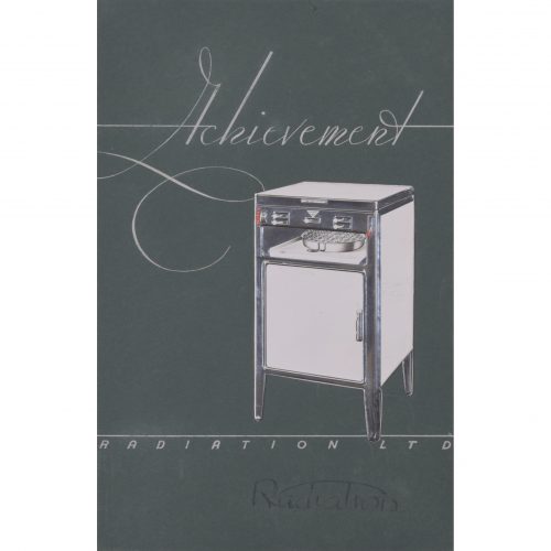
Brownbridge (flourished 1930s - 1940s)
Achievement Radiation gas cookers brochure design
Pen and collage 21.5 x 14 cm From a small archive of works by Brownbridge, a member of the Society of Industrial Artists. Brownbridge's bold design advertises Radiation cookers (innovative gas cookers which were sold in Britain in the 1920s and 1930s). Shiny white against a dark background, the Radiation cooker seems impossibly glamorous and inviting. Society of Industrial Artists correspondance (photographed above) is not included; please enquire separately. Condition: generally very good. If you are interested, please email info@manningfineart.co.uk or call us on 07929 749056. Click here for other designs by Brownbridge. -
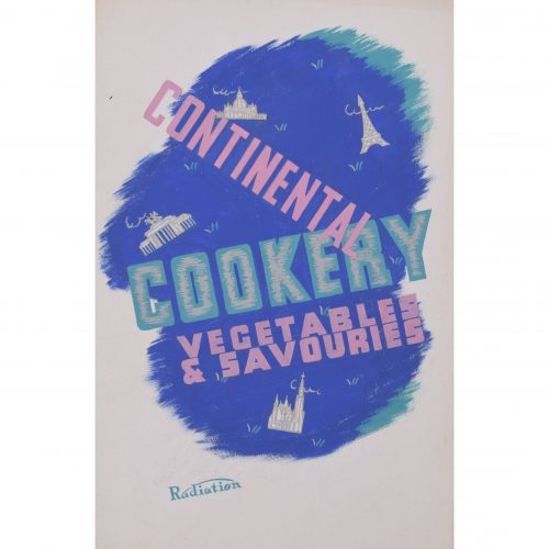
Brownbridge (flourished 1930s - 1940s)
Continental Cookery Radiation cooker brochure design
Gouache 21.5 x 14 cm From a small archive of works by Brownbridge, a member of the Society of Industrial Artists. A beautiful original gouache design for a brochure of continental recipes, created to advertise Radiation cookers (innovative gas cookers which were sold in Britain in the 1920s and 1930s). Brownbridge's brightly-coloured design includes boldly slanted text in pink and turquoise, set over a deep blue background; he also highlights architectural gems of Europe, such as the Eiffel Tower. By cooking with a Radiation cooker, the cover suggests, you too can experience the cultural and culinary delights of Europe from the comfort of your own home. Society of Industrial Artists correspondance (photographed above) is not included; please enquire separately. Condition: generally very good. If you are interested, please email info@manningfineart.co.uk or call us on 07929 749056. Click here for other designs by Brownbridge. -
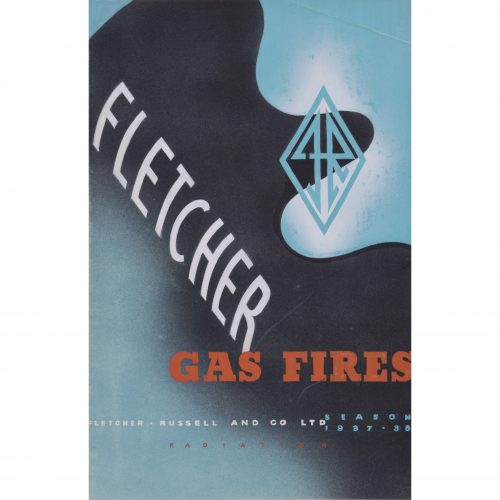
Brownbridge (flourished 1930s - 1940s)
Fletcher Gas Fires brochure design (1937)
Lithographic brochure 21.5 x 14 cm From a small archive of works by Brownbridge, a member of the Society of Industrial Artists. An original gouache design for a brochure advertising Fletcher Russell and Co. gas fires. The futuristic style of the boldly blue-, black-, and orange-coloured poster, as well as the dynamic diamond-shaped badge containing the initials F and R (for Fletcher and Russell) combine to make this a highly modern piece of 1930s design. Society of Industrial Artists correspondance (photographed above) is not included; please enquire separately. Condition: generally very good; gentle crease to top right corner. If you are interested, please email info@manningfineart.co.uk or call us on 07929 749056. Click here for other designs by Brownbridge. -
Out of stock
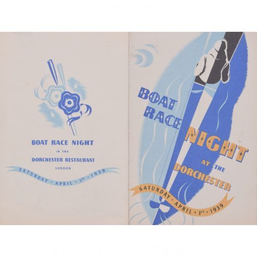
Brownbridge (flourished 1930s - 1940s)
Boat Race at the Dorchester (1939)
Lithographic brochure 15 x 19.5 cm From a small archive of works by Brownbridge, a member of the Society of Industrial Artists. A design for a poster advertising the Dorchester's dinner after the Oxford and Cambridge Boat Race. The artist has built his design around dark and light blues, to represent the colours of Oxford and Cambridge respectively. Brownbridge's design is marvellously 1930s, from the boldly decorative typeface to the whimsically glamorous guests and their waiters floating below the invitation. Boat Race dinners in London are rather different today; at any rate, prices are not normally advertised as 'excluding Wines and Cigars'. Society of Industrial Artists correspondance (photographed above) is not included; please enquire separately. Condition: generally very good. If you are interested, please email info@manningfineart.co.uk or call us on 07929 749056. Click here for other designs by Brownbridge. -
Out of stock
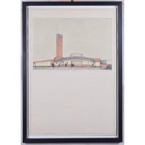
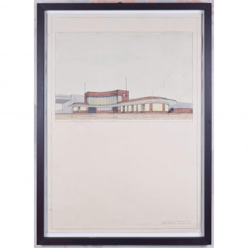
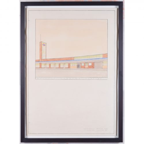
Brian Bannatyne Lewis (1906 - 1991)
Hanger Lane Station (1938)
Pen, ink and watercolour 70 x 50 cm Inscribed 'BB Lewis' lower right. A 1938 design for the new Hanger Lane tube station, commissioned by the Great Western Railway (GWR) for its proposed western extension to the Central Line. The design's Art Deco lettering befits London Transport's aesthetic in the 1930s. Lewis brings his designs to life by including smartly-dressed characters entering and leaving the stations. The Central line opened in 1900, between Shepherd's Bush and Bank; it extended westwards to Ealing Broadway in 1920. Two years after the formation of London Transport in 1933, an extensive New Works Programme began, proposing a westwards extension of the line to Denham. Brian Lewis created designs for nine stations in early 1938, but the Second World War broke out before they could be built. By the time the extension had been built, Lewis was no longer chief architect of the GWR - the stations were modified and completed by Frederick Francis Charles Curtis instead. The extension to Greenford opened in 1947 and finally reached West Ruislip in 1948. Denham never actually became part of the tube line, owing to the establishment of the green belt. Brian Lewis was born in Tasmania, attended school in Melbourne, and subsequently obtained a Diploma in Architecture in 1928 from the University of Melbourne. He then moved to the UK to study at the Liverpool School of Architecture, winning scholarships in each of his three years of study to fund extensive European travel. He married a fellow Liverpool architectural student, Hilary Archer. After moving to London, he took up employment with the GWR in their architects’ office; he also lectured at a local polytechnic, and moonlighted with his wife at home on mainly residential commissions – rather different projects from the hotels and stations which GWR commissioned from him. He exhibited frequently at the Royal Academy of Arts, showing superb measured drawings of historic buildings. In the Second World War he enlisted with the Second Imperial Australian Force, serving in the Middle East, then transferred to the Royal Australian Engineers where he became a Captain. In 1943 he was sent to London to help GWR repair bomb damage. Lewis became Chief Architect of GWR in 1945 (following the retirement of the noted Percy Emerson Culverhouse), and the first Chair of Architecture at Melbourne University in 1947. He also became the consulting architect for the major buildings of the Australian National University in Canberra, producing an imaginative site plan and designing University House, which was awarded the Sulman medal in 1954. He also designed the Risdon Prison Complex in 1960. He retired in 1971 to paint watercolours and write his memoirs. Condition: generally very good; a few handling marks and two holes from filing. Handsomely framed. If you are interested, please email info@manningfineart.co.uk or call us on 07929 749056. Click here to view the other station designs in the set. -
Out of stock
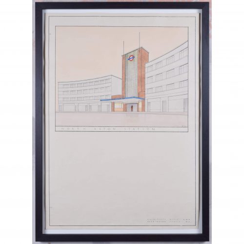
Brian Bannatyne Lewis (1906 - 1991)
North Acton Station (1938)
Pen, ink and watercolour 70 x 50 cm Initialled and dated 26 2 38. A 1938 design for the new North Acton tube station, commissioned by the Great Western Railway (GWR) for its proposed western extension to the Central Line. The design's Art Deco lettering befits London Transport's aesthetic in the 1930s. Lewis brings his designs to life by including smartly-dressed characters entering and leaving the stations. The Central line opened in 1900, between Shepherd's Bush and Bank; it extended westwards to Ealing Broadway in 1920. Two years after the formation of London Transport in 1933, an extensive New Works Programme began, proposing a westwards extension of the line to Denham. Brian Lewis created designs for nine stations in early 1938, but the Second World War broke out before they could be built. By the time the extension had been built, Lewis was no longer chief architect of the GWR - the stations were modified and completed by Frederick Francis Charles Curtis instead. The extension to Greenford opened in 1947 and finally reached West Ruislip in 1948. Denham never actually became part of the tube line, owing to the establishment of the green belt. Brian Lewis was born in Tasmania, attended school in Melbourne, and subsequently obtained a Diploma in Architecture in 1928 from the University of Melbourne. He then moved to the UK to study at the Liverpool School of Architecture, winning scholarships in each of his three years of study to fund extensive European travel. He married a fellow Liverpool architectural student, Hilary Archer. After moving to London, he took up employment with the GWR in their architects’ office; he also lectured at a local polytechnic, and moonlighted with his wife at home on mainly residential commissions – rather different projects from the hotels and stations which GWR commissioned from him. He exhibited frequently at the Royal Academy of Arts, showing superb measured drawings of historic buildings. In the Second World War he enlisted with the Second Imperial Australian Force, serving in the Middle East, then transferred to the Royal Australian Engineers where he became a Captain. In 1943 he was sent to London to help GWR repair bomb damage. Lewis became Chief Architect of GWR in 1945 (following the retirement of the noted Percy Emerson Culverhouse), and the first Chair of Architecture at Melbourne University in 1947. He also became the consulting architect for the major buildings of the Australian National University in Canberra, producing an imaginative site plan and designing University House, which was awarded the Sulman medal in 1954. He also designed the Risdon Prison Complex in 1960. He retired in 1971 to paint watercolours and write his memoirs. Condition: generally very good; a few handling marks and two holes from filing. Handsomely framed. If you are interested, please email info@manningfineart.co.uk or call us on 07929 749056. Click here to view the other station designs in the set. -
Out of stock
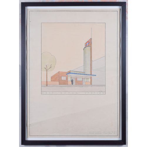
Brian Bannatyne Lewis (1906 - 1991)
East Acton Station (1938)
Pen, ink and watercolour 70 x 50 cm Initialled and dated 28 2 38. A 1938 design for the new East Acton tube station, commissioned by the Great Western Railway (GWR) for its proposed western extension to the Central Line. The design's Art Deco lettering befits London Transport's aesthetic in the 1930s. Lewis brings his designs to life by including smartly-dressed characters entering and leaving the stations. The Central line opened in 1900, between Shepherd's Bush and Bank; it extended westwards to Ealing Broadway in 1920. Two years after the formation of London Transport in 1933, an extensive New Works Programme began, proposing a westwards extension of the line to Denham. Brian Lewis created designs for nine stations in early 1938, but the Second World War broke out before they could be built. By the time the extension had been built, Lewis was no longer chief architect of the GWR - the stations were modified and completed by Frederick Francis Charles Curtis instead. The extension to Greenford opened in 1947 and finally reached West Ruislip in 1948. Denham never actually became part of the tube line, owing to the establishment of the green belt. Brian Lewis was born in Tasmania, attended school in Melbourne, and subsequently obtained a Diploma in Architecture in 1928 from the University of Melbourne. He then moved to the UK to study at the Liverpool School of Architecture, winning scholarships in each of his three years of study to fund extensive European travel. He married a fellow Liverpool architectural student, Hilary Archer. After moving to London, he took up employment with the GWR in their architects’ office; he also lectured at a local polytechnic, and moonlighted with his wife at home on mainly residential commissions – rather different projects from the hotels and stations which GWR commissioned from him. He exhibited frequently at the Royal Academy of Arts, showing superb measured drawings of historic buildings. In the Second World War he enlisted with the Second Imperial Australian Force, serving in the Middle East, then transferred to the Royal Australian Engineers where he became a Captain. In 1943 he was sent to London to help GWR repair bomb damage. Lewis became Chief Architect of GWR in 1945 (following the retirement of the noted Percy Emerson Culverhouse), and the first Chair of Architecture at Melbourne University in 1947. He also became the consulting architect for the major buildings of the Australian National University in Canberra, producing an imaginative site plan and designing University House, which was awarded the Sulman medal in 1954. He also designed the Risdon Prison Complex in 1960. He retired in 1971 to paint watercolours and write his memoirs. Condition: generally very good; a few handling marks and two holes from filing. Handsomely framed. If you are interested, please email info@manningfineart.co.uk or call us on 07929 749056. Click here to view the other station designs in the set. -
Out of stock
Brian Bannatyne Lewis (1906 - 1991)
South Ruislip Station (1938)
Pen, ink and watercolour 70 x 50 cm Initialled and dated 8 3 38. A 1938 design for the new South Ruislip tube station, commissioned by the Great Western Railway (GWR) for its proposed western extension to the Central Line. The design's Art Deco lettering befits London Transport's aesthetic in the 1930s. Lewis brings his designs to life by including smartly-dressed characters entering and leaving the stations. The Central line opened in 1900, between Shepherd's Bush and Bank; it extended westwards to Ealing Broadway in 1920. Two years after the formation of London Transport in 1933, an extensive New Works Programme began, proposing a westwards extension of the line to Denham. Brian Lewis created designs for nine stations in early 1938, but the Second World War broke out before they could be built. By the time the extension had been built, Lewis was no longer chief architect of the GWR - the stations were modified and completed by Frederick Francis Charles Curtis instead. The extension to Greenford opened in 1947 and finally reached West Ruislip in 1948. Denham never actually became part of the tube line, owing to the establishment of the green belt. Brian Lewis was born in Tasmania, attended school in Melbourne, and subsequently obtained a Diploma in Architecture in 1928 from the University of Melbourne. He then moved to the UK to study at the Liverpool School of Architecture, winning scholarships in each of his three years of study to fund extensive European travel. He married a fellow Liverpool architectural student, Hilary Archer. After moving to London, he took up employment with the GWR in their architects’ office; he also lectured at a local polytechnic, and moonlighted with his wife at home on mainly residential commissions – rather different projects from the hotels and stations which GWR commissioned from him. He exhibited frequently at the Royal Academy of Arts, showing superb measured drawings of historic buildings. In the Second World War he enlisted with the Second Imperial Australian Force, serving in the Middle East, then transferred to the Royal Australian Engineers where he became a Captain. In 1943 he was sent to London to help GWR repair bomb damage. Lewis became Chief Architect of GWR in 1945 (following the retirement of the noted Percy Emerson Culverhouse), and the first Chair of Architecture at Melbourne University in 1947. He also became the consulting architect for the major buildings of the Australian National University in Canberra, producing an imaginative site plan and designing University House, which was awarded the Sulman medal in 1954. He also designed the Risdon Prison Complex in 1960. He retired in 1971 to paint watercolours and write his memoirs. Condition: generally very good; a few handling marks and two holes from filing. Handsomely framed. If you are interested, please email info@manningfineart.co.uk or call us on 07929 749056. Click here to view the other station designs in the set. -
Out of stock
Brian Bannatyne Lewis (1906 - 1991)
Perivale Station (1938)
Pen, ink and watercolour 70 x 50 cm A 1938 design for the new Perivale tube station, commissioned by the Great Western Railway (GWR) for its proposed western extension to the Central Line. The design's Art Deco lettering befits London Transport's aesthetic in the 1930s. Lewis brings his designs to life by including smartly-dressed characters entering and leaving the stations. The Central line opened in 1900, between Shepherd's Bush and Bank; it extended westwards to Ealing Broadway in 1920. Two years after the formation of London Transport in 1933, an extensive New Works Programme began, proposing a westwards extension of the line to Denham. Brian Lewis created designs for nine stations in early 1938, but the Second World War broke out before they could be built. By the time the extension had been built, Lewis was no longer chief architect of the GWR - the stations were modified and completed by Frederick Francis Charles Curtis instead. The extension to Greenford opened in 1947 and finally reached West Ruislip in 1948. Denham never actually became part of the tube line, owing to the establishment of the green belt. Brian Lewis was born in Tasmania, attended school in Melbourne, and subsequently obtained a Diploma in Architecture in 1928 from the University of Melbourne. He then moved to the UK to study at the Liverpool School of Architecture, winning scholarships in each of his three years of study to fund extensive European travel. He married a fellow Liverpool architectural student, Hilary Archer. After moving to London, he took up employment with the GWR in their architects’ office; he also lectured at a local polytechnic, and moonlighted with his wife at home on mainly residential commissions – rather different projects from the hotels and stations which GWR commissioned from him. He exhibited frequently at the Royal Academy of Arts, showing superb measured drawings of historic buildings. In the Second World War he enlisted with the Second Imperial Australian Force, serving in the Middle East, then transferred to the Royal Australian Engineers where he became a Captain. In 1943 he was sent to London to help GWR repair bomb damage. Lewis became Chief Architect of GWR in 1945 (following the retirement of the noted Percy Emerson Culverhouse), and the first Chair of Architecture at Melbourne University in 1947. He also became the consulting architect for the major buildings of the Australian National University in Canberra, producing an imaginative site plan and designing University House, which was awarded the Sulman medal in 1954. He also designed the Risdon Prison Complex in 1960. He retired in 1971 to paint watercolours and write his memoirs. Condition: generally very good; a few handling marks and two holes from filing. Handsomely framed. If you are interested, please email info@manningfineart.co.uk or call us on 07929 749056. Click here to view the other station designs in the set. -
Out of stock
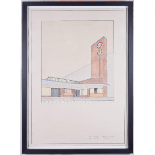
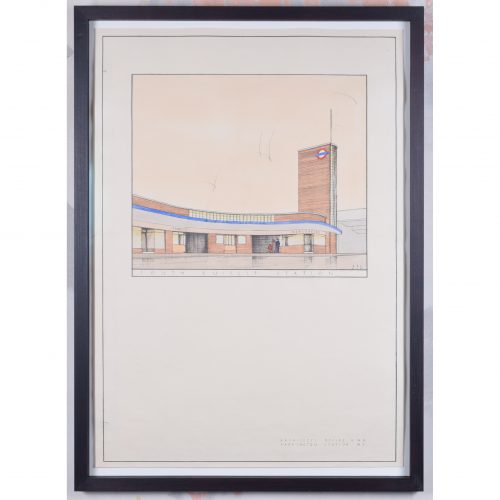
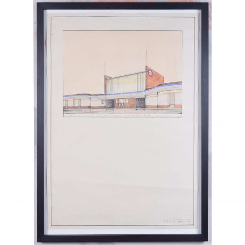
Brian Bannatyne Lewis (1906 - 1991)
Greenford Station (1938)
Pen, ink and watercolour 70 x 50 cm Initialled and dated 7 3 38. A 1938 design for the new Greenford tube station, commissioned by the Great Western Railway (GWR) for its proposed western extension to the Central Line. The design's Art Deco lettering befits London Transport's aesthetic in the 1930s. Lewis brings his designs to life by including smartly-dressed characters entering and leaving the stations. The Central line opened in 1900, between Shepherd's Bush and Bank; it extended westwards to Ealing Broadway in 1920. Two years after the formation of London Transport in 1933, an extensive New Works Programme began, proposing a westwards extension of the line to Denham. Brian Lewis created designs for nine stations in early 1938, but the Second World War broke out before they could be built. By the time the extension had been built, Lewis was no longer chief architect of the GWR - the stations were modified and completed by Frederick Francis Charles Curtis instead. The extension to Greenford opened in 1947 and finally reached West Ruislip in 1948. Denham never actually became part of the tube line, owing to the establishment of the green belt. Brian Lewis was born in Tasmania, attended school in Melbourne, and subsequently obtained a Diploma in Architecture in 1928 from the University of Melbourne. He then moved to the UK to study at the Liverpool School of Architecture, winning scholarships in each of his three years of study to fund extensive European travel. He married a fellow Liverpool architectural student, Hilary Archer. After moving to London, he took up employment with the GWR in their architects’ office; he also lectured at a local polytechnic, and moonlighted with his wife at home on mainly residential commissions – rather different projects from the hotels and stations which GWR commissioned from him. He exhibited frequently at the Royal Academy of Arts, showing superb measured drawings of historic buildings. In the Second World War he enlisted with the Second Imperial Australian Force, serving in the Middle East, then transferred to the Royal Australian Engineers where he became a Captain. In 1943 he was sent to London to help GWR repair bomb damage. Lewis became Chief Architect of GWR in 1945 (following the retirement of the noted Percy Emerson Culverhouse), and the first Chair of Architecture at Melbourne University in 1947. He also became the consulting architect for the major buildings of the Australian National University in Canberra, producing an imaginative site plan and designing University House, which was awarded the Sulman medal in 1954. He also designed the Risdon Prison Complex in 1960. He retired in 1971 to paint watercolours and write his memoirs. Condition: generally very good; a few handling marks and two holes from filing. Handsomely framed. If you are interested, please email info@manningfineart.co.uk or call us on 07929 749056. Click here to view the other station designs in the set. -
Out of stock
Brian Bannatyne Lewis (1906 - 1991)
West Ruislip Station (1938)
Pen, ink and watercolour 70 x 50 cm A 1938 design for the new West Ruislip tube station, commissioned by the Great Western Railway (GWR) for its proposed western extension to the Central Line. The design's Art Deco lettering befits London Transport's aesthetic in the 1930s. Lewis brings his designs to life by including smartly-dressed characters entering and leaving the stations. The Central line opened in 1900, between Shepherd's Bush and Bank; it extended westwards to Ealing Broadway in 1920. Two years after the formation of London Transport in 1933, an extensive New Works Programme began, proposing a westwards extension of the line to Denham. Brian Lewis created designs for nine stations in early 1938, but the Second World War broke out before they could be built. By the time the extension had been built, Lewis was no longer chief architect of the GWR - the stations were modified and completed by Frederick Francis Charles Curtis instead. The extension to Greenford opened in 1947 and finally reached West Ruislip in 1948. Denham never actually became part of the tube line, owing to the establishment of the green belt. Brian Lewis was born in Tasmania, attended school in Melbourne, and subsequently obtained a Diploma in Architecture in 1928 from the University of Melbourne. He then moved to the UK to study at the Liverpool School of Architecture, winning scholarships in each of his three years of study to fund extensive European travel. He married a fellow Liverpool architectural student, Hilary Archer. After moving to London, he took up employment with the GWR in their architects’ office; he also lectured at a local polytechnic, and moonlighted with his wife at home on mainly residential commissions – rather different projects from the hotels and stations which GWR commissioned from him. He exhibited frequently at the Royal Academy of Arts, showing superb measured drawings of historic buildings. In the Second World War he enlisted with the Second Imperial Australian Force, serving in the Middle East, then transferred to the Royal Australian Engineers where he became a Captain. In 1943 he was sent to London to help GWR repair bomb damage. Lewis became Chief Architect of GWR in 1945 (following the retirement of the noted Percy Emerson Culverhouse), and the first Chair of Architecture at Melbourne University in 1947. He also became the consulting architect for the major buildings of the Australian National University in Canberra, producing an imaginative site plan and designing University House, which was awarded the Sulman medal in 1954. He also designed the Risdon Prison Complex in 1960. He retired in 1971 to paint watercolours and write his memoirs. Condition: generally very good; a few handling marks and two holes from filing. Handsomely framed. If you are interested, please email info@manningfineart.co.uk or call us on 07929 749056. Click here to view the other station designs in the set. -
Out of stock
Brian Bannatyne Lewis (1906 - 1991)
Ruislip Gardens Station (1938)
Pen, ink and watercolour 70 x 50 cm Initialled and dated 4 3 38. A 1938 design for the new Ruislip Gardens tube station, commissioned by the Great Western Railway (GWR) for its proposed western extension to the Central Line. The design's Art Deco lettering befits London Transport's aesthetic in the 1930s. Lewis brings his designs to life by including smartly-dressed characters entering and leaving the stations. Ruislip Gardens Station, when built, did not adhere to this design. The Central line opened in 1900, between Shepherd's Bush and Bank; it extended westwards to Ealing Broadway in 1920. Two years after the formation of London Transport in 1933, an extensive New Works Programme began, proposing a westwards extension of the line to Denham. Brian Lewis created designs for nine stations in early 1938, but the Second World War broke out before they could be built. By the time the extension had been built, Lewis was no longer chief architect of the GWR - the stations were modified and completed by Frederick Francis Charles Curtis instead. The extension to Greenford opened in 1947 and finally reached West Ruislip in 1948. Denham never actually became part of the tube line, owing to the establishment of the green belt. Brian Lewis was born in Tasmania, attended school in Melbourne, and subsequently obtained a Diploma in Architecture in 1928 from the University of Melbourne. He then moved to the UK to study at the Liverpool School of Architecture, winning scholarships in each of his three years of study to fund extensive European travel. He married a fellow Liverpool architectural student, Hilary Archer. After moving to London, he took up employment with the GWR in their architects’ office; he also lectured at a local polytechnic, and moonlighted with his wife at home on mainly residential commissions – rather different projects from the hotels and stations which GWR commissioned from him. He exhibited frequently at the Royal Academy of Arts, showing superb measured drawings of historic buildings. In the Second World War he enlisted with the Second Imperial Australian Force, serving in the Middle East, then transferred to the Royal Australian Engineers where he became a Captain. In 1943 he was sent to London to help GWR repair bomb damage. Lewis became Chief Architect of GWR in 1945 (following the retirement of the noted Percy Emerson Culverhouse), and the first Chair of Architecture at Melbourne University in 1947. He also became the consulting architect for the major buildings of the Australian National University in Canberra, producing an imaginative site plan and designing University House, which was awarded the Sulman medal in 1954. He also designed the Risdon Prison Complex in 1960. He retired in 1971 to paint watercolours and write his memoirs. Condition: generally very good; a few handling marks and two holes from filing. Handsomely framed. If you are interested, please email info@manningfineart.co.uk or call us on 07929 749056. Click here to view the other station designs in the set. -
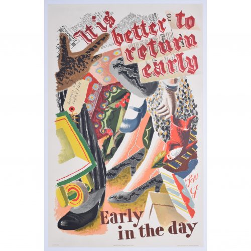
Clifford and Rosemary Ellis
It Is Better To Return Early
Lithographic poster 102 x 61 cm Printed by Waterlow & Sons Ltd for London Transport. This original vintage poster was designed for London Transport and encourages shoppers to head home earlier in the day to avoid congestion on the London Underground and buses. The well-heeled customers in the poster sport smart 1930s shoes, and jostle against their purchases (a Father Christmas puppet and red-berried holly leaves mark the design as published in time for Christmas). The pinstripe-suited gentleman's newspaper serves as the background for the first line of the poster's text, which is slanted in the synthetic cubist style (synthetic cubists were keen to explore collage in their work, often employing collage, especially of newsprint). London Transport was the forerunner of London Underground. During the 1930s London Transport commissioned over forty posters a year from well-known artists such as Laura Knight, CRW Nevinson, Edward Wadsworth, Eric Ravilious, Paul Nash, Graham Sutherland, and Edward McKnight Kauffer – a bold policy that did much to popularise avant-garde artistic styles that stemmed from Cubism, Futurism and Abstraction. Condition: very good, backed to linen. If you are interested, please email info@manningfineart.co.uk or call us on 07929 749056. Click here for other works by Clifford and Rosemary Ellis. -
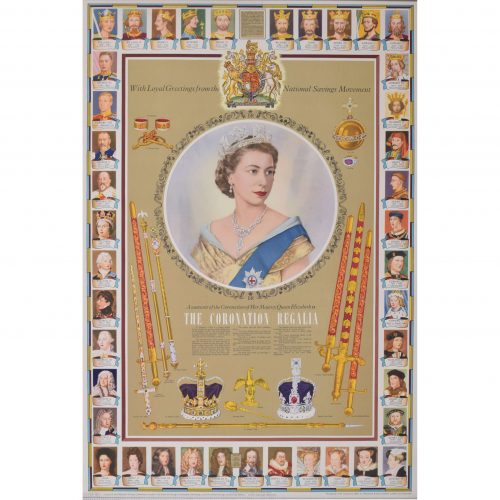
after Dorothy Wilding (1893 - 1976)
The Coronation Regalia (1953)
Original vintage poster 75 x 50 cm Issued by the National Savings Committee, London, the Scottish Savings Committee, Edinburgh, and the Ulster Savings Committee, Belfast. Crown Copyright Reserved. Printed for H.M. Stationery Office by Waterloo & Sons Limited, London and Dunstable. A fantastic piece of royalist British history. The famous portrait photographer Dorothy Wilding captured Queen Elizabeth II at her Coronation in 1952 - the photograph, used as the centrepiece of this poster, was also used on Britain's postage stamps until 1967. This particular poster was designed to be a Coronation souvenir, and features all the regalia and trappings of the United Kingdom's coronation ceremony, including crown, sword, orb, and sceptres, to name a few. The poster's margins are decorated with portraits of Britain's monarchs past, dating back to William the Conqueror. The National Savings Movement was a government-backed savings movement which began during the First World War to finance the government's wartime deficit. Savings products promoted by the movement typically offered a low level of return but the safety of a government guarantee. Various poster designs were issued by the movement to encourage ordinary people to save - we have several different designs in stock. Condition: generally very good. If you are interested, please email info@manningfineart.co.uk or call us on 07929 749056. Click here for other National Savings posters. -
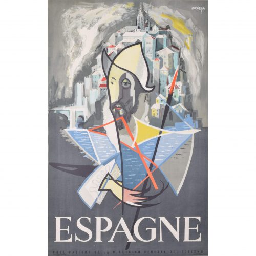
José Ortega (1921 - 1990)
"Don Quixote" Espagne
Original vintage poster c. 1960 99 x 65 cm Printed in Barcelona for the Publications de la Direccion General del Turismo. Ortega's poster is an abstract depiction Don Quixote (the Spanish hero written by Miguel de Cervantes), complete with his distinctive hat and spear. Ortega designed the poster for the Spanish tourist board, using an illustrious figure from Spain's literary heritage to encourage people to visit Spain. José García Ortega was born in Arroba de los Montes and was a member of the Communist Party. He worked as a painter and sculptor, studying at the Círculo de Bellas Artes in Madrid. In 1953 he went to France to study art, funded by a French government scholarship. He returned to Spain throughout the 1950s and 1960s, and became a commercially successful artist. Some of his most famous designs include the posters which the Spanish tourist board commissioned from him circa 1960. Condition: generally very good. If you are interested, please email info@manningfineart.co.uk or call us on 07929 749056. Click here for more original vintage travel posters. -
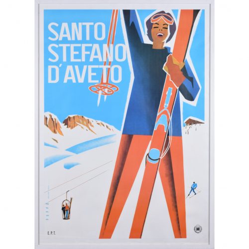
Mario Puppo (1905 - 1977)
Santo Stefano d'Aveto
Original vintage poster 97 x 68 cm Produced circa 1955 for Italian Railways. Mario Puppo's poster advertising the Italian ski resort of Santo Stefano d'Aveto. The figure of a skier reaches upward in triumph; behind her, a vintage ski lift makes its way up the mountain and a blue-clad skier tackles the piste. Mario Puppo was born in Levanto, Italy, and worked in a studio in Chiavari. He designed leaflets advertising skiing and beach resorts, which gained popularity in the 1930s. By the 1940s his poster designs were being featured in the Milan Advertising Graphics show. Throughout the 1940s he designed covers for catalogues, leaflets, playbills, music scores and records, as well as producing more travel posters for public and private Italian companies. Condition: backed to linen; frame included for UK mainland only (excluding Cornwall, Highlands and Islands - where further shipping charges may apply). If you are interested, please email info@manningfineart.co.uk or call us on 07929 749056. Click here for more original vintage posters. -
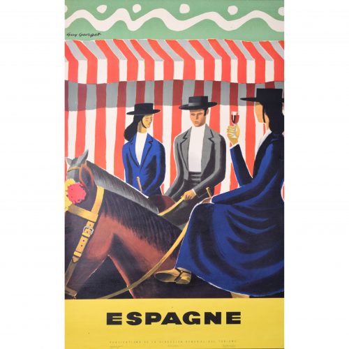
Guy Georget (1911 - 1992)
Espagne - Riders
Original vintage poster 100 x 62 cm One of Georget's fantastic posters designed for the Spanish tourist board. Three riders in traditional dress, with the ladies riding side-saddle, and one with sherry in hand, pose mounted in front of a red and white striped background. The bold, bright colours make the poster typically Georget. Guy Georget was a commercial designer; most of his poster designs were published in the late 1940s. Hired by the tourist boards in their post-war spree of tourism encouragement, Georget designed posters influenced by the styles of Pablo Picasso and Georges Braque. Condition: generally very good; a few tiny repaired edge tears. If you are interested, please email info@manningfineart.co.uk or call us on 07929 749056. Click here for more original vintage travel posters. -
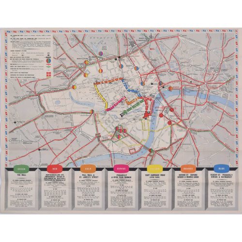
Coronation Arrangements - Map of London (1953)
Lithograph 45 x 60 cm (unfolded) Published by London Transport for the Coronation of Elizabeth II, this delightfully-coloured map illustrates the route taken by the Queen when she was crowned in 1953. Condition: generally very good. If you are interested, please email info@manningfineart.co.uk or call us on 07929 749056. -
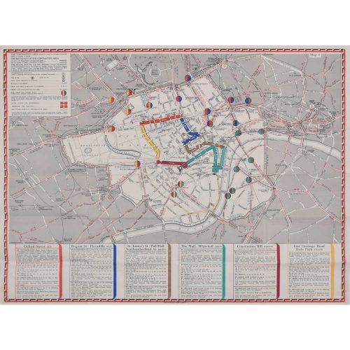
Coronation Arrangements - Map of London (1937)
Lithograph 45 x 60 cm (unfolded) Published by London Transport for the Coronation of George VI, this map illustrates the route the King took in 1936. And best of all, it's just (almost!) as useful in today's London. Condition: generally very good. If you are interested, please email info@manningfineart.co.uk or call us on 07929 749056. -
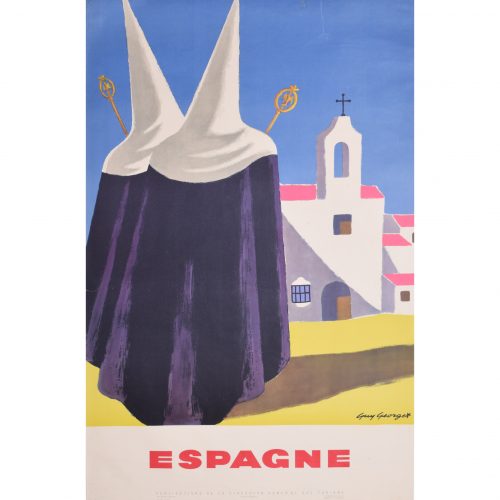
Guy Georget (1911 - 1992)
Espagne - Pilgrims
Original vintage poster 100 x 62 cm One of the fantastic posters Georget designed for the Spanish tourist board. Two pilgrims progress towards a typically Spanish church; Georget makes uses vibrant tones of bright blue, pink, and yellow to illustrate the scene. Guy Georget was a commercial designer; most of his poster designs were published in the late 1940s. Hired by the tourist boards in their post-war spree of tourism encouragement, Georget designed posters influenced by the styles of Pablo Picasso and Georges Braque. Condition: generally very good; a few repaired edge tears including one at the top c. 80mm, one to left side c. 25 mm. If you are interested, please email info@manningfineart.co.uk or call us on 07929 749056. Click here for more original vintage travel posters. -
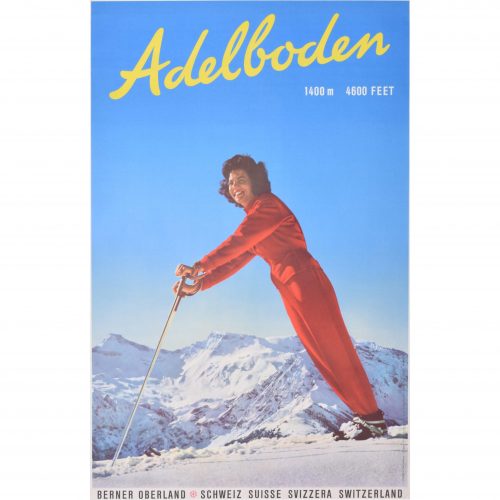
Adelboden
Original vintage poster 104 x 63 cm A fantastic original vintage poster advertising the Swiss ski resort of Adelboden, tucked away in the Bernese Oberland. Printed in Switzerland by Brügger AG. The photograph was taken by the Swiss photographers Emanuel Gyger and Arnold Klopfenstein. The pair were renowned for their captivating skiing images. Condition: generally very good. If you are interested, please email info@manningfineart.co.uk or call us on 07929 749056. Click here for more original vintage skiing posters. -
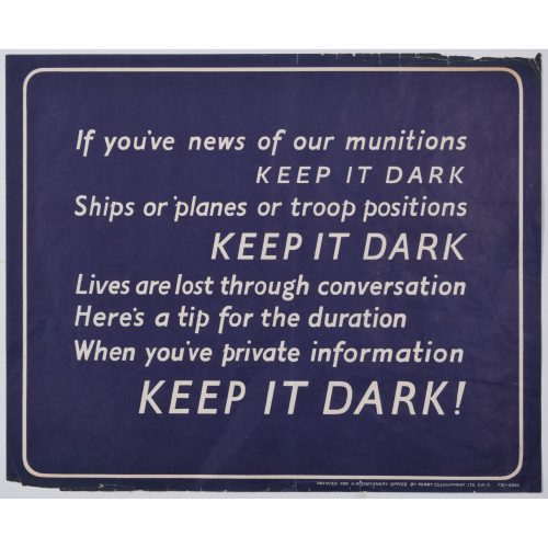
Keep It Dark (1939 - 1945)
Lithographic poster 25 x 31 cm Sponsored by Her Majesty's Stationery Office; printed by Perry Colourprint. A copy of this poster is held by the Imperial War Museum. This poster, bearing lyrics designed to be sung to the tune of "She'll be coming round the mountain", was designed for the Ministry of Information during the Second World War. It urges the population to avoid talking carelessly about details of Britain's operational movements, which might unwittingly end up in the wrong hands. Condition: good. Some small losses to extreme margins. If you’d like to know more, please email info@manningfineart.co.uk or call us on 07929 749056. -
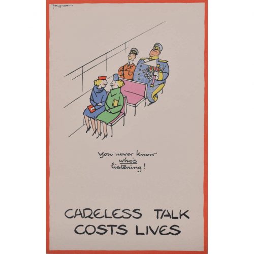
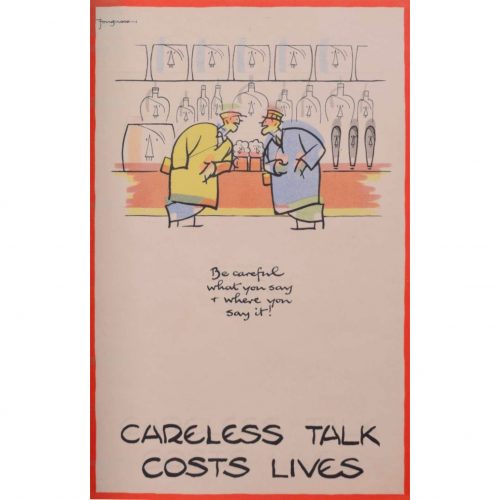
Cyril Kenneth Bird ‘Fougasse’ (1887 - 1965)
Careless Talk Costs Lives (circa 1940)
Lithographic poster 32 x 20 cm (12.5 x 8 in) Version printed on thinner paper. Fougasse was a British cartoonist. He was art editor of Punch between 1937 and 1949, and subsequently editor until 1953. He is best known for his ‘Careless Talk Costs Lives’ series of posters, and the other posters for the Ministry of Information and London Transport. As the Second World War progressed, the Ministry of Information’s poster campaign had become less and less effective. There were posters instructing the population to save old clothes for rags, turn off the lights, save food, dig for victory, watch out for spies, and keep calm and carry on. With this instruction overload, the population had ceased paying attention to the posters. Fougasse noticed this, and offered his services unpaid to the Ministry of Information, with a view to bringing a touch of humour to the posters. His amusing designs with pithy captions, reminiscent of newspaper cartoons, helped to get the Ministry's messages across in a novel way. Fougasse's distinctive poster style, with the red border, was subsequently adopted by other Ministry artists. Condition: if you’d like to know more, please email info@manningfineart.co.uk or call us on 07929 749056. -
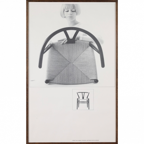
Paul Salomonsen (active 1960s) Y Chair (1964)
Lithographic poster (2014) 99 x 61 cm The poster features Hans J Wegner's famous 'Y chair', also known as the 'Wishbone chair'. Carl Hansen & Søn commissioned the poster from a photograph by Salomonsen, a 1960s photographer. The stylish and typically Danish woman examining the chair marks it as a piece of typically Danish design. The chair was known as "The Chair" when it was used in the TV-transmitted debate between John F Kennedy and Richard Nixon in 1959. The Chair subsequently became an icon of Danish mid-century furniture design. Condition: Excellent. If you’d like to know more, please email info@manningfineart.co.uk or call us on 07929 749056. -
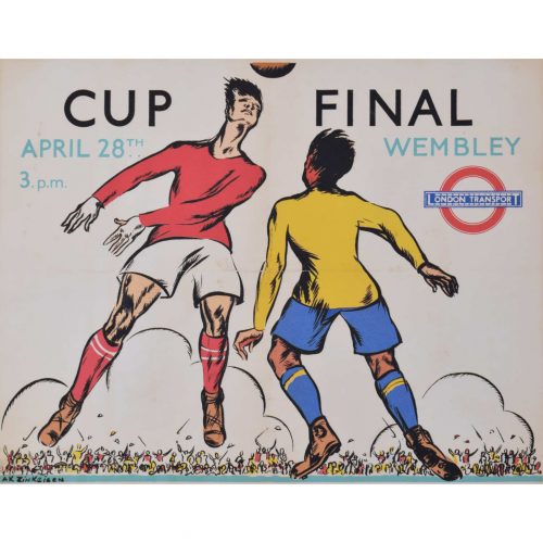
Anna Zinkeisen (1901 - 1976)
Wembley Cup Final (1934)
Lithographic poster 40 x 50 cm Signed in plate lower left, numbered 34/760, and printed by the DPC (Dangerfield Printing Company) for London Transport. Anna Zinkeisen created this design in 1934 for London Transport as a panel poster (12.5 x 10", for display within underground carriages or on buses). The Cup Final that year was between Manchester City and Portsmouth; Manchester City triumphed with a 2-1 scoreline. This particular lithograph from the same time was produced to a slightly larger scale than the panel poster, and is not recorded in the London Transport Museum archives. The process of lithography requires a skilled operator to draw a negative image on a stone plate (the Greek word 'lithos' meaning 'stone') - one plate for each colour in the image. The stone is then treated with acid and etched in a way as to produce a printing plate which can then be inked. Printing at different sizes therefore required the manual creation of new plates, and small differences between different sized versions are thus visible. Anna Zinkeisen won a scholarship to the Royal Academy Schools in 1916, focusing on sculpture and exhibiting at the Royal Academy in 1919. She was awarded the Landseer Award in 1920 and 1921, and went on to become an esteemed portrait artist, often of society ladies. She produced a series of posters for London Transport in the inter-war period. During the Second World War, Zinkeisen became a nurse, and was profoundly affected by the suffering she saw during her time working in St Mary's Hospital. This is arguably the point at which she and her sister Doris reached the pinnacle of their careers, producing some of the finest and most affecting depictions of the world at war made during this period. Condition: good. Backed to conservation paper; small loss to bottom left-hand corner and slight toning to extremities. If you’d like to know more, please email info@manningfineart.co.uk or call us on 07929 749056. -
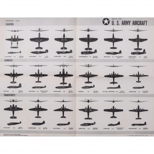
1943 Army World War II USA (1942)
Original aeroplane recognition poster 44 x 59 cm A summary of US aeroplanes from the series of US Navy identification posters that we have in stock. Fighters: P38 Lightning; P39 Airacobra; Curtiss P40E Warhawk; P47 Thunderbolt; P51 Mustang; A31 Vengeance. Bombers: A20 Boston; B25 Mitchell; B26 Marauder; Lockheed Hudson; Boeing B17E Flying Fortress; B24 Consolidated Liberator. Transports: C45 Voyager; C46 Commando; C47 Douglas Skytrain; Lockheed Lodestar; C76 Caravan; C54 Douglas Skymaster. Condition: generally very good, occasional handling marks. Folds as issued. If you’d like to know more, please email info@manningfineart.co.uk or call us on 07929 749056. -
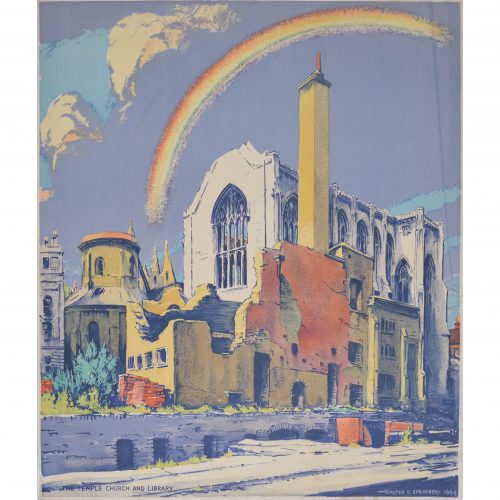
Walter Ernest Spradbery (1889 - 1969)
Temple Church and Library after Bombardment (1944)
Lithograph 66 x 57 cm Walter Spradbery's poster for the London Underground depicting a bombed Temple Church; a rainbow strikes hopefully out of the church's remains, and the sun shines on the golden stone of the building. The full poster bears the legend 'The Proud City' above Spradbery's design, and, beneath it, a quote from Charles Lamb: 'So may the winged horse, your ancient badge and cognisance, still flourish!'. This is a fantastic piece of British and London history, as well as a fantastically designed poster by a notable 20th century artist. The London Transport Museum has a copy of the poster, reference 1983/4/5751. 'The Proud City' was a series of six posters, all designed by Spradbery. They were commissioned by London Transport in 1944 as a defiant celebration of London's surviving the Blitz, and each poster also included a literary quotation. Walter Ernest Spradbery was a designer, painter, and poet who lived through the First and Second World Wars. He produced posters for LNER, Southern Railways, and London Transport, and was noted for his fascination with architecture and landscape. He studied, and later taught, at the Walthamstow School of Art. He was a pacifist and campaigned for nuclear disarmament, serving in the Medical Corps during the First World War and painting scenes of warfare for its duration, as well as during the Second World War. His anti-war stance and the horrors he had witnessed as a medic fed into his post-war poster design, especially 'The Proud City' poster series. Condition: generally very good. If you’d like to know more, please email info@manningfineart.co.uk or call us on 07929 749056. -
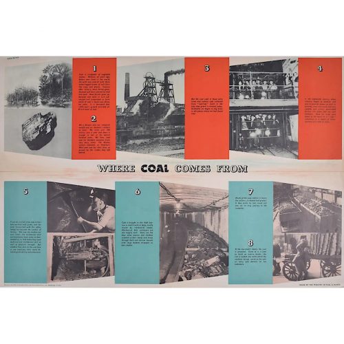
FHK Henrion (1914 - 1990)
Where Coal Comes From (circa 1945)
Original vintage poster 51 x 76 cm Signed in plate. Issued by the Ministry of Fuel and Power; printed for HM Stationery Office by Field Sons & Co Ltd, Bradford. We have been unable to identify any other copy of this poster by this renowned designer in any public collection - it is possibly the only remaining copy. A Ministry of Fuel poster encouraging the public to use less fuel. FHK Henrion was a German graphic designer who moved to Paris after leaving school, studying with the poster designer Paul Colin and then moving to London in 1936. Interned in the Isle of Man during the Second World War, he went on to design posters for the Ministry of Information and the US Office of War Information. After the War he started his own design agency, pioneering the concept of corporate identity. Clients included KLM, Giro, The Post Office, Tate & Lyle. The Ministry of Power and Fuel existed from 1942 to 1957 to control the nation's use of the scarce resources during and after the Second World War. Condition: centre folds as issued with a little wear to the extremities of the folds; generally very good. If you’d like to know more, please email info@manningfineart.co.uk or call us on 07929 749056. -
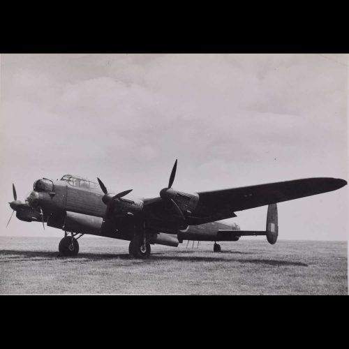
Lancaster HK543
Original Silver Gelatin photograph 19 x 25 cm Stamped to reverse "Copyright 'the Aeroplane'" 23 July 1945 HK543 was a Lancaster III, probably produced in 1943. Here she is shown in July 1945, she was recorded photgraphically on bombing trials from Boscombe Down that month, this photograph may reasonably be assumed to be from that event. Provenance: from the collection of Philip J R Moyes, author of many books on the RAF, most notably The Pictorial History which ran to several volumes. Condition: mostly good. -
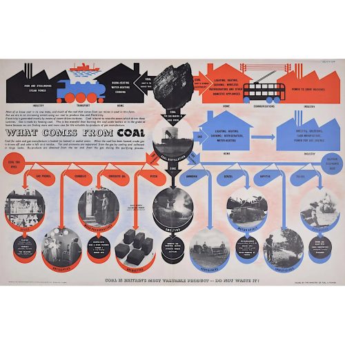
FHK Henrion (1914 - 1990)
What Comes from Coal (circa 1945)
Original vintage poster 51 x 76 cm Signed in plate. Issued by the Ministry of Fuel and Power; printed for HM Stationery Office by Field Sons & Co Ltd, Bradford. We have been unable to identify any other copy of this poster by this renowned designer in any public collection - it is possibly the only remaining copy. A Ministry of Fuel poster encouraging the public to use less fuel. FHK Henrion was a German graphic designer who moved to Paris after leaving school, studying with the poster designer Paul Colin and then moving to London in 1936. Interned in the Isle of Man during the Second World War, he went on to design posters for the Ministry of Information and the US Office of War Information. After the War he started his own design agency, pioneering the concept of corporate identity. Clients included KLM, Giro, The Post Office, Tate & Lyle. The Ministry of Power and Fuel existed from 1942 to 1957 to control the nation's use of the scarce resources during and after the Second World War. Condition: centre folds as issued with a little wear to the extremities of the folds; generally very good. If you’d like to know more, please email info@manningfineart.co.uk or call us on 07929 749056. -
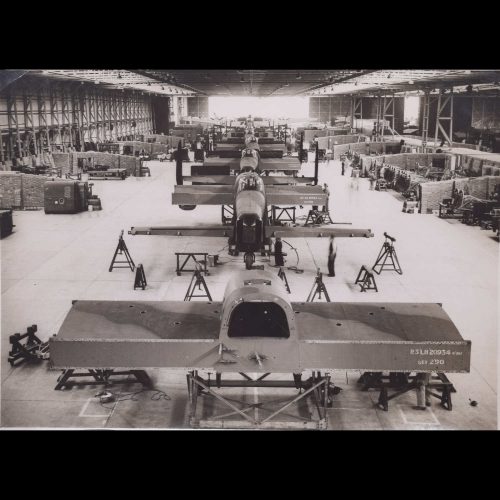
Lancaster Bombers under Construction
Original Silver Gelatin photograph 17 x 21 cm Stamped to reverse 'Certified by Photographic News Agencies Ltd as passed by Censor' '23 Oct 1942' This photograph shows the parts of a Lancaster bomber being assembled. At the back of the photograph, facing away from the viewer, are two nearly or newly completed aircraft, their airscrews visible attached to the wings. The factory buzzes with activity as important war work is undertaken. We have been unable to trace any other copy of this photograph. Provenance: from the collection of Philip J R Moyes, author of many books on the RAF, most notably The Pictorial History which ran to several volumes. -
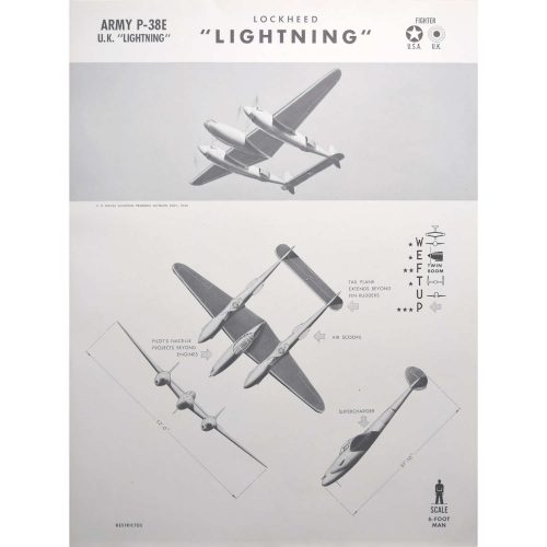
Army P-38E Lockheed "Lightning"
Aeroplane identification poster, published 1942 63 x 47 cm A particularly unusual style of aeroplane identification poster, owing to the very arty images. Most such posters rely on very plain silhouettes, this series - and we have several in this series; view them here - have a much more arty approach to the task with shading and an interesting angle view. The Lockheed P-38 Lightning was an American single-seated, twin piston-engined fighter aircraft that was used during World War II. The Lightning was originally designed as a bomber-interceptor and was never intended to be a fighter. Weight was kept to a minimum and it was far more advanced and faster than its U.S. counterparts, the Bell P-39 Airacobra and Curtiss P-40 Warhawk (original Airacobra and Warhawk posters from the same 1942 series are also available in our storefront). It caught the attention of the US Army Air Corps (USAAC) very quickly. The Lightning shot down more Japanese aeroplanes than any other fighter during World War II. When first introduced in 1939, the Lightning was able to fly a steady course at 413 mph (665 km/h), making it the fastest production aeroplane in the world. It remained one of the fastest climbers right up to the end of the WW II. Condition: generally very good. If you are interested, please email info@manningfineart.co.uk or call us on 07929 749056. -
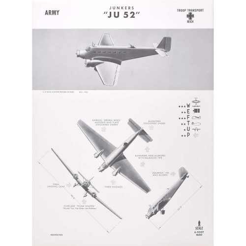
Junkers "JU 52"
Aeroplane identification poster, published 1942 63 x 47 cm A particularly unusual style of aeroplane identification poster, owing to the very arty images. Most such posters rely on very plain silhouettes, this series - and we have several in this series; view them here - have a much more arty approach to the task with shading and an interesting angle view. The Junkers Ju 52/3m (nicknamed Tante Ju ("Aunt Ju") and Iron Annie) was a transport aircraft that was designed and manufactured by German aviation company Junkers. Development of the Ju 52 commenced during 1930, headed by German aeronautical engineer Ernst Zindel. Its maiden flight was on 13 October 1930. Following the rise of Nazi Germany, thousands of Ju 52s were procured as a staple military transport of the nation. The Ju 52 was in production between 1931 and 1952. In a civilian role, it flew with over 12 airlines, including Swissair and Deutsche Luft Hansa, as both a passenger carrier and a freight hauler. In a military role, large numbers flew with the Luftwaffe, being deployed on virtually all fronts of the Second World War as a troop and cargo transport; it was also briefly used as a medium bomber. Additionally, the type was deployed by other nation''s militaries in conflicts such as the Spanish Civil War, the Chaco War, and the Portuguese Colonial War. During the postwar era, the Ju 52 had a lengthy service life with numerous military and civilian operators; large numbers were still in use by the 1980s. Even in the 21st century, several aircraft have remained operational, typically used for purposes such as heritage aviation displays and aerial sightseeing. Condition: generally very good. If you are interested, please email info@manningfineart.co.uk or call us on 07929 749056. -
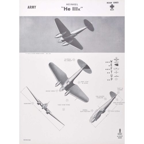
Heinkel "He 111K"
Aeroplane identification poster, published 1942 63 x 47 cm A particularly unusual style of aeroplane identification poster, owing to the very arty images. Most such posters rely on very plain silhouettes, this series - and we have several in this series; view them here - have a much more arty approach to the task with shading and an interesting angle view. The Heinkel He 111 was a German bomber aircraft designed by Siegfried and Walter Günter at Heinkel Flugzeugwerke in 1934. Through development it was described as a "wolf in sheep''s clothing"; due to restrictions placed on Germany after the First World War prohibiting bombers, it masqueraded as a civil airliner, although from conception the design was intended to provide the nascent Luftwaffe with a fast medium bomber. Perhaps the best-recognised German bomber due to the distinctive, extensively glazed "greenhouse" nose of later versions, the Heinkel He 111 was the most numerous Luftwaffe bomber during the early stages of World War II. The bomber fared well until the Battle of Britain, when its weak defensive armament was exposed. Nevertheless, it proved capable of sustaining heavy damage and remaining airborne. As the war progressed, the He 111 was used in a wide variety of roles on every front in the European theatre. It was used as a strategic bomber during the Battle of Britain (and has a prominent role in the film "Battle of Britain"), a torpedo bomber in the Atlantic and Arctic, and a medium bomber and a transport aircraft on the Western, Eastern, Mediterranean, Middle Eastern, and North African Front theatres. The He 111 was constantly upgraded and modified, but became obsolete during the latter part of the war. Condition: generally very good. If you are interested, please email info@manningfineart.co.uk or call us on 07929 749056. -
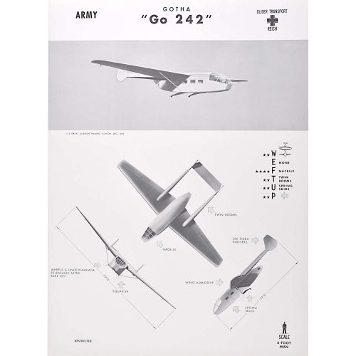
Army Gotha "Go 242"
Aeroplane identification poster, published 1942 63 x 47 cm A particularly unusual style of aeroplane identification poster, owing to the very arty images. Most such posters rely on very plain silhouettes, this series - and we have several in this series; view them here - have a much more arty approach to the task with shading and an interesting angle view. The Gotha Go 242 was a transport glider used by the Luftwaffe during World War II. It was designed by Albert Kalkert in response to the request for a heavy transport glider to replace the DFS 230 which was then in service. The requirement was for a glider capable of carrying 20 fully laden troops, or equivalent cargo. Two prototypes flew in 1941 and the type quickly entered production, with a total of 1,528 being built. In service, Go 242s were towed into the air by Heinkel He 111s or Junkers Ju 52s. Most saw service in the Mediterranean, North Africa and Aegean. Ju 87D-2s had strengthened rear fuselage and combined tailwheel and hook for towing the Go 242. Today, there are two surviving 242s - one in the Musée de la Resistance du Vercors in Valence, France, and the other in the Technik Museum and Luftwaffenmuseum der Bundeswehr in Berlin, Germany. Condition: generally very good. If you are interested, please email info@manningfineart.co.uk or call us on 07929 749056. -
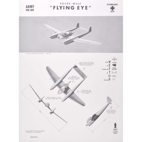
Army FW-189 "Flying Eye"
Aeroplane identification poster, published 1942 63 x 47 cm A particularly unusual style of aeroplane identification poster, owing to the very arty images. Most such posters rely on very plain silhouettes, this series - and we have several in this series; view them here - have a much more arty approach to the task with shading and an interesting angle view. The Focke-Wulf Fw 189 Uhu ("Eagle Owl") was a German twin-engine, twin-boom, three-seat tactical reconnaissance and army cooperation aircraft. It first flew in 1938, entered service in 1940 and was produced until mid-1944. It was nicknamed the “Flying Eye.” Patrolling the vast flatlands of Ukraine and Belarus, the Flying Eye was used extensively on the Eastern Front with great success. It was nicknamed "Rama" ("frame") by Soviet forces, in reference to its distinctive tailboom and stabiliser shapes, which gave it its characteristic quadrangular appearance. Despite its low speed, the Fw 189's manoeuvrability made it a difficult target for attacking Soviet fighters. When attacked, the Flying Eye was often able to out-turn enemy fighters by simply flying in a tight circle. Condition: generally very good. If you are interested, please email info@manningfineart.co.uk or call us on 07929 749056. -
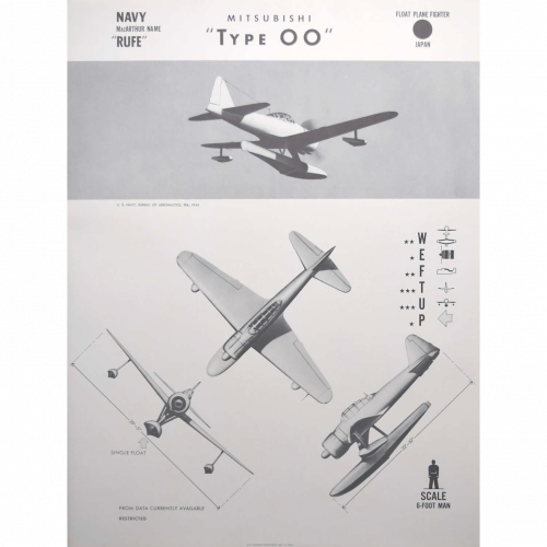
"Rufe" Mitsubishi "Type OO"
Aeroplane identification poster, published 1942 63 x 47 cm A particularly unusual style of aeroplane identification poster, owing to the very arty images. Most such posters rely on very plain silhouettes, this series - and we have several in this series; view them here - have a much more arty approach to the task with shading and an interesting angle view. This Japanese floatplane, known to the Allies as a "Rufe", was developed from the Mitsubishi A6M Type 0 - the famous ''Zero'' figher, mainly to support amphibious operations and defend remote bases. It was based on the A6M-2 Model 11 fuselage, with a modified tail and added floats. A total of 327 were built, including the original prototype. The aircraft was deployed in 1942 and was only used in operations taking place in the Aleutians and Solomon Islands. Such seaplanes were effective in harassing American patrol torpedo boats at night. They could also drop flares to illuminate the American boats which were vulnerable to destroyer gunfire, and depended on cover of darkness. Condition: generally very good. If you are interested, please email info@manningfineart.co.uk or call us on 07929 749056. -
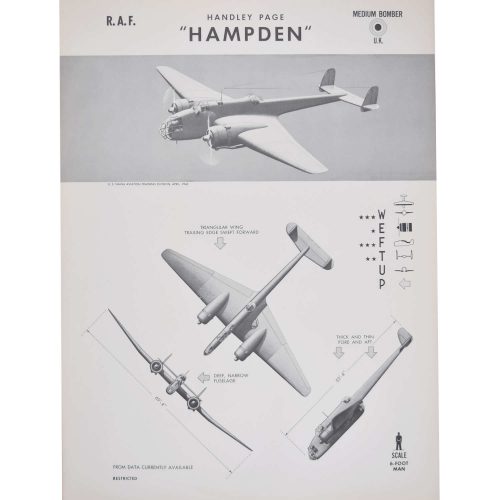
Royal Air Force Handley Page "Hampden" Bomber
Aeroplane identification poster, published 1943 63 x 47 cm A particularly unusual style of aeroplane identification poster, owing to the very arty images. Most such posters rely on very plain silhouettes, this series - and we have several in this series; view them here - have a much more arty approach to the task with shading and an interesting angle view. The Handley Page HP.52 Hampden is a British twin-engine medium bomber that was operated by the Royal Air Force (RAF). It was part of the trio of large twin-engine bombers procured for the RAF, joining the Armstrong Whitworth Whitley and Vickers Wellington. The Hampden was powered by Bristol Pegasus radial engines but a variant known as the Handley Page Hereford had in-line Napier Daggers. The Hampden served in the early stages of the Second World War, bearing the brunt of the early bombing war over Europe, taking part in the first night raid on Berlin and the first 1,000-bomber raid on Cologne. When it became obsolete, after a period of mainly operating at night, it was retired from RAF Bomber Command service in late 1942. By 1943, the rest of the trio were being superseded by the larger four-engined heavy bombers such as the Avro Lancaster. Condition: generally very good. If you are interested, please email info@manningfineart.co.uk or call us on 07929 749056. -
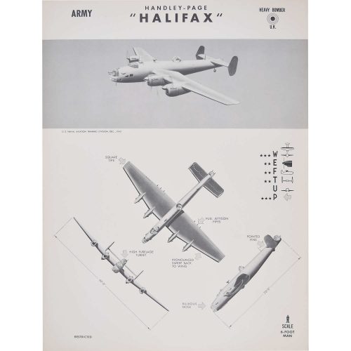
Handley-Page "Halifax"
Aeroplane identification poster, published 1942 63 x 47 cm A particularly unusual style of aeroplane identification poster, owing to the very arty images. Most such posters rely on very plain silhouettes, this series - and we have several in this series; view them here - have a much more arty approach to the task with shading and an interesting angle view. The Halifax bomber was a twin-engined bomber that entered service with the RAF in 1940. Viewed by Arthur ''Bomber'' Harris as inferior to the Lancaster, on account of its smaller payload, the crews preferred it. 1,833 aircraft were lost in service with Bomber Command, across a total of 82,733 operations. Only three survive, one at the Yorkshire Air Museum in Elvington (based on a fuselage that had been in use at a chicken farm following a crash near Stornoway), one at the National Air Force Museum of Canada (which was discovered in 1991 in Norway and subsequently restored), and one at the RAF Museum in London (that crash landed in Norway following an attack on the German battleship Tirpitz; rediscovered in 1971, it has been left unrestored). Condition: generally very good. If you are interested, please email info@manningfineart.co.uk or call us on 07929 749056. -
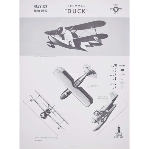
Navy and Army Grumman "Duck"
Aeroplane identification poster, published 1942 63 x 47 cm A particularly unusual style of aeroplane identification poster, owing to the very arty images. Most such posters rely on very plain silhouettes, this series - and we have several in this series; view them here - have a much more arty approach to the task with shading and an interesting angle view. The Grumman J2F Duck was an American single-engine amphibious biplane. It was used by each major branch of the U.S. armed forces from the mid-1930s until just after World War II, primarily for utility and air-sea rescue duties. It was also used by the Argentine Navy, who took delivery of their first J2F in 1937. Apart from general utility and light transport duties, its missions included mapping, reconnaissance, anti-submarine patrol, air-sea rescue work, photographic surveys, and target tug. Condition: generally very good. If you are interested, please email info@manningfineart.co.uk or call us on 07929 749056. -
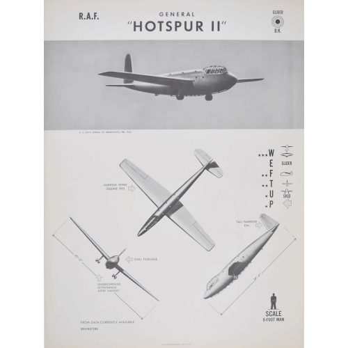
1942 RAF General Hotspur II
Aeroplane identification poster, published 1942 63 x 47 cm A particularly unusual style of aeroplane identification poster, owing to the very arty images. Most such posters rely on very plain silhouettes, this series - and we have several in this series; view them here - have a much more arty approach to the task with shading and an interesting angle view. A particularly unusual style of aeroplane recognition poster, owing to the very arty images. Most such posters rely on very plain silhouettes, this series - and we have several in this series - have a much more arty approach to the task with shading and an interesting angle view. The General Aircraft GAL.48 Hotspur was a military glider designed and built by the British company General Aircraft Ltd during World War II. When the British airborne establishment was formed in 1940 by order of Prime Minister Winston Churchill, it was decided that gliders would be used to transport airborne troops into battle. General Aircraft Ltd were given a contract by the Ministry of Aircraft Production in June 1940 to design and produce an initial glider for use by the airborne establishment, which resulted in the Hotspur. Conceived as an "assault" glider which necessitated a compact design and no more than eight troops carried, tactical philosophy soon favoured larger numbers of troops being sent into battle aboard gliders. Due to this, the Hotspur was mainly relegated to training where it did excel and it became the basic trainer for the glider schools that were formed. The Hotspur was named after Sir Henry Percy, a significant captain during the Anglo-Scottish wars who was also known as "Hotspur". A Hotspur Mark II (HH268) replica is on display at the Museum of Army Flying in Hampshire, England. The front fuselage of a Hotspur was preserved at the Parachute Regiment And Airborne Forces Museum in Aldershot prior to the museum''s 2007 closing, in anticipation of a move to the Imperial War Museum Duxford. Condition: generally very good. If you are interested, please email info@manningfineart.co.uk or call us on 07929 749056. -
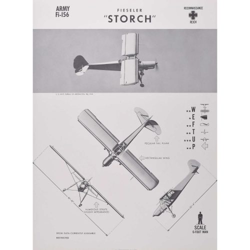
Army Fi-156 Fieseler "Storch"
Aeroplane identification poster, published 1944 63 x 47 cm A particularly unusual style of aeroplane identification poster, owing to the very arty images. Most such posters rely on very plain silhouettes, this series - and we have several in this series; view them here - have a much more arty approach to the task with shading and an interesting angle view. The Fieseler Fi 156 Storch, meaning "stork", was a small German liaison aircraft built by Fieseler before and during World War II. It was notable for its excellent short-takeoff-and-landing performance and low stall speed of 31 mph.The Douglas Skymaster was a four-engine transport aircraft used by the United States Army Air Forces in World War II and the Korean War. Like the Douglas C-47 Skytrain (the Skytrain poster from the same series is also available in our storefront), the Skymaster was derived from a civilian airliner, the Douglas DC-4. The Storch was deployed in all European and North African theatres of World War II. In addition to its liaison function, a number were used to fly a battalion of Infantry Regiment Grossdeutschland behind enemy lines during the invasion of Belgium. In 1943, the Storch played a role in Operation Eiche, the rescue of deposed Italian dictator Benito Mussolini from a boulder-strewn mountain-top near the Gran Sasso. Even though the mountain was surrounded by Italian troops, German commando Otto Skorzeny and 90 paratroopers used gliders to land on the peak and quickly captured it. However, the problem of how to get back off remained. A Focke-Achgelis Fa 223 helicopter was sent, but it broke down en route. Instead, pilot Heinrich Gerlach flew over in a Storch. After Mussolini and Skorzeny had boarded the aircraft, the Storch took off to 250 ft, even though the aircraft was overloaded. A Storch was the last aircraft shot down by the Allies on the Western Front. Condition: generally very good. If you are interested, please email info@manningfineart.co.uk or call us on 07929 749056. -
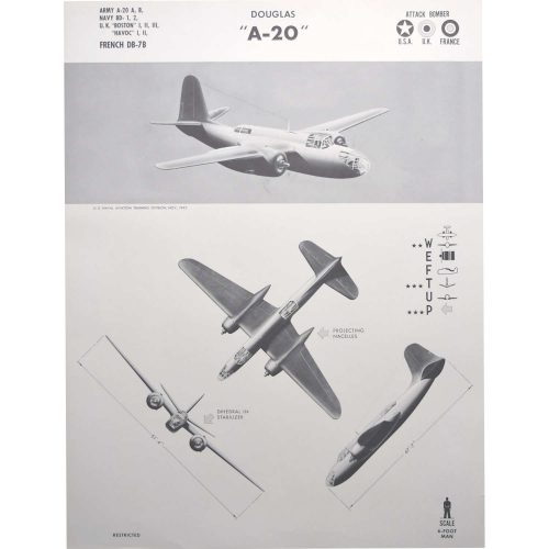
Army A-20 A, B, Navy BD- 1, 2, UK "Boston" I, II, III, "Havoc" I, II, French DB-7B Douglas "A-20"
Aeroplane identification poster, published 1942 63 x 47 cm A particularly unusual style of aeroplane identification poster, owing to the very arty images. Most such posters rely on very plain silhouettes, this series - and we have several in this series; view them here - have a much more arty approach to the task with shading and an interesting angle view. The Douglas A-20 was a medium bomber, attack aircraft, night intruder, night fighter, and reconnaissance aircraft of World War II. Designed to meet an Army Air Corps requirement for a bomber, it was ordered by France for their air force before the USAAC decided it would also meet their requirements. French DB-7s were the first to see combat. The A-20 served with several Allied air forces, principally the United States Army Air Forces (USAAF), the Soviet Air Forces (VVS), Soviet Naval Aviation (AVMF), and the Royal Air Force (RAF) of the United Kingdom. A total of 7,478 aircraft were built, of which more than a third served with Soviet units. It was also used by the air forces of Australia, South Africa, France, and the Netherlands during the war. Condition: generally very good. If you are interested, please email info@manningfineart.co.uk or call us on 07929 749056.