-
Out of stock
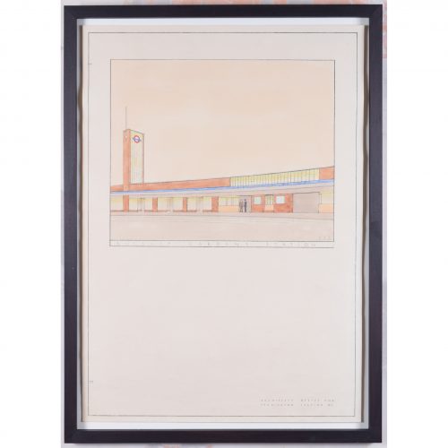
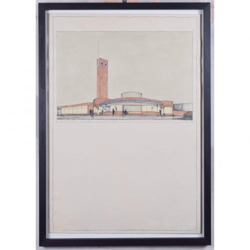
Brian Bannatyne Lewis (1906 - 1991)
North Acton Station (1938)
Pen, ink and watercolour 70 x 50 cm Initialled and dated 26 2 38. A 1938 design for the new North Acton tube station, commissioned by the Great Western Railway (GWR) for its proposed western extension to the Central Line. The design's Art Deco lettering befits London Transport's aesthetic in the 1930s. Lewis brings his designs to life by including smartly-dressed characters entering and leaving the stations. The Central line opened in 1900, between Shepherd's Bush and Bank; it extended westwards to Ealing Broadway in 1920. Two years after the formation of London Transport in 1933, an extensive New Works Programme began, proposing a westwards extension of the line to Denham. Brian Lewis created designs for nine stations in early 1938, but the Second World War broke out before they could be built. By the time the extension had been built, Lewis was no longer chief architect of the GWR - the stations were modified and completed by Frederick Francis Charles Curtis instead. The extension to Greenford opened in 1947 and finally reached West Ruislip in 1948. Denham never actually became part of the tube line, owing to the establishment of the green belt. Brian Lewis was born in Tasmania, attended school in Melbourne, and subsequently obtained a Diploma in Architecture in 1928 from the University of Melbourne. He then moved to the UK to study at the Liverpool School of Architecture, winning scholarships in each of his three years of study to fund extensive European travel. He married a fellow Liverpool architectural student, Hilary Archer. After moving to London, he took up employment with the GWR in their architects’ office; he also lectured at a local polytechnic, and moonlighted with his wife at home on mainly residential commissions – rather different projects from the hotels and stations which GWR commissioned from him. He exhibited frequently at the Royal Academy of Arts, showing superb measured drawings of historic buildings. In the Second World War he enlisted with the Second Imperial Australian Force, serving in the Middle East, then transferred to the Royal Australian Engineers where he became a Captain. In 1943 he was sent to London to help GWR repair bomb damage. Lewis became Chief Architect of GWR in 1945 (following the retirement of the noted Percy Emerson Culverhouse), and the first Chair of Architecture at Melbourne University in 1947. He also became the consulting architect for the major buildings of the Australian National University in Canberra, producing an imaginative site plan and designing University House, which was awarded the Sulman medal in 1954. He also designed the Risdon Prison Complex in 1960. He retired in 1971 to paint watercolours and write his memoirs. Condition: generally very good; a few handling marks and two holes from filing. Handsomely framed. If you are interested, please email info@manningfineart.co.uk or call us on 07929 749056. Click here to view the other station designs in the set. -
Out of stock
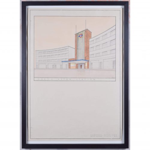
Brian Bannatyne Lewis (1906 - 1991)
East Acton Station (1938)
Pen, ink and watercolour 70 x 50 cm Initialled and dated 28 2 38. A 1938 design for the new East Acton tube station, commissioned by the Great Western Railway (GWR) for its proposed western extension to the Central Line. The design's Art Deco lettering befits London Transport's aesthetic in the 1930s. Lewis brings his designs to life by including smartly-dressed characters entering and leaving the stations. The Central line opened in 1900, between Shepherd's Bush and Bank; it extended westwards to Ealing Broadway in 1920. Two years after the formation of London Transport in 1933, an extensive New Works Programme began, proposing a westwards extension of the line to Denham. Brian Lewis created designs for nine stations in early 1938, but the Second World War broke out before they could be built. By the time the extension had been built, Lewis was no longer chief architect of the GWR - the stations were modified and completed by Frederick Francis Charles Curtis instead. The extension to Greenford opened in 1947 and finally reached West Ruislip in 1948. Denham never actually became part of the tube line, owing to the establishment of the green belt. Brian Lewis was born in Tasmania, attended school in Melbourne, and subsequently obtained a Diploma in Architecture in 1928 from the University of Melbourne. He then moved to the UK to study at the Liverpool School of Architecture, winning scholarships in each of his three years of study to fund extensive European travel. He married a fellow Liverpool architectural student, Hilary Archer. After moving to London, he took up employment with the GWR in their architects’ office; he also lectured at a local polytechnic, and moonlighted with his wife at home on mainly residential commissions – rather different projects from the hotels and stations which GWR commissioned from him. He exhibited frequently at the Royal Academy of Arts, showing superb measured drawings of historic buildings. In the Second World War he enlisted with the Second Imperial Australian Force, serving in the Middle East, then transferred to the Royal Australian Engineers where he became a Captain. In 1943 he was sent to London to help GWR repair bomb damage. Lewis became Chief Architect of GWR in 1945 (following the retirement of the noted Percy Emerson Culverhouse), and the first Chair of Architecture at Melbourne University in 1947. He also became the consulting architect for the major buildings of the Australian National University in Canberra, producing an imaginative site plan and designing University House, which was awarded the Sulman medal in 1954. He also designed the Risdon Prison Complex in 1960. He retired in 1971 to paint watercolours and write his memoirs. Condition: generally very good; a few handling marks and two holes from filing. Handsomely framed. If you are interested, please email info@manningfineart.co.uk or call us on 07929 749056. Click here to view the other station designs in the set. -
Out of stock
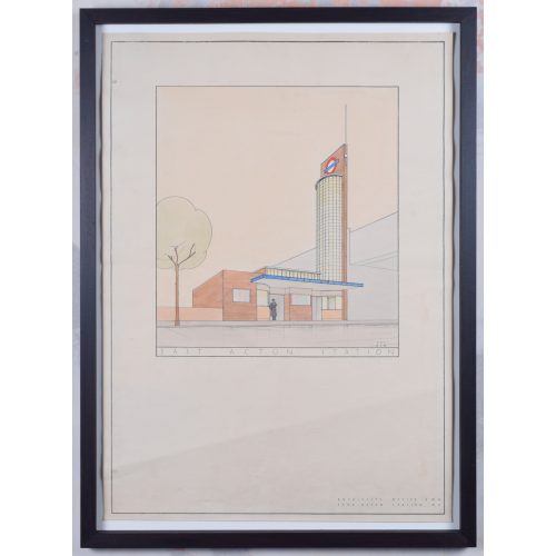
Brian Bannatyne Lewis (1906 - 1991)
Hanger Lane Station (1938)
Pen, ink and watercolour 70 x 50 cm Inscribed 'BB Lewis' lower right. A 1938 design for the new Hanger Lane tube station, commissioned by the Great Western Railway (GWR) for its proposed western extension to the Central Line. The design's Art Deco lettering befits London Transport's aesthetic in the 1930s. Lewis brings his designs to life by including smartly-dressed characters entering and leaving the stations. The Central line opened in 1900, between Shepherd's Bush and Bank; it extended westwards to Ealing Broadway in 1920. Two years after the formation of London Transport in 1933, an extensive New Works Programme began, proposing a westwards extension of the line to Denham. Brian Lewis created designs for nine stations in early 1938, but the Second World War broke out before they could be built. By the time the extension had been built, Lewis was no longer chief architect of the GWR - the stations were modified and completed by Frederick Francis Charles Curtis instead. The extension to Greenford opened in 1947 and finally reached West Ruislip in 1948. Denham never actually became part of the tube line, owing to the establishment of the green belt. Brian Lewis was born in Tasmania, attended school in Melbourne, and subsequently obtained a Diploma in Architecture in 1928 from the University of Melbourne. He then moved to the UK to study at the Liverpool School of Architecture, winning scholarships in each of his three years of study to fund extensive European travel. He married a fellow Liverpool architectural student, Hilary Archer. After moving to London, he took up employment with the GWR in their architects’ office; he also lectured at a local polytechnic, and moonlighted with his wife at home on mainly residential commissions – rather different projects from the hotels and stations which GWR commissioned from him. He exhibited frequently at the Royal Academy of Arts, showing superb measured drawings of historic buildings. In the Second World War he enlisted with the Second Imperial Australian Force, serving in the Middle East, then transferred to the Royal Australian Engineers where he became a Captain. In 1943 he was sent to London to help GWR repair bomb damage. Lewis became Chief Architect of GWR in 1945 (following the retirement of the noted Percy Emerson Culverhouse), and the first Chair of Architecture at Melbourne University in 1947. He also became the consulting architect for the major buildings of the Australian National University in Canberra, producing an imaginative site plan and designing University House, which was awarded the Sulman medal in 1954. He also designed the Risdon Prison Complex in 1960. He retired in 1971 to paint watercolours and write his memoirs. Condition: generally very good; a few handling marks and two holes from filing. Handsomely framed. If you are interested, please email info@manningfineart.co.uk or call us on 07929 749056. Click here to view the other station designs in the set. -
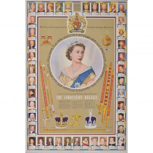
after Dorothy Wilding (1893 - 1976)
The Coronation Regalia (1953)
Original vintage poster 75 x 50 cm Issued by the National Savings Committee, London, the Scottish Savings Committee, Edinburgh, and the Ulster Savings Committee, Belfast. Crown Copyright Reserved. Printed for H.M. Stationery Office by Waterloo & Sons Limited, London and Dunstable. A fantastic piece of royalist British history. The famous portrait photographer Dorothy Wilding captured Queen Elizabeth II at her Coronation in 1952 - the photograph, used as the centrepiece of this poster, was also used on Britain's postage stamps until 1967. This particular poster was designed to be a Coronation souvenir, and features all the regalia and trappings of the United Kingdom's coronation ceremony, including crown, sword, orb, and sceptres, to name a few. The poster's margins are decorated with portraits of Britain's monarchs past, dating back to William the Conqueror. The National Savings Movement was a government-backed savings movement which began during the First World War to finance the government's wartime deficit. Savings products promoted by the movement typically offered a low level of return but the safety of a government guarantee. Various poster designs were issued by the movement to encourage ordinary people to save - we have several different designs in stock. Condition: generally very good. If you are interested, please email info@manningfineart.co.uk or call us on 07929 749056. Click here for other National Savings posters. -
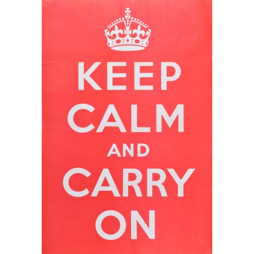
Anonymous, UK 1939
Keep Calm and Carry On
Ministry of Information Original poster, 1939 76 x 50 cm Very rare - we have traced copies in the Imperial War Museum collection but no other public collection. Scroll down for further information. Condition: A/A- Generally excellent, with three folds and a small crease as visible in photograph and tiny loss to left edge of middle fold. Deliberately not backed this to linen or over-restored as it is important that it does not look like a modern reproduction. If you are interested email info@manningfineart.co.uk or call us on 07929 749056. -
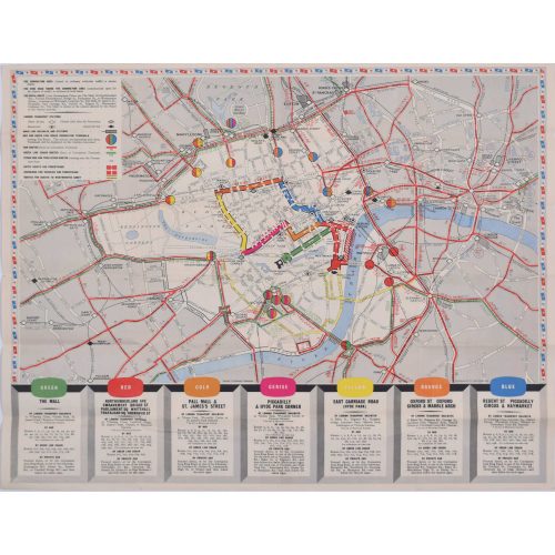
Coronation Arrangements - Map of London (1953)
Lithograph 45 x 60 cm (unfolded) Published by London Transport for the Coronation of Elizabeth II, this delightfully-coloured map illustrates the route taken by the Queen when she was crowned in 1953. Condition: generally very good. If you are interested, please email info@manningfineart.co.uk or call us on 07929 749056. -
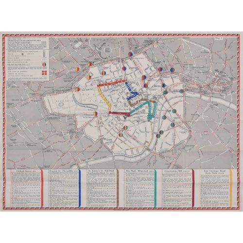
Coronation Arrangements - Map of London (1937)
Lithograph 45 x 60 cm (unfolded) Published by London Transport for the Coronation of George VI, this map illustrates the route the King took in 1936. And best of all, it's just (almost!) as useful in today's London. Condition: generally very good. If you are interested, please email info@manningfineart.co.uk or call us on 07929 749056. -
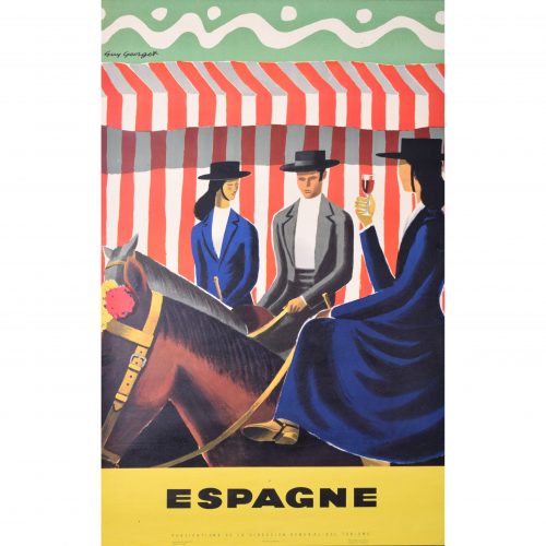
Guy Georget (1911 - 1992)
Espagne - Riders
Original vintage poster 100 x 62 cm One of Georget's fantastic posters designed for the Spanish tourist board. Three riders in traditional dress, with the ladies riding side-saddle, and one with sherry in hand, pose mounted in front of a red and white striped background. The bold, bright colours make the poster typically Georget. Guy Georget was a commercial designer; most of his poster designs were published in the late 1940s. Hired by the tourist boards in their post-war spree of tourism encouragement, Georget designed posters influenced by the styles of Pablo Picasso and Georges Braque. Condition: generally very good; a few tiny repaired edge tears. If you are interested, please email info@manningfineart.co.uk or call us on 07929 749056. Click here for more original vintage travel posters. -
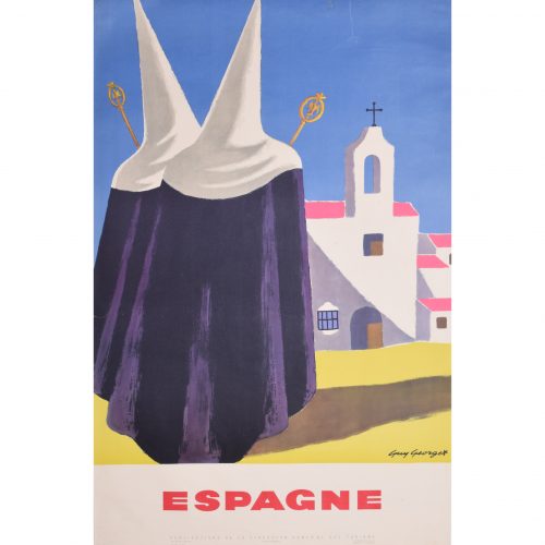
Guy Georget (1911 - 1992)
Espagne - Pilgrims
Original vintage poster 100 x 62 cm One of the fantastic posters Georget designed for the Spanish tourist board. Two pilgrims progress towards a typically Spanish church; Georget makes uses vibrant tones of bright blue, pink, and yellow to illustrate the scene. Guy Georget was a commercial designer; most of his poster designs were published in the late 1940s. Hired by the tourist boards in their post-war spree of tourism encouragement, Georget designed posters influenced by the styles of Pablo Picasso and Georges Braque. Condition: generally very good; a few repaired edge tears including one at the top c. 80mm, one to left side c. 25 mm. If you are interested, please email info@manningfineart.co.uk or call us on 07929 749056. Click here for more original vintage travel posters. -
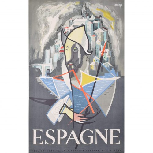
José Ortega (1921 - 1990)
"Don Quixote" Espagne
Original vintage poster c. 1960 99 x 65 cm Printed in Barcelona for the Publications de la Direccion General del Turismo. Ortega's poster is an abstract depiction Don Quixote (the Spanish hero written by Miguel de Cervantes), complete with his distinctive hat and spear. Ortega designed the poster for the Spanish tourist board, using an illustrious figure from Spain's literary heritage to encourage people to visit Spain. José García Ortega was born in Arroba de los Montes and was a member of the Communist Party. He worked as a painter and sculptor, studying at the Círculo de Bellas Artes in Madrid. In 1953 he went to France to study art, funded by a French government scholarship. He returned to Spain throughout the 1950s and 1960s, and became a commercially successful artist. Some of his most famous designs include the posters which the Spanish tourist board commissioned from him circa 1960. Condition: generally very good. If you are interested, please email info@manningfineart.co.uk or call us on 07929 749056. Click here for more original vintage travel posters. -
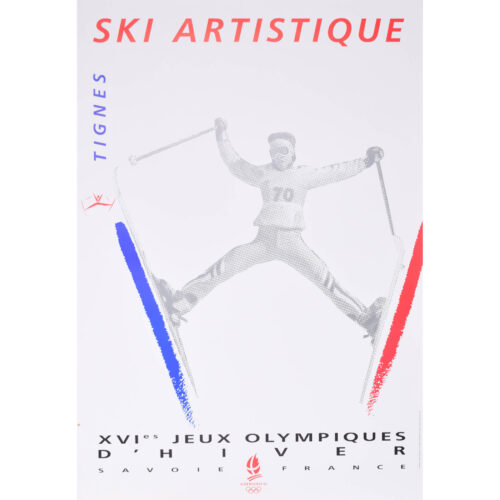
R C Meaux
Tignes - Ski Artistique (1990)
Original vintage poster 80 x 53 cm An original vintage poster printed in colour in 1990 by L’Avenir Graphic. The poster was designed to promote the 1992 Olympic Winter Games in Albertville. A similar design was also used for a limited edition French postage stamp in 1992. Condition: very good. If you are interested, please email info@manningfineart.co.uk or call us on 07929 749056. Click here for more original vintage ski posters. -
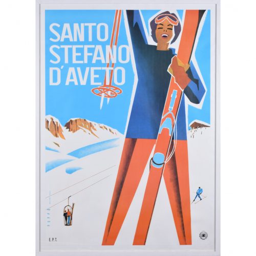
Mario Puppo (1905 - 1977)
Santo Stefano d'Aveto
Original vintage poster 97 x 68 cm Produced circa 1955 for Italian Railways. Mario Puppo's poster advertising the Italian ski resort of Santo Stefano d'Aveto. The figure of a skier reaches upward in triumph; behind her, a vintage ski lift makes its way up the mountain and a blue-clad skier tackles the piste. Mario Puppo was born in Levanto, Italy, and worked in a studio in Chiavari. He designed leaflets advertising skiing and beach resorts, which gained popularity in the 1930s. By the 1940s his poster designs were being featured in the Milan Advertising Graphics show. Throughout the 1940s he designed covers for catalogues, leaflets, playbills, music scores and records, as well as producing more travel posters for public and private Italian companies. Condition: backed to linen; frame included for UK mainland only (excluding Cornwall, Highlands and Islands - where further shipping charges may apply). If you are interested, please email info@manningfineart.co.uk or call us on 07929 749056. Click here for more original vintage posters. -
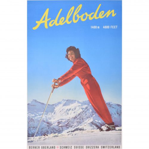
Adelboden
Original vintage poster 104 x 63 cm A fantastic original vintage poster advertising the Swiss ski resort of Adelboden, tucked away in the Bernese Oberland. Printed in Switzerland by Brügger AG. The photograph was taken by the Swiss photographers Emanuel Gyger and Arnold Klopfenstein. The pair were renowned for their captivating skiing images. Condition: generally very good. If you are interested, please email info@manningfineart.co.uk or call us on 07929 749056. Click here for more original vintage skiing posters. -
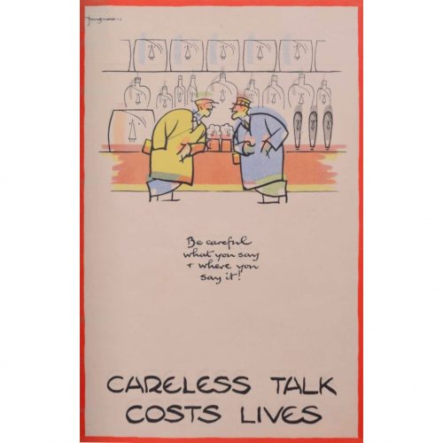
Cyril Kenneth Bird ‘Fougasse’ (1887 - 1965)
Careless Talk Costs Lives (circa 1940)
Lithographic poster 32 x 20 cm (12.5 x 8 in) Version printed on thinner paper. Fougasse was a British cartoonist. He was art editor of Punch between 1937 and 1949, and subsequently editor until 1953. He is best known for his ‘Careless Talk Costs Lives’ series of posters, and the other posters for the Ministry of Information and London Transport. As the Second World War progressed, the Ministry of Information’s poster campaign had become less and less effective. There were posters instructing the population to save old clothes for rags, turn off the lights, save food, dig for victory, watch out for spies, and keep calm and carry on. With this instruction overload, the population had ceased paying attention to the posters. Fougasse noticed this, and offered his services unpaid to the Ministry of Information, with a view to bringing a touch of humour to the posters. His amusing designs with pithy captions, reminiscent of newspaper cartoons, helped to get the Ministry's messages across in a novel way. Fougasse's distinctive poster style, with the red border, was subsequently adopted by other Ministry artists. Condition: if you’d like to know more, please email info@manningfineart.co.uk or call us on 07929 749056. -
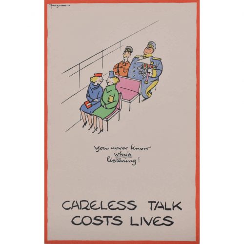
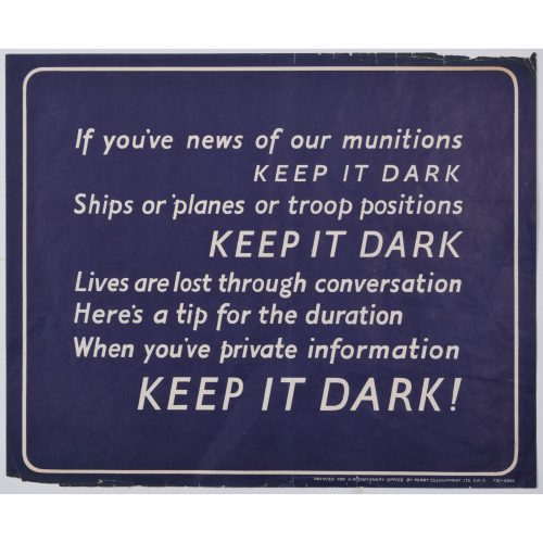
Keep It Dark (1939 - 1945)
Lithographic poster 25 x 31 cm Sponsored by Her Majesty's Stationery Office; printed by Perry Colourprint. A copy of this poster is held by the Imperial War Museum. This poster, bearing lyrics designed to be sung to the tune of "She'll be coming round the mountain", was designed for the Ministry of Information during the Second World War. It urges the population to avoid talking carelessly about details of Britain's operational movements, which might unwittingly end up in the wrong hands. Condition: good. Some small losses to extreme margins. If you’d like to know more, please email info@manningfineart.co.uk or call us on 07929 749056. -
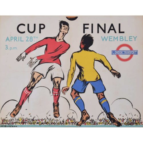
Anna Zinkeisen (1901 - 1976)
Wembley Cup Final (1934)
Lithographic poster 40 x 50 cm Signed in plate lower left, numbered 34/760, and printed by the DPC (Dangerfield Printing Company) for London Transport. Anna Zinkeisen created this design in 1934 for London Transport as a panel poster (12.5 x 10", for display within underground carriages or on buses). The Cup Final that year was between Manchester City and Portsmouth; Manchester City triumphed with a 2-1 scoreline. This particular lithograph from the same time was produced to a slightly larger scale than the panel poster, and is not recorded in the London Transport Museum archives. The process of lithography requires a skilled operator to draw a negative image on a stone plate (the Greek word 'lithos' meaning 'stone') - one plate for each colour in the image. The stone is then treated with acid and etched in a way as to produce a printing plate which can then be inked. Printing at different sizes therefore required the manual creation of new plates, and small differences between different sized versions are thus visible. Anna Zinkeisen won a scholarship to the Royal Academy Schools in 1916, focusing on sculpture and exhibiting at the Royal Academy in 1919. She was awarded the Landseer Award in 1920 and 1921, and went on to become an esteemed portrait artist, often of society ladies. She produced a series of posters for London Transport in the inter-war period. During the Second World War, Zinkeisen became a nurse, and was profoundly affected by the suffering she saw during her time working in St Mary's Hospital. This is arguably the point at which she and her sister Doris reached the pinnacle of their careers, producing some of the finest and most affecting depictions of the world at war made during this period. Condition: good. Backed to conservation paper; small loss to bottom left-hand corner and slight toning to extremities. If you’d like to know more, please email info@manningfineart.co.uk or call us on 07929 749056. -
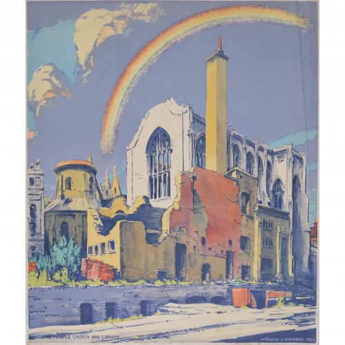
Walter Ernest Spradbery (1889 - 1969)
Temple Church and Library after Bombardment (1944)
Lithograph 66 x 57 cm Walter Spradbery's poster for the London Underground depicting a bombed Temple Church; a rainbow strikes hopefully out of the church's remains, and the sun shines on the golden stone of the building. The full poster bears the legend 'The Proud City' above Spradbery's design, and, beneath it, a quote from Charles Lamb: 'So may the winged horse, your ancient badge and cognisance, still flourish!'. This is a fantastic piece of British and London history, as well as a fantastically designed poster by a notable 20th century artist. The London Transport Museum has a copy of the poster, reference 1983/4/5751. 'The Proud City' was a series of six posters, all designed by Spradbery. They were commissioned by London Transport in 1944 as a defiant celebration of London's surviving the Blitz, and each poster also included a literary quotation. Walter Ernest Spradbery was a designer, painter, and poet who lived through the First and Second World Wars. He produced posters for LNER, Southern Railways, and London Transport, and was noted for his fascination with architecture and landscape. He studied, and later taught, at the Walthamstow School of Art. He was a pacifist and campaigned for nuclear disarmament, serving in the Medical Corps during the First World War and painting scenes of warfare for its duration, as well as during the Second World War. His anti-war stance and the horrors he had witnessed as a medic fed into his post-war poster design, especially 'The Proud City' poster series. Condition: generally very good. If you’d like to know more, please email info@manningfineart.co.uk or call us on 07929 749056. -
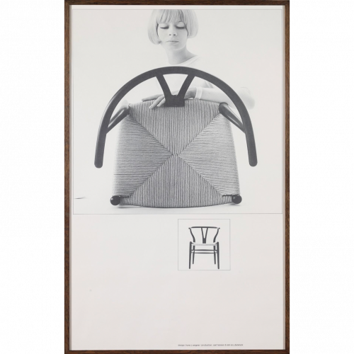
Paul Salomonsen (active 1960s) Y Chair (1964)
Lithographic poster (2014) 99 x 61 cm The poster features Hans J Wegner's famous 'Y chair', also known as the 'Wishbone chair'. Carl Hansen & Søn commissioned the poster from a photograph by Salomonsen, a 1960s photographer. The stylish and typically Danish woman examining the chair marks it as a piece of typically Danish design. The chair was known as "The Chair" when it was used in the TV-transmitted debate between John F Kennedy and Richard Nixon in 1959. The Chair subsequently became an icon of Danish mid-century furniture design. Condition: Excellent. If you’d like to know more, please email info@manningfineart.co.uk or call us on 07929 749056. -
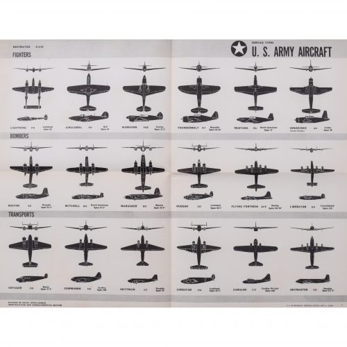
1943 Army World War II USA (1942)
Original aeroplane recognition poster 44 x 59 cm A summary of US aeroplanes from the series of US Navy identification posters that we have in stock. Fighters: P38 Lightning; P39 Airacobra; Curtiss P40E Warhawk; P47 Thunderbolt; P51 Mustang; A31 Vengeance. Bombers: A20 Boston; B25 Mitchell; B26 Marauder; Lockheed Hudson; Boeing B17E Flying Fortress; B24 Consolidated Liberator. Transports: C45 Voyager; C46 Commando; C47 Douglas Skytrain; Lockheed Lodestar; C76 Caravan; C54 Douglas Skymaster. Condition: generally very good, occasional handling marks. Folds as issued. If you’d like to know more, please email info@manningfineart.co.uk or call us on 07929 749056. -
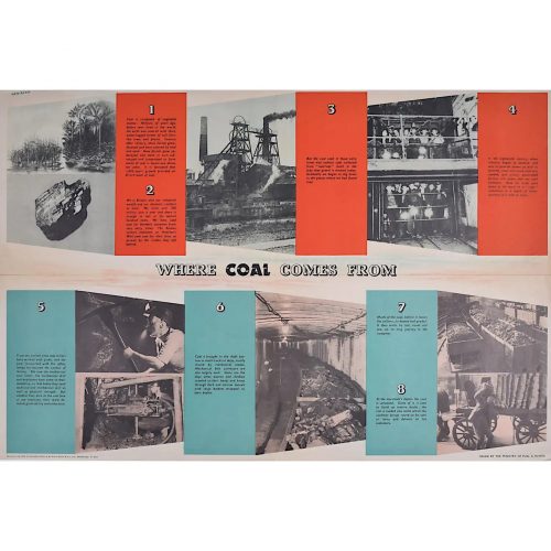
FHK Henrion (1914 - 1990)
Where Coal Comes From (circa 1945)
Original vintage poster 51 x 76 cm Signed in plate. Issued by the Ministry of Fuel and Power; printed for HM Stationery Office by Field Sons & Co Ltd, Bradford. We have been unable to identify any other copy of this poster by this renowned designer in any public collection - it is possibly the only remaining copy. A Ministry of Fuel poster encouraging the public to use less fuel. FHK Henrion was a German graphic designer who moved to Paris after leaving school, studying with the poster designer Paul Colin and then moving to London in 1936. Interned in the Isle of Man during the Second World War, he went on to design posters for the Ministry of Information and the US Office of War Information. After the War he started his own design agency, pioneering the concept of corporate identity. Clients included KLM, Giro, The Post Office, Tate & Lyle. The Ministry of Power and Fuel existed from 1942 to 1957 to control the nation's use of the scarce resources during and after the Second World War. Condition: centre folds as issued with a little wear to the extremities of the folds; generally very good. If you’d like to know more, please email info@manningfineart.co.uk or call us on 07929 749056. -
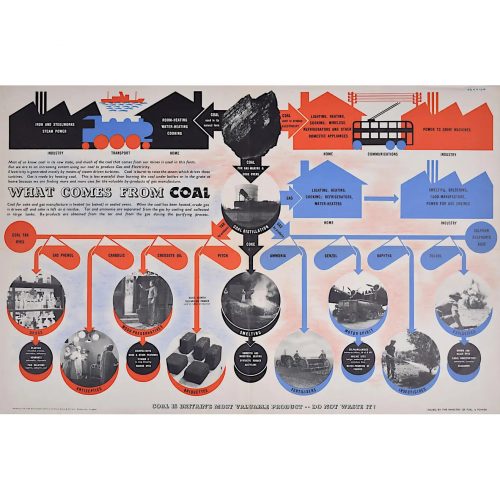
FHK Henrion (1914 - 1990)
What Comes from Coal (circa 1945)
Original vintage poster 51 x 76 cm Signed in plate. Issued by the Ministry of Fuel and Power; printed for HM Stationery Office by Field Sons & Co Ltd, Bradford. We have been unable to identify any other copy of this poster by this renowned designer in any public collection - it is possibly the only remaining copy. A Ministry of Fuel poster encouraging the public to use less fuel. FHK Henrion was a German graphic designer who moved to Paris after leaving school, studying with the poster designer Paul Colin and then moving to London in 1936. Interned in the Isle of Man during the Second World War, he went on to design posters for the Ministry of Information and the US Office of War Information. After the War he started his own design agency, pioneering the concept of corporate identity. Clients included KLM, Giro, The Post Office, Tate & Lyle. The Ministry of Power and Fuel existed from 1942 to 1957 to control the nation's use of the scarce resources during and after the Second World War. Condition: centre folds as issued with a little wear to the extremities of the folds; generally very good. If you’d like to know more, please email info@manningfineart.co.uk or call us on 07929 749056. -
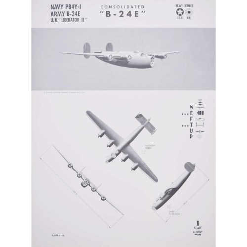
Navy and Army Consolidated Aircraft "B-24E" "Liberator II"
US Naval Aviation Training Division Original aeroplane recognition poster (1942) 63 x 47 cm A particularly unusual style of aeroplane identification poster, owing to the very arty images. Most such posters rely on very plain silhouettes, this series - and we have several in this series; view them here - have a much more arty approach to the task with shading and an interesting angle view. The Consolidated B-24 Liberator is an American heavy bomber, designed by Consolidated Aircraft of San Diego, California. Early RAF Liberators were the first aircraft to cross the Atlantic Ocean as a matter of routine. The B-24 was used extensively in World War II. It served in every branch of the American armed forces as well as several Allied air forces and navies, and was used in every theatre of war operations. In comparison with its contemporaries, the B-24 was relatively difficult to fly and had poor low-speed performance; it also had a lower ceiling and was less robust than the Boeing B-17 Flying Fortress. While aircrews tended to prefer the B-17, General Staff favoured the B-24 and procured it in huge numbers for a wide variety of roles. At approximately 18,500 units – including 8,685 manufactured by Ford Engine Company – it holds records as the world's most produced bomber, heavy bomber, multi-engine aircraft, and American military aircraft in history. Condition: Generally very good, occasional handling marks. If you’d like to know more, please email info@manningfineart.co.uk or call us on 07929 749056. -
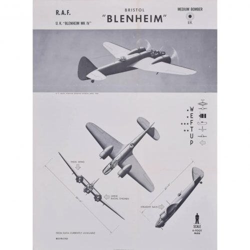
Royal Air Force Bristol Blenheim
US Naval Aviation Training Division Original aeroplane recognition poster (1942) 63 x 47 cm A particularly unusual style of aeroplane identification poster, owing to the very arty images. Most such posters rely on very plain silhouettes, this series - and we have several in this series; view them here - have a much more arty approach to the task with shading and an interesting angle view. The Bristol Blenheim is a British light bomber aircraft designed and built by the Bristol Aeroplane Company which was used extensively in the first two years of the Second World War. Condition: Generally very good, occasional handling marks or folds. If you’d like to know more, please email info@manningfineart.co.uk or call us on 07929 749056. -
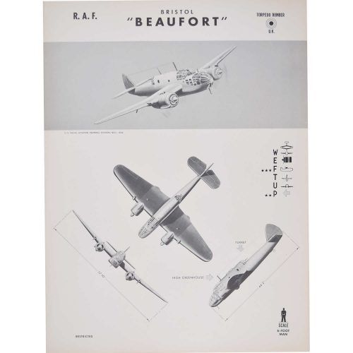
Bristol Beaufort Torpedo Bomber
US Naval Aviation Training Division Original aeroplane recognition poster (1942) 63 x 47 cm A particularly unusual style of aeroplane identification poster, owing to the very arty images. Most such posters rely on very plain silhouettes, this series - and we have several in this series; view them here - have a much more arty approach to the task with shading and an interesting angle view. The Bristol Beaufort (manufacturer designation Type 152) was a British twin-engined torpedo bomber designed by the Bristol Aeroplane Company, and developed from experience gained designing and building the earlier Blenheim light bomber. At least 1,180 Beauforts were built by Bristol and other British manufacturers. The Australian government''s Department of Aircraft Production (DAP) also manufactured variants of the Beaufort. These are often known collectively as the DAP Beaufort. More than 700 Australian-built Beauforts saw service with the Royal Australian Air Force in the South West Pacific theatre, where they were used until the end of the war. Beauforts first saw service with Royal Air Force Coastal Command and then the Royal Navy Fleet Air Arm from 1940. They were used as torpedo bombers, conventional bombers and mine-layers until 1942, when they were removed from active service and were then used as trainer aircraft until being declared obsolete in 1945. Beauforts also saw considerable action in the Mediterranean; Beaufort squadrons based in Egypt and on Malta helped interdict Axis shipping supplying Rommel's Deutsches Afrikakorps in North Africa. Although it was designed as a torpedo-bomber, the Beaufort was more often used as a medium day bomber. The Beaufort also flew more hours in training than on operational missions and more were lost through accidents and mechanical failures than were lost to enemy fire. The Beaufort was adapted as a long-range heavy fighter variant called the Beaufighter, which proved to be very successful and many Beaufort units eventually converted to the Beaufighter. Condition: good. If you’d like to know more, please email info@manningfineart.co.uk or call us on 07929 749056. -
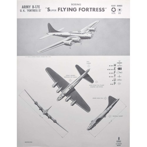
B-17E Boeing "Super Flying Fortress"
World War II US and UK heavy bomber plane Original aeroplane recognition poster (1942) 63 x 47 cm A particularly unusual style of aeroplane identification poster, owing to the very arty images. Most such posters rely on very plain silhouettes, this series - and we have several in this series; view them here - have a much more arty approach to the task with shading and an interesting angle view. The Boeing B-17 Flying Fortress is a four-engined heavy bomber developed in the 1930s for the United States Army Air Corps. From its introduction in 1938, the B-17 Flying Fortress evolved through numerous design advances, becoming the third-most produced bomber of all time. The B-17 was primarily employed by the United States Army Air Forces in the daylight strategic bombing campaign of World War II against German industrial, military and civilian targets. The B-17 also participated to a lesser extent in the Pacific War, early in World War II, where it conducted raids against Japanese shipping and airfields. In 1935 it was simply known as the Model 299. Seattle Times reporter Richard Smith dubbed the new plane, with its many machine-gun mounts, the “Flying Fortress,” and Boeing quickly adopted and trademarked the name. Condition: generally very good, occasional handling marks. If you’d like to know more, please email info@manningfineart.co.uk or call us on 07929 749056. -
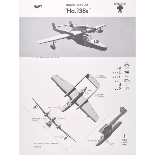
1943 Blohm und Voss "Ha. 138B"
World War II German Reich reconnaissance plane Original aeroplane recognition poster (1943) 63 x 47 cm A particularly unusual style of aeroplane identification poster, owing to the very arty images. Most such posters rely on very plain silhouettes, this series - and we have several in this series; view them here - have a much more arty approach to the task with shading and an interesting angle view. Condition: generally very good, occasional handling marks. If you’d like to know more, please email info@manningfineart.co.uk or call us on 07929 749056. -
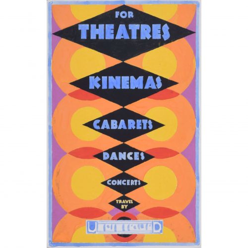
Gerald Mac Spink (flourished 1920 - 1940)
For Theatres, Kinemas, Cabarets, Dances, Concerts, Travel by Underground (c. 1930)
Gouache 30 x 19 cm Original design for a London Transport poster. Framed. A fantastic gouache design by Spink for a London Underground poster. The artist's striking Art Deco design and heady use of colour advertises the glamour of travelling by Tube to various evening entertainments around London. Spink was a skilled artist and designer who produced a series of posters in the inter-war period for companies including the London Underground, Southern Railways, LNER, Hawker Engineering, and British Steel. He won a prize in 1933 from the Imperial Institute for his poster artwork. He also worked as an aeronautical engineer in Kingston-on-Thames for Hawker Engineering; his greatest achievement was the creation of the 'Squanderbug', a 500cc racing car which he built in 1947, and which races even to this day. Provenance: the artist's estate. Condition: good; a few small scuffs to gouache, as visible in photographs. Handsomely framed. If you’d like to know more, please email info@manningfineart.co.uk or call us on 07929 749056. -
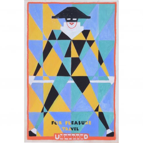
Gerald Mac Spink (flourished 1920 - 1940)
For Pleasure, Travel by Underground (c. 1930)
Gouache 26 x 18 cm Original design for a London Transport poster. Framed. A dynamic Art Deco poster design by Mac Spink. A boldly-coloured harlequin figure encourages travel via the London Underground. Spink was a skilled artist and designer who produced a series of posters in the inter-war period for companies including the London Underground, Southern Railways, LNER, Hawker Engineering, and British Steel. He won a prize in 1933 from the Imperial Institute for his poster artwork. He also worked as an aeronautical engineer in Kingston-on-Thames for Hawker Engineering; his greatest achievement was the creation of the 'Squanderbug', a 500cc racing car which he built in 1947, and which races even to this day. Provenance: the artist's estate. Condition: good; a few small scuffs to gouache, as visible in photographs. Handsomely framed. If you’d like to know more, please email info@manningfineart.co.uk or call us on 07929 749056. -
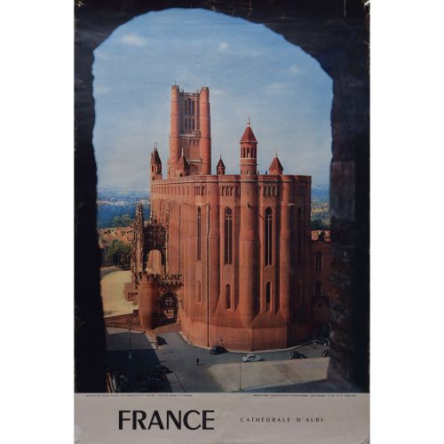
France - Cathedrale d'Albi, Toulouse
Original vintage poster 60 x 40 cm The Basilique Cathédrale Sainte-Cécile d'Albi (Cathedral Basilica of Saint Cecilia), also known as Albi Cathedral, is the seat of the Catholic Archbishop of Albi. First built in the aftermath of the Albigensian Crusade, the grim exterior resembles a fortress, but the interior is lavishly decorated with art and sculpture, a very ornate choir screen, and walls in bright blues and golds, in the Toulousian or Southern French Gothic. It was begun in 1282 and was under construction for 200 years. It is claimed to be the largest brick building in the world. In 2010 the cathedral, along with its episcopal buildings, was designated a UNESCO World Heritage Site because of its unique architecture and the remarkable consistency in its design. Condition: small tear to lower left corner; some wear to corners. If you’d like to know more, please email info@manningfineart.co.uk or call us on 07929 749056. -
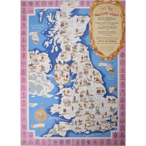
Charles Paine (1895-1967)
Army Map of England (1944)
Lithograph 99 x 75 cm Published for the National Savings Committee in London, the Scottish Savings Committee in Edinburgh, and the Ulster Savings Committee in Belfast. Printed at Field Sons & Co. Ltd., Bradford, for His Majesty's Stationery Office, London. Signed lower left in the plate. Charles Paine was a versatile and prolific designer, who drew on his training in stained glass to create bold, structured and highly stylised lithographs for a variety of companies. This decorative and brightly-coloured map illustrates the various county regiments of Great Britain, with a border of regimental badges. If you’d like to know more, please email info@manningfineart.co.uk or call us on 07929 749056. -
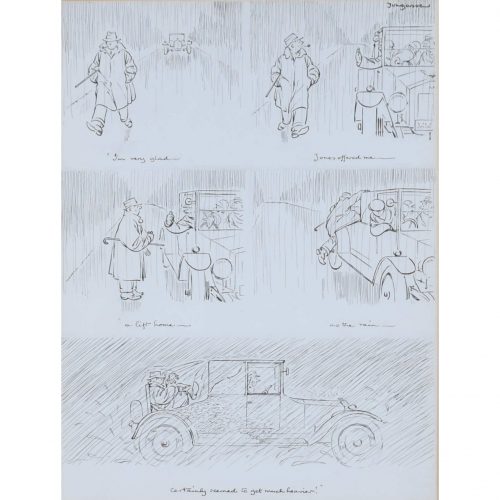
Fougasse (Cyril Kenneth Bird, 1887 - 1965)
'I'm very glad Jones offered me a lift home as the rain certainly seemed to get much heavier!' (1966)
Pen and ink 32 x 24 cm Signed upper right. Cyril Kenneth Bird, under the name Fougasse, was a British cartoonist. He was art editor of Punch 1937 - 1949, and subsequently editor until 1953. He is best known for his ‘Careless Talk Costs Lives’ series of posters, and produced many other posters for the Ministry of Information and London Underground. His pen and ink cartoons for Punch are some of his gentlest and funniest works. Provenance: The Fine Art Society Ltd., 148 New Bond Street, June 1966. If you’d like to know more, please email info@manningfineart.co.uk or call us on 07929 749056. -
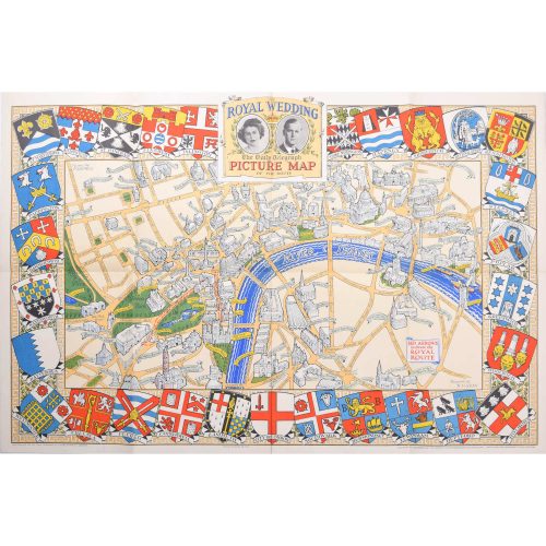
N. V. Gray
The Royal Wedding: Picture Map of the Route through London (1947)
Lithograph 50 x 76 cm Produced by H.A. & W.L. Pitkin Ltd for the Daily Telegraph and published by Geographia Ltd., of Hutchinson & Co. Signed in plate lower right. Complete with slip showing the genealogy of the two parties. Princess Elizabeth (later Her Majesty Queen Elizabeth II) and Prince Philip married on Thursday 20th November 1947 at Westminster Abbey in London. This map, commissioned and sold by the Daily Telegraph newspaper, was designed by N. V. Gray. It depicts the route the carriage processions took on the way to the Abbey; Princess Elizabeth and her father King George Vi travelled in the magnificent Irish State Coach. Crests of London's boroughs border this delightfully coloured map. If you’d like to know more, please email info@manningfineart.co.uk or call us on 07929 749056. -
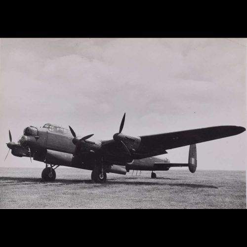
Lancaster HK543
Original Silver Gelatin photograph 19 x 25 cm Stamped to reverse "Copyright 'the Aeroplane'" 23 July 1945 HK543 was a Lancaster III, probably produced in 1943. Here she is shown in July 1945, she was recorded photgraphically on bombing trials from Boscombe Down that month, this photograph may reasonably be assumed to be from that event. Provenance: from the collection of Philip J R Moyes, author of many books on the RAF, most notably The Pictorial History which ran to several volumes. Condition: mostly good. -
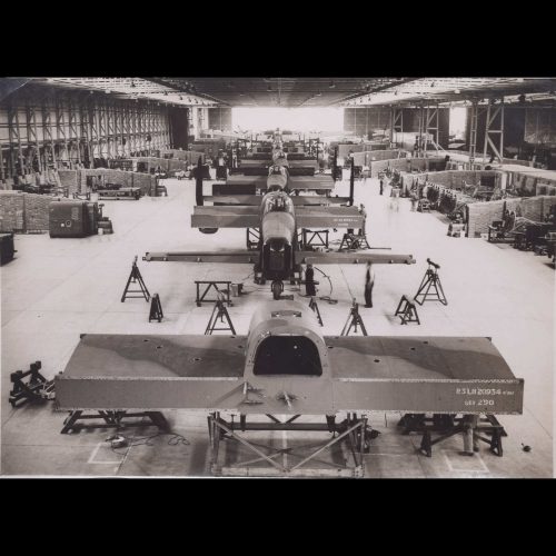
Lancaster Bombers under Construction
Original Silver Gelatin photograph 17 x 21 cm Stamped to reverse 'Certified by Photographic News Agencies Ltd as passed by Censor' '23 Oct 1942' This photograph shows the parts of a Lancaster bomber being assembled. At the back of the photograph, facing away from the viewer, are two nearly or newly completed aircraft, their airscrews visible attached to the wings. The factory buzzes with activity as important war work is undertaken. We have been unable to trace any other copy of this photograph. Provenance: from the collection of Philip J R Moyes, author of many books on the RAF, most notably The Pictorial History which ran to several volumes. -
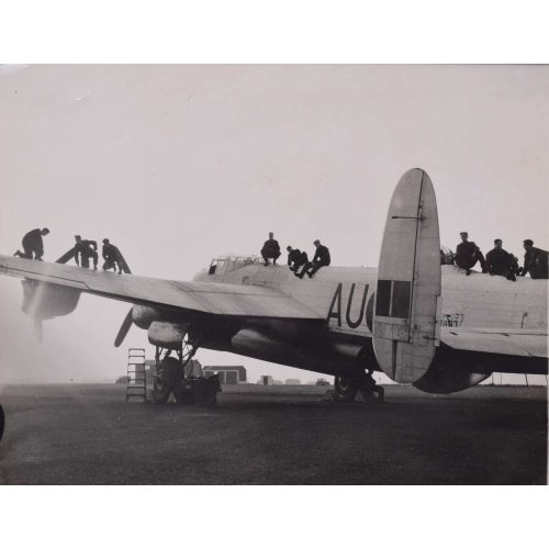
Lancaster Bomber AU-Q loading bombs
Original Silver Gelatin photograph 21 x 25 cm Stamped to reverse 'Copyright Associated Press Photograph' Press release states:LAST MINUTE PREPARATIONS FOR TOMORROW'S ATTACK ON THE FLEET At RAF Station Upwood, Hunts, today, Dec 8th last minute preparations were being carried out for tomorrow's attack on the fleet. Photo shows a Lancaster being made ready for a dawn take off tomorrow photographed this evening against the setting sun. WOR 339889 Associated Press Photo Provenance: from the collection of Philip J R Moyes, author of many books on the RAF, most notably The Pictorial History which ran to several volumes. -
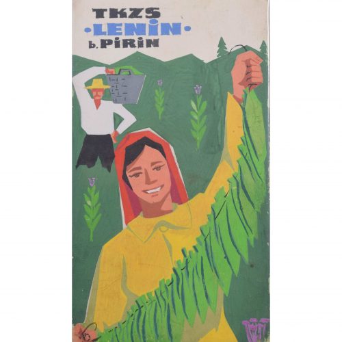
Soviet Union pro-Lenin Marxist Bulgarian propaganda poster design (circa 1950s)
Gouache on board 20 x 11.5 cm After a Communist takeover in 1945, Bulgaria was a Soviet ally during the Cold War, and maintained good relationships with Russia until the Revolutions of 1989. From 1945 to 1948, the country became entrenched within the Soviet sphere of influence under the control of the Bulgarian Communist Party (BCP) which oversaw a program of Stalinization in the late 1940s and 1950s. Both countries are Slavic nations, and are bound together by a common Orthodox Christian culture. This poster design is a piece of Leninist propaganda, designed to make Bulgarians associate Lenin and Soviet Marxist rule with efficiency and plenty. It is inscribed to the reverse in Bulgarian 'To grow plants in rows next to each other - the thickest row with straight cobs'. The Pirin Mountains referred to in the top left-hand corner are a mountain range in southwestern Bulgaria. Condition: very good. If you’d like to know more, please email info@manningfineart.co.uk or call us on 07929 749056. -
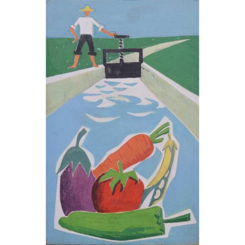
Soviet Union socialist irrigation Bulgarian propaganda poster design (circa 1950s)
Gouache on board 18 x 11 cm After a Communist takeover in 1945, Bulgaria was a Soviet ally during the Cold War, and maintained good relationships with Russia until the Revolutions of 1989. From 1945 to 1948, the country became entrenched within the Soviet sphere of influence under the control of the Bulgarian Communist Party (BCP) which oversaw a program of Stalinization in the late 1940s and 1950s. Both countries are Slavic nations, and are bound together by a common Orthodox Christian culture. This poster design features huge juicy vegetables, grown as the result of newly-implemented irrigation systems. Socialist farming practices in Bulgaria were commonplace during its time as a Soviet ally or 'satellite'; the government was keen to encourage well-yielding farming practices and to be seen as a protector of agricultural infrastructure turing this turbulent period of the 20th century. Condition: very good. If you’d like to know more, please email info@manningfineart.co.uk or call us on 07929 749056. -
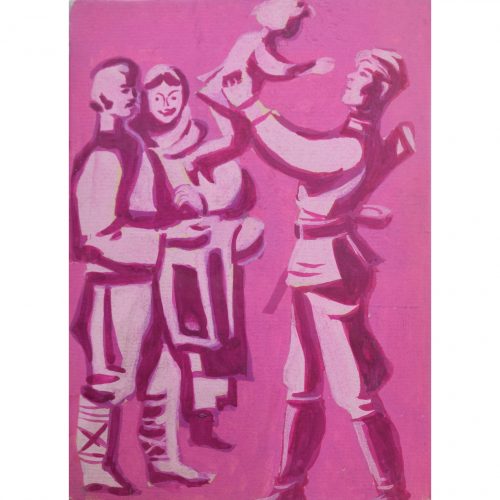
Bulgarian pro-natalist propaganda poster design (circa 1950s)
Gouache on board 17 x 12 cm After a Communist takeover in 1945, Bulgaria was a Soviet ally during the Cold War, and maintained good relationships with Russia until the Revolutions of 1989. From 1945 to 1948, the country became entrenched within the Soviet sphere of influence under the control of the Bulgarian Communist Party (BCP) which oversaw a program of Stalinization in the late 1940s and 1950s. Both countries are Slavic nations, and are bound together by a common Orthodox Christian culture. This poster design, painted in warm pink-purple tones and depicting a Bulgarian soldier holding a toddler aloft, was designed as post-war pro-natalist propaganda (likely from the 1950s). Bulgaria and its Soviet allies had lost a huge number of men during the war, and this design for a poster was intended to encourage Bulgarians to have more children. Condition: very good. If you’d like to know more, please email info@manningfineart.co.uk or call us on 07929 749056. -
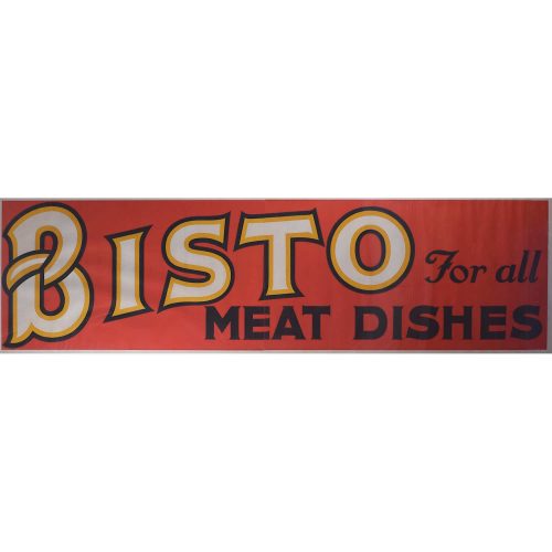
'Bisto for all Meat Dishes'
Original vintage poster 55 x 202 cm This original vintage poster is an excellent opportunity to acquire a piece of British advertising history. Bisto is an instantly recognisable brand today, and has been throughout the 20th century; the catchphrase on the poster here, "Bisto for all meat dishes" was used in the 1950s. The first Bisto product, in 1908, was a meat-flavoured gravy powder which rapidly became a bestseller in the UK. It was added to gravies to thicken them and give a richer taste and aroma. Invented by Messrs Roberts & Patterson, it was named "Bisto" because it "Browns, Seasons and Thickens in One". As of 2005, Bisto Gravy Granules had a British market share of over 70%. Nearly all British grocery outlets stock a Bisto product. -
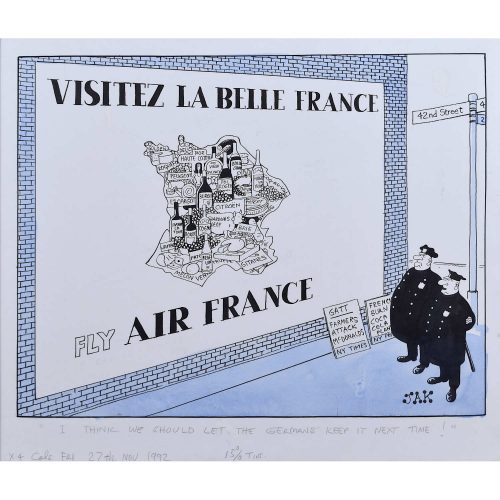
JAK (Raymond Allen Jackson) 1927-1997
"I think we should let the Germans keep it next time" (1992)
Visitez La Belle France, Fly Air France 51x59cm Pen, ink and monochrome wash with inscriptions in pencil. For the London Evening Standard JAK was one of Britian's best-known political cartoonists, working for the London Evening Standard and the Daily Mail between the 1950s and 1990s. He left school at the age of 14, and after a brief career as a messenger boy studied at Willesden College of Technology, studying art with the aim of becoming an art teacher. Following National Service (in the Territorial Army, teaching conscripts to paint), in 1950 he became a staff artist at Link House Publications, and then at advertising agency J Keymer & Co. Whilst working here he submitted cartoons to Punch and other journals, joining the Evening Standard in 1952 as illustrator, also drawing occasional cartoons. In 1966, following the suicide of 'Vicky' (Victor Weisz), he became policital cartoonist at the Evening Standard. Some of his cartoons were highly controversial. In 1970 he caricatured power workers (then striking to improve their conditions) as stupid, greedy and deaf to reason; the entire Evening Standard staff nearly went on strike in response. In 1982 a cartoon in response to the Northern Ireland situation (he frequently depicted Irish people negatively) caused Ken Livingstone to withdraw all advertising from the Standard. His style was distinctive, drawn in ink on 17" x 21.5" board using a mapping pen and brush. His signature was always in a bottom corner, with blob-like serifs, and the title and other instructions were drawn on the picture in pencil. He also drew cartoons for the Mail on Sunday, Daily Express, and Sunday Express. -
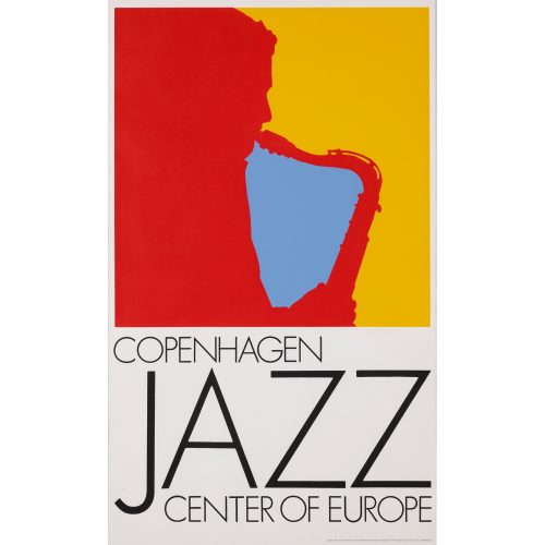
Per Arnoldi (born 1941)
Copenhagen: Jazz Center of Europe (1972)
Lithographic poster 99 x 61 cm Per Arnoldi was born in Copenhagen in 1941. He is a Danish designer and artist most famous for his prolific commercial poster art. Arnoldi is a lifelong fan of jazz, and, as well as having created many jazz-related posters, he hosts monthly jazz radio shows and occasionally tours with a jazz trio. This bold and dynamic poster is typical of Arnoldi's jazz designs. He notably uses block primary colours and simple, often silhouetted, compositions. The Tourist Association of Copenhagen commissioned the poster in order to encourage tourists to visit the city and its musical haunts. The saxophonist silhouetted in the image is thought to be a representation of Stan Getz, the American jazz saxophonist who died in 1991. If you'd like to know more, please email info@manningfineart.co.uk or call us on 07929 749056. Condition: Excellent. -
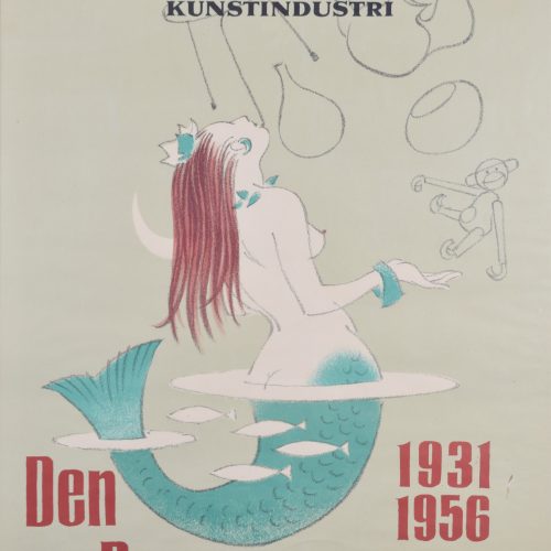
Arne Ungermann (1902-1981)
'Den Permanente', "The Permanente Exhibition" (1956)
Lithographic poster 84 x 61 cm The Danish artist Arne Ungermann designed this poster in 1956 to celebrate the 25th anniversary of Den Permanente in Copenhagen. Den Permanente, or the Permanent Exhibition, celebrated Danish art, craft, and design, and operated between the 1930s and 1980s. The Danish silversmith Kay Bojesen came up with the idea for the exhibition, which also served as a shop where customers could buy Danish art and crafts. Bojesen's idea became a reality when Christian Grauballe, director of the iconic Danish design company Holmegaard, invested in it in 1931. Den Permanente became an icon of Danish 20th century design, selling furniture, glassware, lighting, ceramics, jewellery, and textiles. Bojesen is most famous for his wooden monkey design, which Ungermann features in his poster. The motif of the mermaid emerging from the sea could be a motif drawn from Hans Christian Andersen, but made modern - she breaks the surface of the ocean in order to marvel at the treasure trove of man-made objects exhibited at Den Permanente. The notable Little Mermaid statue on Copenhagen's promenade, installed in 1913, is also inspired by Andersen's fairy tale. If you'd like to know more, please email info@manningfineart.co.uk or call us on 07929 749056. Condition: Excellent. -
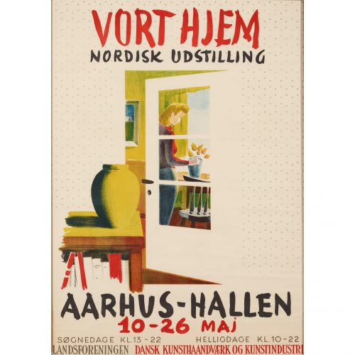
Danish Society of Arts and Crafts
'Vort Hjem', "Our Home" poster (c. 1950)
Lithographic poster 80.5 x 57 cm A poster advertising the 'Vort Hjem Nordisk Udstilling' - the "Our Home: Nordic Exhibition". The exhibition explored Nordic interior design and was commissioned by the Danish Society of Arts and Crafts. The poster presents a domestic scene of a woman arranging flowers; we see her through the glass panels of an ajar door, which invites us into the typically Danish interior. If you'd like to know more, please email info@manningfineart.co.uk or call us on 07929 749056. Condition: Excellent. -
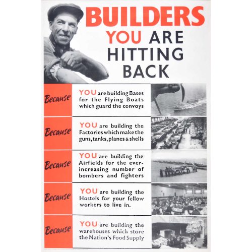
Builders YOU Are Hitting Back Original WW2 Poster (c.1940)
'Builders - YOU Are Hitting Back' Original WW2 Poster (c.1940) 76 x 50.5 cm Lithograph and letterpress (on paper) Printed by Lowe and Brydone Printers Ltd, London NW10. Published by HM Stationery Office. Because: You are building bases for the Flying Boats which guard the convoys You are building the Factories which makes the guns, tanks, planes & shells You are building the Airfields for the ever increasing number of bombers and fighters - Spitfire You are building the Hostels for your fellow workers to live in You are building the warehouses which store the Nation's Food Supply -
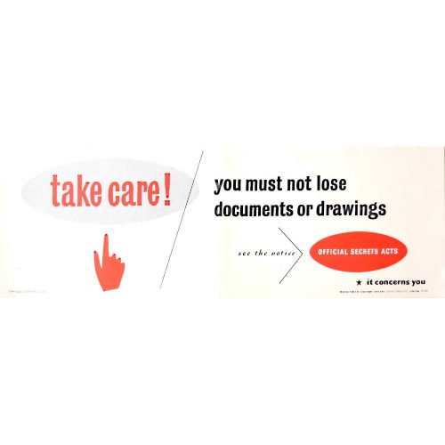
Take Care! Official Secrets Act WW2 Poster (c.1940)
Lithographic poster 18 x 51 cm Printed for the HM Stationary Office by Gothic Press, London. -
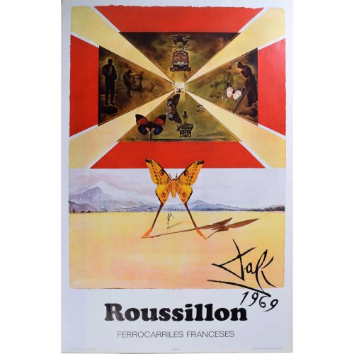
Salvador Dali (1904-1989)
Rousillon Original Poster for French National Railways SNCF (1969)
98 x 62 cm Lithographic posterThis is one example of the seven posters Surrealist painter Salvador Dali (1904-1989) designed for the French National Railways in the late 1960s and early 1970s - click here for the others.Condition: Generally very good - a little creasing to the very edges.